

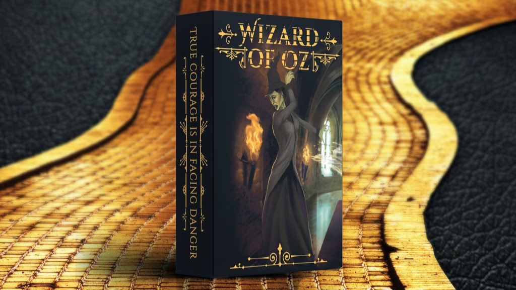
Designed by extraordinary digital artist Suzanne van Pelt and produced by LUX Playing Cards, the Wizard of Oz decks are a fully custom deck of playing cards, inspired by L. Frank Baum’s fantasy novels. The decks feature new art, embossing and foil on the tuck, and the new “Impressions” technology by MPC which allows the card back to be raised/lifted/glossy so that you can actually feel the embossing on the card back.
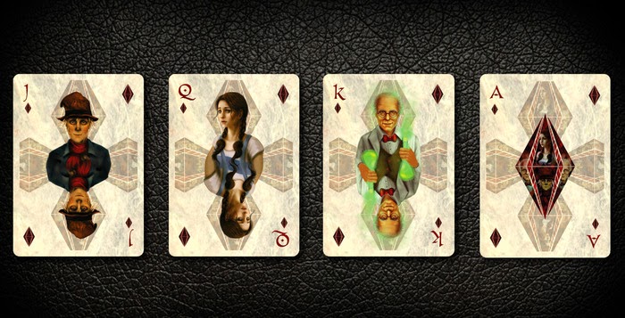
A lot of thought has gone into the design and layout of the deck. For example, the Spades feature the evil characters, while the Diamonds portrays Dorothy with two very important Oz characters, the Wizard and the Scarecrow. The Hearts are represented with the Cowardly Lion and the Tin Woodman, along with the Good Witch of the North, all of whom helped Dorothy and the Clubs are made entirely of characters originally from Kansas, including Aunt Em, Uncle Henry, and Toto.
We had a quick chat with Bryan Sloan of LUX Playing Cards on the design background & idea behind the Wizard of Oz deck and his experience from his first Kickstarter project.
When did you start work on the Wizard of Oz deck?
I decided to do this deck in March, almost 1 year ago. So we planned and outlined the characters and commissioned the art from Suzanne van Pelt of Norway. She did a great job by making the characters unique.
Tell us about this new technology you are using for the deck?
We also wanted to experiment with the technology with the glossy raised backs on some of the cards. It’s a feature that goes well with the “fantasy” theme, and then of course we wanted some decks printed by USPCC.
Can you tell us more about the artwork and the design of the deck?
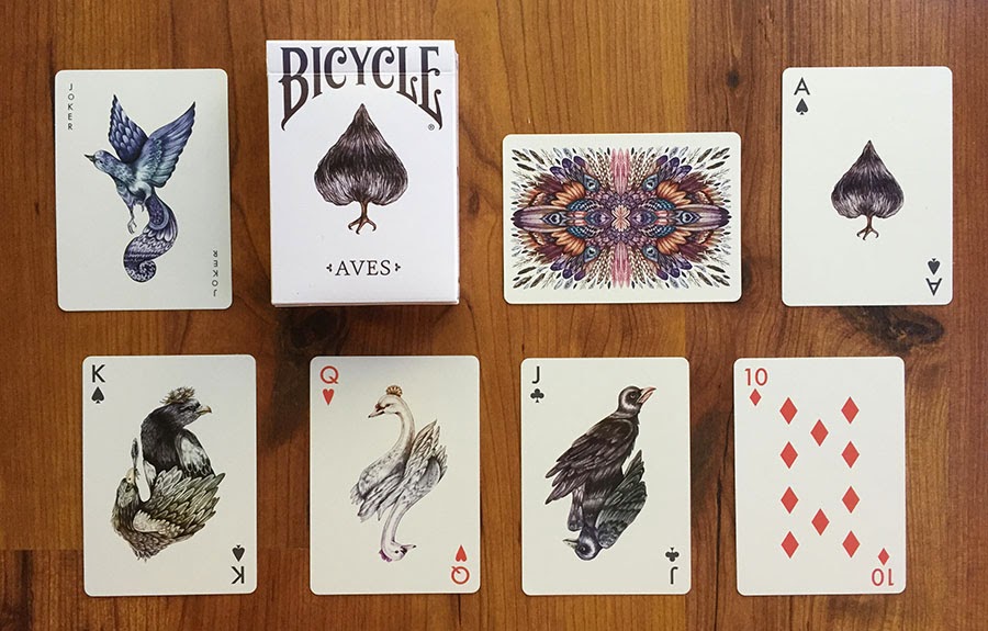
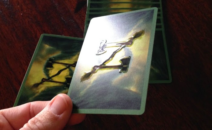
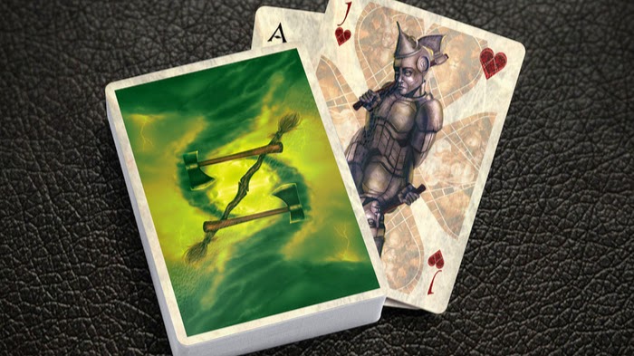
The art itself is very intricate, and the final product will be amazing. I’m glad to see that the Aves deck has been received so well, and I am hoping that these will be printed so everyone can enjoy the new art by Suzanne. The card back itself is a balance between good and evil. The tornado from Kansas that picks up Dorothy can be seen, and it looks 3 dimensional. The negative space between the axes and brooms create the letters “O” and “Z” to help create the OZ deck. It’s a really creative back design that I can’t wait to see in-person.
That being said, the Wizard of Oz deck is very different from the Aves deck. How did you come out with the idea for the Wizard of Oz theme?
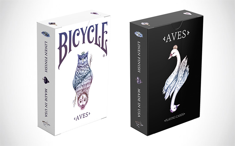
We wanted to do something different that might appeal to a different group of card players in this new project. Our Aves deck was critically acclaimed, and even featured on the very popular Colossal sites. This Wizard of Oz deck definitely has a smaller niche target audience, although people who are fans of fantasy art will enjoy it. I’m trying to publish decks that are different from what’s currently on the market, so we wanted to explore something completely outside the norm.
Walk us through the process you and artist took to design the deck. How did you get to this finished product?
Suzanne van Pelt is a fantastic artist who specializes in fantasy work, including crossing over from humans to non-humans, which was perfect for a deck in this realm. She was able to put together some amazing creatures with really intricate details. My favorite card in the deck is the Tin Woodman. The details on this card are superb, as she showed everything from the detail on the axe blade to the rust and imperfections on his attire. Suzanne started with sketches of different characters, and took her time to finish each portrait to try to bring forth the essential character and features of each individual.
What was your most brilliant breakthrough when designing the deck?
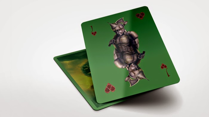
I knew we wanted USPCC to print a deck, and so we went that route, as they know how to put out a fantastic product which handles well. I then decided to do something completely different, and offer the new “impressions” technology from MPC which allows each card to have a raised glossy feature. Instead of on the card faces as MPC did with their successful campaign, I put the raised glossy feature on the card backs. I think it’s a great feature to have on a card back that sets the deck apart from other typical decks. It’s a fun avenue to explore and it’s definitely a new feature to have fun with.
You have successful completed the Aves deck. What are a few key elements and principles you incorporated into your project that you think future Kickstarter creators could benefit from knowing?
I love seeing creators try something new. The Aves deck was actually a risk because there is not a lot out there as far as fine art playing cards. Uusi is one studio that has published some great fine art decks, although we still are in the minority. There are definitely decks with great detail (anything by Lorenzo Gaggiotti) but on the face of it, Aves, a deck featuring art inspired by birds, doesn’t hit home with a lot of people. That is when the art speaks for itself, and the talent of the artist can reach out to people.
Thank you for your time Bryan and all the best! If you like what you’ve read here and want to support the Wizard of Oz deck, you can find it on Kickstarter here.
The Wizard of Oz Playing Cards will be available in two editions: Bicycle branded edition by USPCC and Emerald City edition by MPC with new embossing technology to accentuate the art on the card back. Pledge starts from $12 and the uncut sheet is available as an add-on.