


The Gargoyles deck by Lance Miller has a bit of history to it. The decks concept made its debut in 2010 at the Label Expo Americas show in Chicago. The deck was 100% plastic and came in a fully illustrated cellophane wrapper. The “Expo” deck had standard courts and was actually produced to test the capabilities of the flexography printing press. The Expo deck had a few more features and secrets and has become quite scarce. With only 300 decks available for purchase and the rest of the remaining 2200 given away to the people attending the Expo, they seem to have dried up over time. That “Expo” deck did accomplish one more thing, it drew a lot of attention to the design and the artist behind it from the playing card community, and people wanted a Gargoyles deck of their own.
In 2011 Lance T. Miller took the original Gargoyle Expo design and gave it a bit of “Re-Tooling”. The design of the deck is dark and rooted in “Gargoyle” mythology and numerology. There’s a paragraph on the Gargoyle ad card that I’ve always liked, and it reads as follow:
“The card is a reminder that evil is all around us and that the very nature of humans and their “silver tongues of deceit” are what often challenges us most. Believe it or not I am actually a Christian Artist. I simply choose to showcase the beauty of the struggle between good and evil rather than focus heavily in one direction or another”
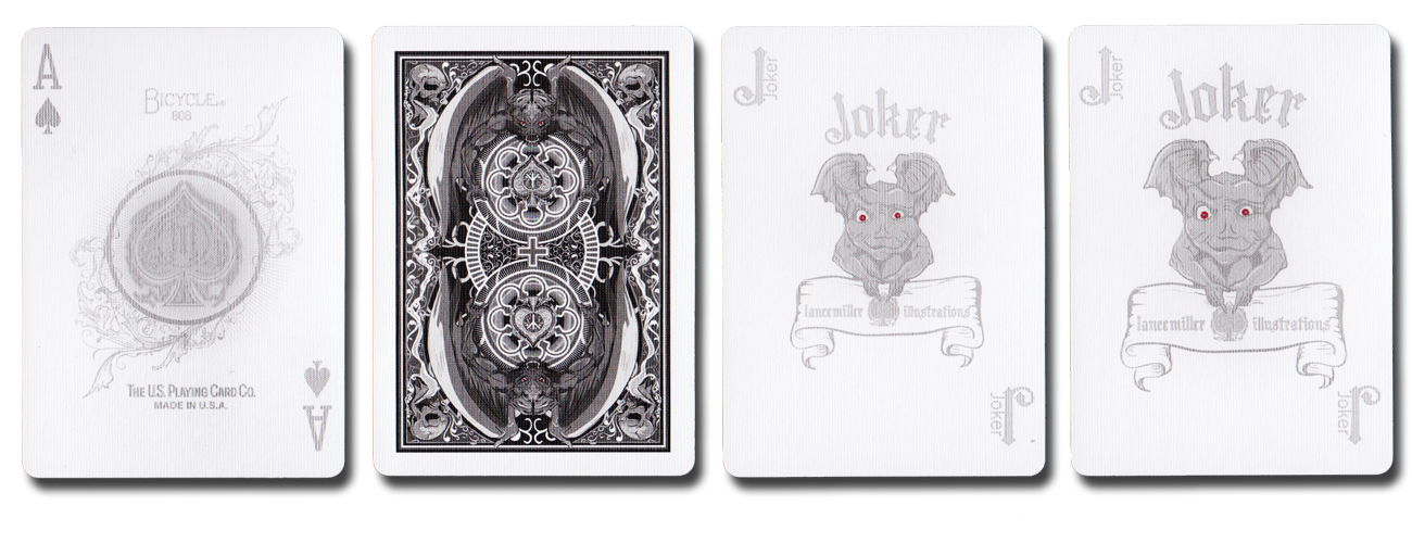
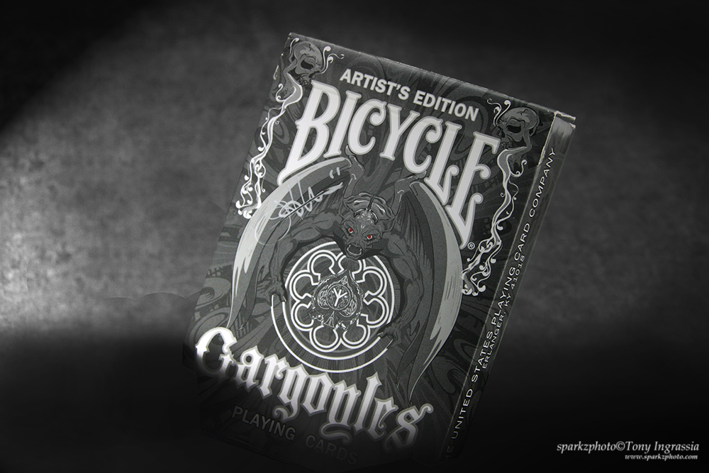
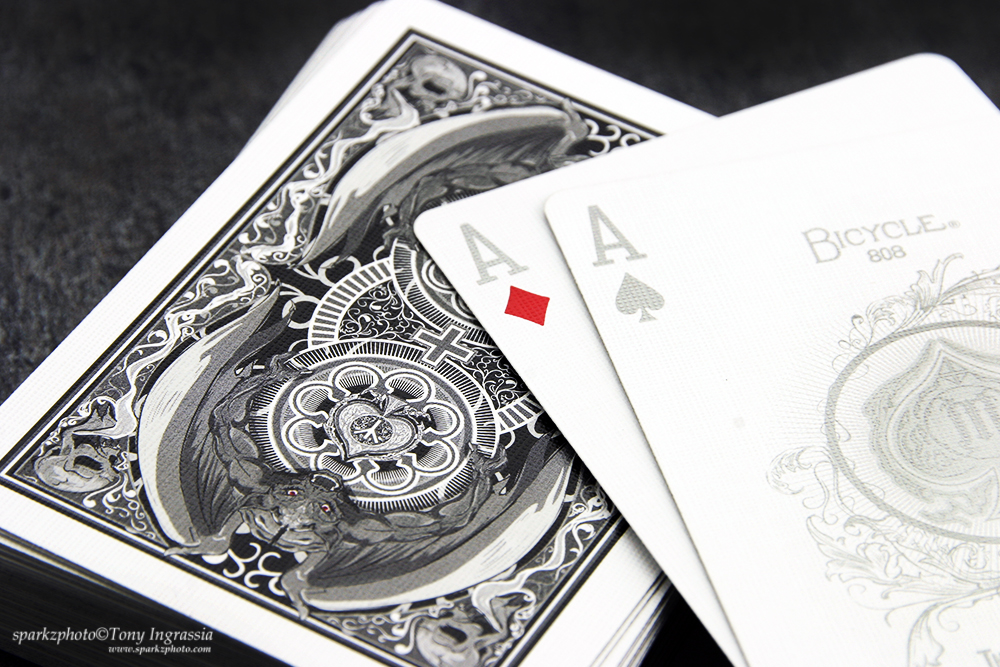
The deck is just beautiful, it’s well designed and has some cool features that I’ll discuss, but, once I read the “Artists” intentions behind the deck, I liked it even more. You look at it with a different perspective and the elements and design not only make sense, but fit together so well. There are decks that are cool for the sake of being cool, and then there are decks that just embrace their own concept. Gargoyle’s color pallet is for the most part void of any vibrant color, the deck and tuck is done in shades of grey, black and white. The only splash of color you’ll find in this deck is the color red, which stays intact for the Hearts and Diamonds, but also appears on the Gaff card as well as the eyes of the Gargoyle’s featured on the back design, Jokers and tuck case.
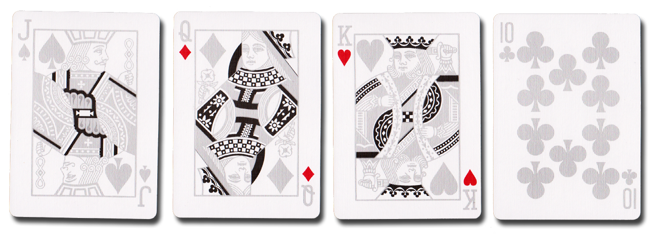
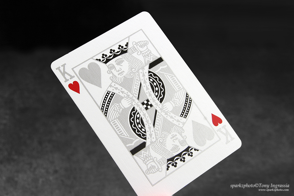
Within the deck, silver metallic inks replace pretty much everything else; minus some hard black accents in the court design that just pop when the card is held at an angle. The court design itself is pretty much standard, but the inks and that bold black work well with the overall look of the deck. The custom Ace of Spades has a nice “Classic” feel, with just enough customization to make it unique to the deck. Gargoyle’s also features 2 Jokers, both with identical metallic Gargoyle’s images, complete with bright red eyes. The only difference between the two is size; one Joker has a slightly smaller image size than the other. The deck also includes a Gaff card as well as an ad card explaining the concept, mythology and numerology used in the deck……probably the best ad card ever.
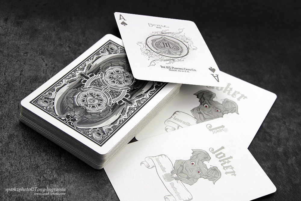
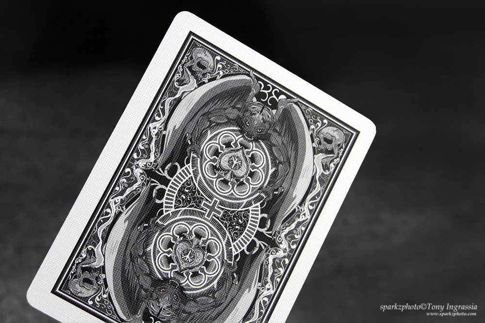
The back design is beautifully designed and balanced, not only in terms of symmetry of the elements, but also the concept of the struggle between good and evil. The outstretched wings of the opposing Gargoyles protecting the center “Emblems” along with a small cross in the center of the back really work well together. The framework of the back design also features stylized skulls in each corner and some intricate design work to tie it all together. The grey tone continues on the back design, as well as the red eyes of the Gargoyle’s and the use of stark white on the emblem cross and center elements really add that bust of contrast that’s appealing to the eye.
The tuck case mirrors the imagery and design elements of the
back design, and continues the use of the stark white to add some contrast to
the look. It is Bicycle branded and features the words “Artists Edition” at the
top. The Artist’s Edition indicating the “re-working” of the Expo version.
The Bicycle Gargoyle’s had a print run of 2500, but this
deck was one of the first crop of “Custom Playing Cards” and one of the first
to use metallic inks. Both decks are collectable, and while the Expo deck is
the harder to find and will put a bigger dent in your wallet; I
still like the Artists Edition of the Gargoyles better. Now, that being said, both of these decks will test your patience if you add them to your list of decks to look for.
Hardly ever seen on eBay and when they are they do command quite a premium. Gargoyle’s
definitely gets a spot on my “Must Have”, if your a true collector, at leas one of these should be on yours.
The Collection segment is produced by Anthony Ingrassia of Kardify. No part of this article, images or video can be reproduced without written permission from the author and Kardify.com. To see more of Anthony’s (Sparkz) collection and work please visit sparkzphoto.com .