


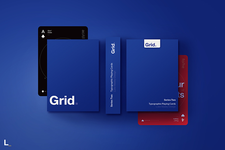
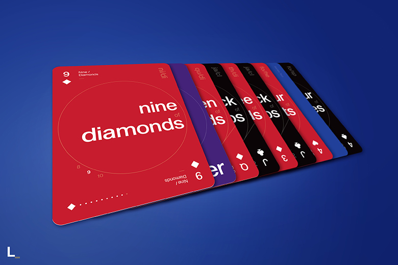
Now on Kickstarter, Grid Series Two playing cards is the second deck in a three part collection based on the design principals of the International Typographic Style, otherwise known as the ‘Swiss Style’ of graphic design. The deck is the brainchild of designer Luke Wadey and focuses on how each face card can be displayed through text. Here are 5 things you should know about the design of Grid Series Two playing cards:
1. Originally started in the 1920s in Germany, the Netherlands and Russia, the ‘Swiss Style’ later developed in Switzerland in the 1950s
It’s main principals are readability and cleanliness, with most creations adopting an asymmetric layout, always based on the use of a grid. These grids, usually made up of hidden columns and rows, are used to align words, numbers, pictures and patterns and so each series in the Grid collection adopts these principals. The works of designers such as Ernst Keller and Josef-Müller Brockmann have been a real inspiration from a graphic point of view.
2. The cards are poker size and printed by USPCC but are far from traditional
Luke told Kardify, “As a graphic designer more than an illustrator, as well as a card collector, I wanted to find a way to combine two of my biggest passions and make a collection of decks which truly stand out from the crowd. I fully appreciate the incredible work of designers of other playing cards currently in the world, I am often drawn to the cards with incredible detail and illustration. However, I see the detail of my decks as ‘less is more’, doing away with traditional pips and instead adopting a typographic format, with each card acting like a miniature poster, with bold words setting the theme rather than illustration and numbers.”
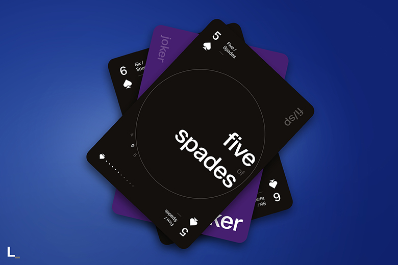
3. Luke tried to keep the design minimal but functional
The back of the card is stripped back to just the name of the deck, with full colour bleed for real impact of colour. “If for example you look at my version of the picture cards, they each have a diagonal line introduced as a minimal graphic, like a poster, but it replicates the diagonal line often from on traditional picture cards where the suit is duplicated and rotated. It’s a small detail but it’s my way of reflection tradition.”
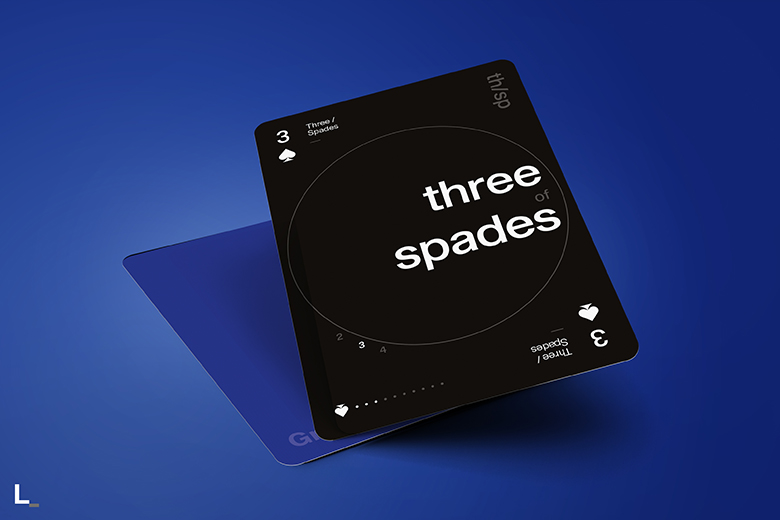
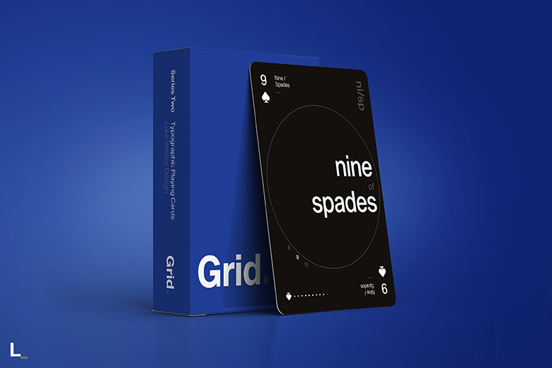
4. Alignment
With Grid Series Two, as well as vertical and horizontal alignment like in Grid Series One, Luke introduced the circle to create a dial effect and explore how different grids can be adopted on playing cards. “Each card has bespoke set of alignment with the numbers and letters that sit on the edge of the circle so that they visually look to have the same alignment, whilst not always sitting in exactly the same place on each card.”
5. The cards can be read and viewed in many different ways with only two being symmetrical
A) The card is written in it’s full name; seven of diamonds.
B) Traditional use in the corners with 7 and the diamond pip.
C) Written with traditional upper and lowercase next to it; Seven / Diamonds.
D) Around the circle there is the current sequence of cards before and after; 6 7 8.
E) Short hand code in the upper right corner; se/di
F) In the lower left corner similar to Grid Series One, the current card is shown by the pip and lit up dots, with ones that don’t apply being faded out for ace to ten, and then switching to diagonal lines for the picture cards; diamond pip with 7 white dots.
Grid Series Two is available now on Kickstarter. Pledge starts at £8 and the deck will be printed by the U.S. Playing Card Co.


