Responsive Ad Slot

Kickstarter: 7 Questions with Alvin Cheung on the SiShou Playing Cards


Born in Hong Kong, Alvin Cheung considers himself pretty ordinary, someone you might just pass by or bump into while wandering around China Town. In Alvin’s earlier days in High School he would spend much of his spare time creating Forum signatures and banners. With his creativity in high gear, Alvin started reading and studying every on-line tutorial he could find on Photo Shop and Illustrator and worked hard to keep improving his design skills.

Alvin decided to head to the United Kingdom to pursue his education and obtain his University degree. He studied Interior Design but his passion was always in graphic design.

“I have been a freelance designer since graduating, because I do not like the idea of working 9-5 for someone else at a fixed income. My dream is to build a company and start from there. I knew from heart it will be a hard journey, but the passion for design gets me motivated.”

Alvin has also been fascinated with card tricks for as long as he can remember and would go to magic shows in his area regularly. With these two passions in hand, and his creativity pushing him forward, Alvin moved forward to bring these to passions together.

“My dream is to be able to produce a deck of cards that will be used around the world to perform magic by all sorts of magicians.”

Alvin has taken that first step in his dream by producing a beautiful deck of playing cards inspired by the ancient four beasts of Chinese mythology. The deck is called SiShou and is currently live on Kickstarter. Alvin took a small break from the campaign to share a little about the project with us.


What inspired the SiShou deck?
Coming from a Chinese background, I looked into the stories of Chinese mythology. I read books, articles and watched videos about it. This inspired me to create the SiShou - Four Beasts deck. With coincidence there are also four suits in a deck. This is how I implemented each beast onto a different suit.

A little history about the myth, each beast is supposed to be a protector for part of the compass, where the Black tortoise is North, Azure dragon is East, Vermillion Bird is South, and White tiger is West. The tuck box was designed based on the placing of each beast. This is also evident in stone carvings dated 2000 years ago.

Asian themes lend themselves well to a vibrant colors, what inspired the color pallet of SiShou?
At first the deck was intended to be in a traditional red. But in order to appeal to a younger audience, I decided to have it in a teal color. The plan is to choose a pallet that appeals to card collectors and yet it does not become too different for regular poker players. 

Could you walk us through your “Creative” process, do you have a routine when designing a deck or individual card?
The creative process always starts at one single point, which is the inspiration. In this project, I took the design elements of actual stone carvings with the beasts on and converted it onto the deck. I then research on my theme and chose to use the traditional Chinese painting style that were printed on pottery for the beast designs.

For my routine when designing, I always close my eyes and imagine a complete design in my head first. This allows me to then draft out a concept that can be developed further. Once I have a draft, I would then refine the design and add details onto it to create a more intricate design. 


Have any changes been made from the original design concept?
There have been a lot of changes from the original design concept. The faces are different, the courts have been changed into beasts rather than having the human design, and the tuck box have been improved.

I also carefully chose the right color for the box to create a nice balance between modern and traditional colors.

When designing this deck, did you have a specific “group” in mind, or was it designed to cater to a wide variety of card aficionados?
At first I wanted to target everyone, but that did not seem to work in the first campaign. Right now I am trying to aim at 3 groups, card collectors, magicians, and poker players. I do not know how well it will be but the thought process of the design have been made to cater all three target audiences.

Can supporters of your project expect any surprises or “Stretch Goals” during this campaign?
I always love to surprise. It took me a year and a half to “surprise” everyone by restarting this project. If the campaign goes well, I would definitely add a few freebies into pledges. As for stretch goals, I would be aiming at including embossed tuck box, color interior, metallic ink, and maybe a different color version.


What are some of your favorite decks or designers?
I must say the one that inspired me to start this project was Tyler of Pedale Design. I really like his style of art with clean lines. I also love the inking technique of Jackson Robinson, a very talented guy.

We want to thank Alvin for his time and consideration. The SiShou deck has an amazing design and unique color pallet which lends to its concept very well. If you haven't already, head on over to the Kickstarter campaign and help Alvin's vision become a reality. You can also follow the progress and keep up on any future projects by following Alvin's Facebook page. We want to with Alvin luck on his project and are looking forward to more of his concepts and designs in the future. 

Kickstarter: 7 Questions with Pocono Modern and the Retro Deck

You may have heard of Pocono Modern, but maybe not realize that Playing Cards aren’t their only creative outlet. Pocono Modern actually has an interestingly creative company, specializing in a wide variety of services. Pocono Modern offers architectural services as well as beautiful home furnishings down to Vintage Art prints. Kraig Kalashian is an architect and designer who is also the owner of the company. Joe Morelli’s background is in sculpture and graphic design, who received his MFA from the University of Massachusetts. It was Kraig’s idea to produce a midcentury modern deck of playing cards and in May of 2014 the Pocono Modern Playing Cards were launched on Kickstarter and found great success, not only reaching its funding goal, but exceeding it.

“Kraig and I simply love playing cards and we love midcentury modern graphic design. We’ve been wanting to create fresh, well-designed and functional decks of cards for some time, and are so pleased with all of the feedback we’ve been getting for these.”

With that success, Pocono Modern brings its second deck to Kickstarter, The Retro Deck. Inspired by the simplicity and elegance of midcentury modern design, The Retro Deck is available in two colors and features some truly striking design and graphic elements. The project is currently live on Kickstarter and will be available until November 3rd. Kickstarter campaigns are always hectic, but Joe Morelli was nice enough to take a small break from the campaign and answer a few questions about The Retro Deck and its development.


Did the experience with the Pocono deck give you a better vision of how to approach the Retro Deck?
We learned so much from the design of previous deck. For both the Woodland Deck and the Retro Deck, we looked at hundreds of historical and current designs, but no amount of research can beat the dialogue that happens from a Kickstarter campaign between the card enthusiasts and the designers. Particularly, aspects of functionality and playability were the first things we considered with this new deck.

Do you have a routine when coming up with a design concept?
Aside from hours of research, we have stacks of card mockups that were printed and cut at full-scale, held in our hands, fanned out, etc. Since a playing card is as much an object as a design composition, it’s important to get a feel for the scale and how each card relates to another.

What was the inspiration and motivation behind the concept of the Retro Deck?
Where the Woodland Deck feels more bright and playful, this new Retro Deck is darker, relatively minimal, and more sleek and mid-century modern. We wanted to explore the clean, hard geometry of the era a bit further and create a deck that was just as bold, yet more elegant. Sticking to people for the court cards in this deck allowed us to get even deeper into playing card history and lore. It was a lot of fun reinterpreting certain details that have now been in playing cards for decades, and in some cases, centuries.

Most designers get very excited about an idea, what excites you about the Retro Deck?
Kraig and I both are diehard fans of midcentury modern graphic and industrial design, and so any opportunity we have to design a product that harkens back to the timelessness and elegance of that era is very exciting. Also, the challenge of balancing the design aesthetic with the need for functionality is a fun, indeed.

Was it challenging to maintain some of the “Standard” deck features with the design style of the Retro Deck?
We wanted the pips to be vertical and elegant, and so it was a challenge to arrange them at an appropriate scale on the number cards. Also, with the colored field on the faces of the cards, it’s very important to keep a good amount of contrast with the indices. Precise Pantone colors are being selected for this purpose, as opposed to a CMYK print.

Could you tell us about the two variations available for the Retro deck?
In the end, we liked both the Light version of the Deck and the dark too much to choose any one, and felt that this design would best be presented as a set. There are merits to both versions.


What are some of your favorite decks or designers?
Kraig and I both have our favorites, and there are so many amazing designs that we’ve both started collecting. Currently we’re loving the Federal 52 Deck, The Boardwalk deck, and the Draplin Design co. "Thick Lines” deck.

We want to thank Joe and Pocono Modern for sharing some information and their time, if you haven’t checked out The Reto Deck, you can check it out on Kickstarter where the project is currently LIVE! You can also visit Pocono Moderns website and check out all their other wonderful products and services.

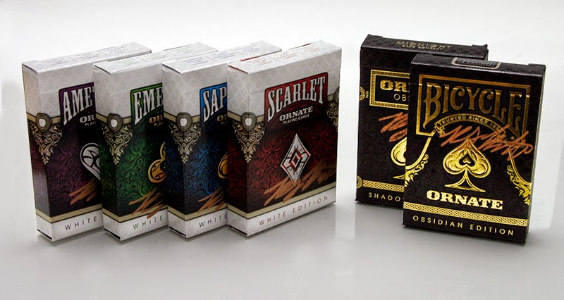
Contest UPDATE: Win a complete set of White Ornates!


How would you like to win a complete set of White Ornate's? 

But not just any set, but a complete set of SIGNED White Ornate's! Signed by non other than Randy Butterfield the designer of this beautiful deck. The set will included one of each un-branded decks in Scarlet, Sapphire, Amethyst, and Emerald. Along with one of each Obsidian versions, Bicycle Branded and Un-Branded, all signed in metallic gold ink, all brought to you from Randy and House of Playing Cards.

Randy Butterfield has brought the playing card community some truly beautiful and unique deck designs and concepts, not to mention his current, and first solo project Draconian, which is now available on Kickstarter!


So, how do you win this awesome one of a kind package? It's relatively simple...

As I mentioned earlier, Randy Butterfield has created some amazing decks, all you need to do is name all the decks that Randy has created. Not very hard?!

How to qualify to WIN:
  • Entries must be received by 12am CDT on October 23rd, 2014
  • Everyone who submits the correct answers will automatically be added to the random drawing. 

The Rules:

  • You must name all decks to qualify for the drawing
  • You must be a backer of the Draconian deck at the time the campaign closes
  • Email your list of Randy's decks to anthony@kardify.com, the subject should read "Ornate6Kdfy"
  • 1 (One) winner will be chosen from a random drawing on October 25th, 2014.

Hints:
  • There are 25 decks, this includes color and branding variations.
  • The Draconian's are part of the list (Free Answer)

Kardify would like to thank Randy Butterfield and HOPC for their generosity in supplying us with such a unique and one of a kind prize foe one lucky winner!

You can keep up with Randy's work and future projects by following his company site Midnight Cards on Facebook. You can also visit HOPC website for a huge selection of custom playing cards and accessories!


Thanks everyone and GOOD LUCK!


10/25/2014: And the WINNER is....

Sky Shadowski!! Congratulations Sky!

We would like to thank everyone who participated and most of all Randy Butterfield and HOPC for the great and unique Prize!


NOTE:
The winner was chosen at random from a pool of entries.


Kickstarter: Silver Arrow Playing Cards


Silver Arrows will be one of the nicest playing card decks you own at an unbeatable price featuring full embossed tuck cases in premium metallic thread paper stock, silver metallic foil, and printing on both inside and outside of the tuck! The cards are also printed by the awesome guys at Expert Playing Card Co. with embossed finish and Metallic Silver Ink. Unbelievable value!

Available now on Kickstarter!


[Final Update]

[Update #3]

[Update #2]


[Update #1]


[Original Drawing]

© all rights reserved
Kardify 2013