Responsive Ad Slot

Showing posts with label collection. Show all posts

Collections: Cobra Playing Cards

Meticulously crafted by our friends at JPGames, the eye-catching Cobra’s are illustrated by the talented Rick Davidson.

This custom deck features easily recognizable face cards standard traditional faces, and indices. To give It a touch of luxury, stunning gold metallic inks were used on the courts and card backs.

The deck is neatly packaged in a gorgeous minimalist burgundy tuck box complete with gold foil COBRA logo and detailing.

The deck has been printed using Cartamundi‘s durable B9 Cardistry stock which has a lovely soft feel and finish. Available now from JP Games for £10.

Images by MadAboutCards (Instagram: @madaboutcards) provided by JP Games Ltd.

Collections: Eye Of The Ocean Playing Cards

The Quartermaster Edition is a pre-release for The Eye of the Ocean Kickstarter project last year. Designer Lorenzo Gaggiotti printed the deck to check the cards to see how they work together and what needed to be tweaked. At the same time, it is part of Stockholm17’s Patreon 2020 annual reward (around 100 already shipped).


A limited number was also made available on the Eye of the Ocean Kickstarter. The tuck and back design are different from the main Eye of the Ocean decks. Tweaks and changes were made to the faces, as well. Only 300 units of Quartermaster were printed in total, and all of them have the signature and the number.

Images by the talented Richard Arturo (Instagram: @richardarturo47)

Collections: Requiem Playing Cards


Requiem Playing Cards is created by Sweden based Italian artist/designer Lorenzo Gaggiotti in 2014. This unique set of playing cards is unlike any other... it is gory and dark yet beautiful in a weird way. Requiem is custom designed and features darkness and pain as a theme. The illustrations for the Courts, Jokers and Aces are very dark. The suits are made out of broken Hearts, Clubs with thorns, cracked Diamonds and dry leaves as Spades. Pips are unique and the gold metallic ink on this blood red deck gives it a touch of elegance


Collections: Rome by Midnight Cards


Historical themed decks are kind of hit or miss for me. I’m not a huge fan of decks that end up being a documentary spread over 52 tiny pages with stock photographs. I am a fan though of those artists and designers who bring their own interpretation and vision of a certain period or historical figure.

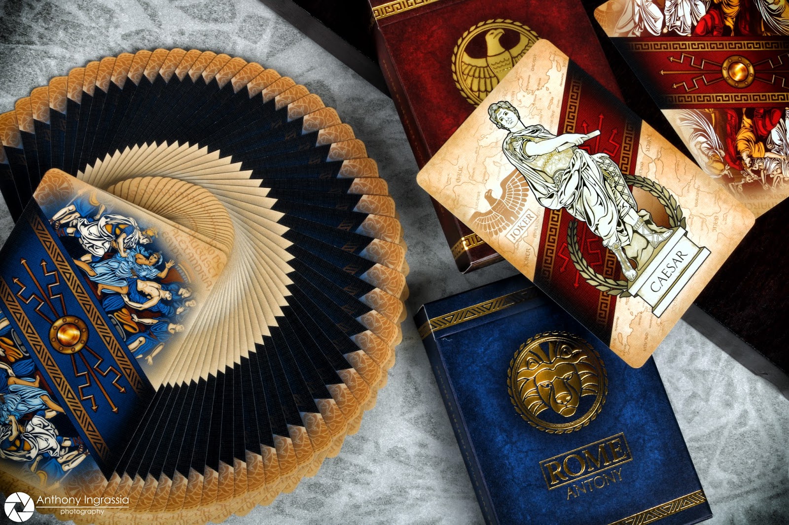
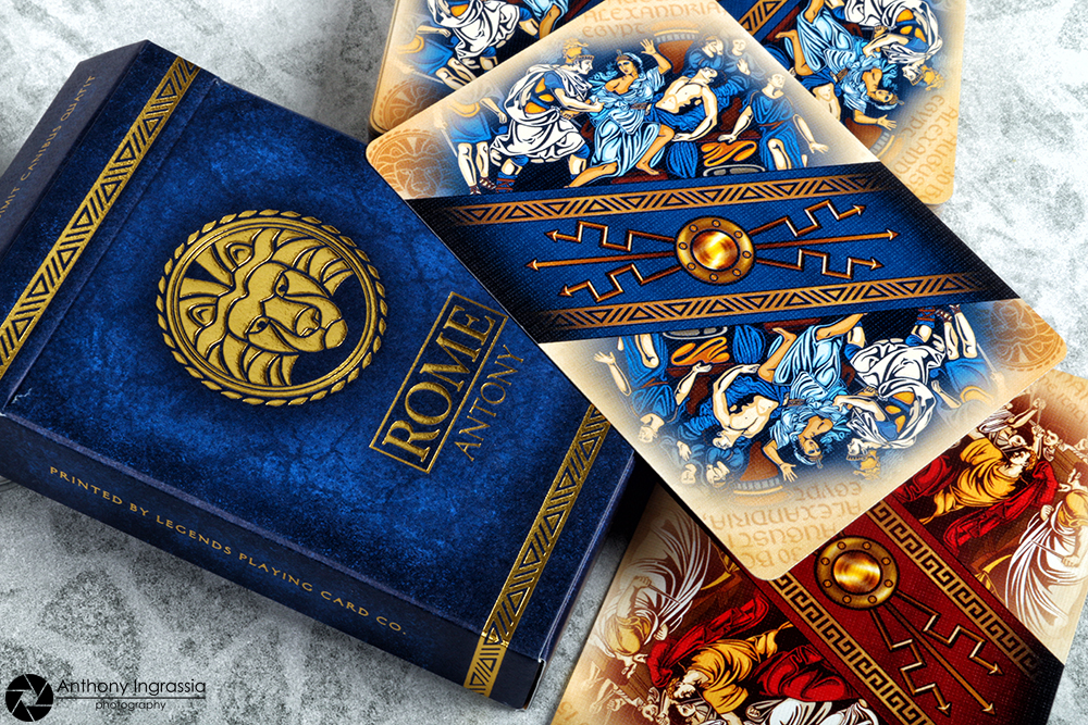
Rome by Randy Butterfield and Midnight Cards does a great job capturing the look and feel of Roman times with vibrant colors and beautiful detail. The Rome playing cards are offered in two versions, the Antony deck in blue and the Caesar deck in red. Both decks feature 100% hand drawn custom artwork in both the tuck case and playing cards.


The base color of both tuck cases has a nice gradient effect on a textured background lending itself well to the theme. Each tuck has beautiful gold foil scroll work that wraps around the tuck on the top and bottom as well as a nice vertical banner on the back side of each with the initials SPQR, which are the Latin initials of what loosely translates to “The Senate and People of Rome”. Both tuck cases also feature a very cool map of ancient Europe printed across the entire interior of the tuck box. From there each version takes on a bit of its own uniqueness.


The Blue Antony deck features a gold foiled Lions head emblem on the front of the tuck as well as the “version“ name under the deck name. The top flap of the Antony deck also features a quote by Mark Antony “Tarum et clama dimit canibus quatit”, “Cry havoc and let slip the dogs of war”. The Red Caesar deck features a gold foiled Eagle emblem on the front of the tuck, again, indicating the “version” name under the word Rome. The Caesar deck has two quotes on the tuck flap, “Alea iacta est”, “The die is cast” a Latin phrase attributed by Suetonius to Julius Caesar on January 10, 49 BC as he led his army across the Rubicon river in Northern Italy. And “Veni vidi vici”, "I came; I saw; I conquered" is a Latin phrase popularly attributed to Julius Caesar, the phrase is used to refer to a swift, conclusive victory.


The playing cards have a two-way custom court set depicting the men and women of the Roman Republic such as Marcus Brutus and Cleopatra. The courts are set over a diagonal banner with line work appropriate to the period and a nice gradient to black to the card edge, which is a bigger deal than you think because it eliminates the visual key of identifying the suite colors by looking at the edge of the card. The face cards feature the same diagonal banner, now fully exposed, revealing a gold roman styled shield on the middle of the banner.

The pips and indices are very reminiscent of Randy’s past pip design, but tweaked to match the design concept of the Rome deck. The pips are placed on either side of the banner representing opposing shields. The banners are also matched to the red and black suites respectively, the red having a red banner, while the black suites feature a blue banner. The Aces in the deck, including the Ace of Spades, are all oversized pips surrounded by a laurel wreath. Each also has its own unique tag. The AoS says Rome, the AoD, SPQR. The AoH reads “LEG XIII” referring to Julius Caesar's 13th Twin Legion, while the AoS refers to Mark Antony's Cyrenean Third Legion with “LEG III”. The custom Jokers depict both Antony and Caesar as statues upon pedestals engraved with their respective names, a laurel wreath rising from around the pedestal and an eagle icon on the upper left side with a panel reading “Joker” complete the layout.


All the card backgrounds, courts, face cards and Jokers, feature the same map of ancient Europe seen on the inside of the tuck case, but has numerous little details such as the respective number of the number card in roman numerals on the map along with other cool little elements and other unique details you will have fun tracking down.


The back design, while at first glance looks like just a color swap, are unique. Both feature the same banner design found on the card faces but the banners are now surrounded by scenes depicting the deaths of both Julius Caesar and Mark Antony with a subtle fade on the card edge. The cards were printed by the Legends Playing Card Co. on their Classic finish, one of my all-time favorites.


I really like the Rome decks, the bold color, look and design perfectly work with the concept behind the design. If you weren’t following the Kickstarter campaign you’ll be really impressed with all the small details on this projects design, again, at first glance many see a basic color swap and not much else, but there is so much more to the Rome deck than meets the eye it’s crazy. I for one was really impressed with all the small details hidden throughout the decks. The project did feature a nice little “Toga” sleeve for the decks as a limited run of only 600… a perfect little touch in my opinion. If you’re not familiar with the project I strongly recommend considering it, if you’re a fan of ancient history the desks will surely please and if you’re a collector, the unique elements of these decks should impress you and surely open a spot in your collection.


For more information on Randy and Midnight Cards you can follow him on his Facebook page and you can find out more on all the details that went into this project by taking a visit to the Kickstarter project page. You can also visit the Midnight Cards shop and pick up a few of these beautiful decks. 


The Collection segment is produced by Anthony Ingrassia of Kardify. No part of this article, images or video can be reproduced without written permission from the author and Kardify.com. 

Collections: Royal Bee Premium Back No.168


The Classic Bee deck, is there anyone who doesn't recognize the name or the all to familiar logo, probably not. A staple in the Playing Card Industry, the Bee stock and finish is second to none. Over the years there have been small variations of the Bee deck, but most recently, there have been a few exclusive releases by The United States Playing Card Co. to its Asian market in the form of a more custom release, but holding itself pretty close to the original Bee design.

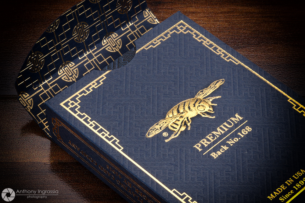
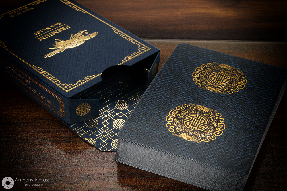
Recently USPC released a new homage to the classic deck, the Royal Bee Premium Back No. 168. Designed by Fin Studio's, this version pulls it's inspiration directly from Asian culture with the subtle woven look of the soft tuck to the design and line work that cover both the front, back and interior of the tuck case. A Bee deck wouldn't be complete without it's Iconic insect hovering around the circular design on the front of the deck and also makes an appearance on the back, beautifully framed in gold foil lines and hovering over the text "Premium Back No. 168"


As  mentioned, the tuck is adorned with gold foil that just jumps off the dark blue stock of the tuck case, the beautiful pattern and design carry into the tuck's interior to give it a nice touch and visual appeal. The usual ad copy can be found on the tucks sides, bottom and top, all in brilliant gold foil.


The decks design, line work and look continue onto the back design. Keeping the dark blue palette, the back design features the same woven pattern from the tuck, and also features a tandem variation of the circular pattern from the front of the tuck utilizing USPC's new Metalluxe Technology bringing a bit more shine to the dark backdrop. The gold foiling stands out really well and there is no hint of the foiled design element carrying through to the face of the cards.

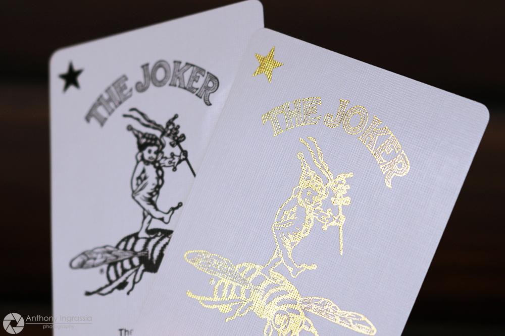
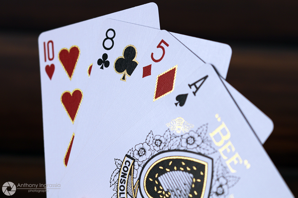
The deck has standard courts, the familiar Ace of Spades and of course my favorite Bee riding Joker. The added eye candy to this "Standard" offering is the embellishment of 55 of the 56 cards with gold foil. The Ace of Spades gets some nice gold outlining to the design as well as a fully foiled logo. The gold against the black line work pops in amazing contrast.


The Jokers split the foil duties between them, with one standard black ink Joker and the other presented completely in gold foil. To round out the bling factor, the courts get a really nice dose of gold framing themselves accentuating the line work of the classic court design, lines and clothing elements. Even the pips get a treatment of gold framing making them pop when the light hits them just right. To ensure a bit of standard playability, the indices remain untouched.


If you're a fan of Bee Decks like I am, the Premium Back No. 168 won't disappoint you in any way but one, the price and availability. You'll need to go the 3rd party route to track these down and they will command a premium price. If that price is reasonable is a choice we all need to make on our own. If you do take the plunge, I recommend opening this beautiful revamped classic and enjoying the work that was put into it. Too often we as collectors get caught up in the chore of keeping pristine sealed decks, but honestly, there is no bigger joy than to appreciate and get a bit excited seeing a desk in its entirety, outside and in. I don't often tell readers to part with there hard earned cash on my recommendation, but this is one of those times I would encourage most collectors to pick up at least one and share it with as many friends as you can. Premium it is, and its subtle, yet effective, "Shine" makes it a nice standout.

The Collection segment is produced by Anthony Ingrassia of Kardify. No part of this article, images or video can be reproduced without written permission from the author and Kardify.com.

Collections: Anubis & Osiris Luxury Playing Cards by Steve Minty


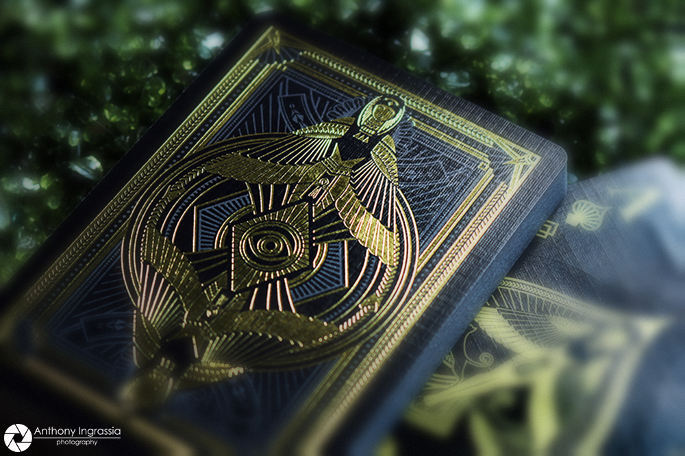
With so many choices and so many new projects popping up in the Playing Card community, it seems like the burning challenge for designers and artists is about building a better mouse trap. While I strongly believe that originality and creativity is still the key, many still put a lot of emphasis on something unique, different and that has never been done before. But there are those themes that have been around a while with varying successes and failures. Maybe not as persistent as Zombie decks, but Egyptian themed decks have been done numerous times, much like the Zombie decks though, we haven’t really seen an Egyptian themed deck taken to the next level, as it were.

That, I’m happy to report has changed for the Egyptian theme…..we can only hold our breath on the Zombie decks. Just a few months ago I received my Egyptian tandem from Steve Minty who launched a Kickstarter featuring two decks, the Osiris and the Anubis Luxury Playing Cards. I’ll be the first to admit that with any Kickstarter project you have to take the creators concept with a grain of salt, what the creator see’s in his mind’s eye sometimes falls a bit short of expectation. Not that the finished product is bad, but I’ve heard from creators themselves that it fell a bit short of their expectations. When I saw the Anubis and Osiris project I truly liked the design, the color palette’s being used and all the intricate line work and iconic elements of Egyptian culture that were being used throughout the two decks.


But what I received in the mail was just amazing. It doesn’t happen often that I’m really blown away by a deck the minute I take it out of its shipping package, but this was one of those times. While Steve described and detailed the decks perfectly on the campaign, including the gold foiling that was to be included on the back designs, its one thing to describe something, something completely different to see it in your hands. 


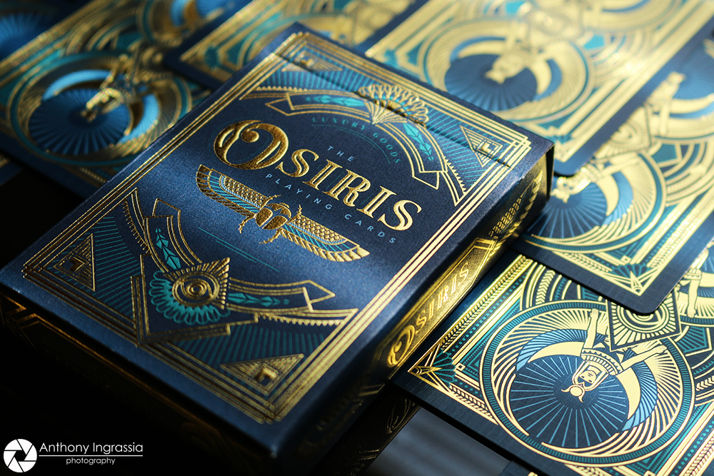
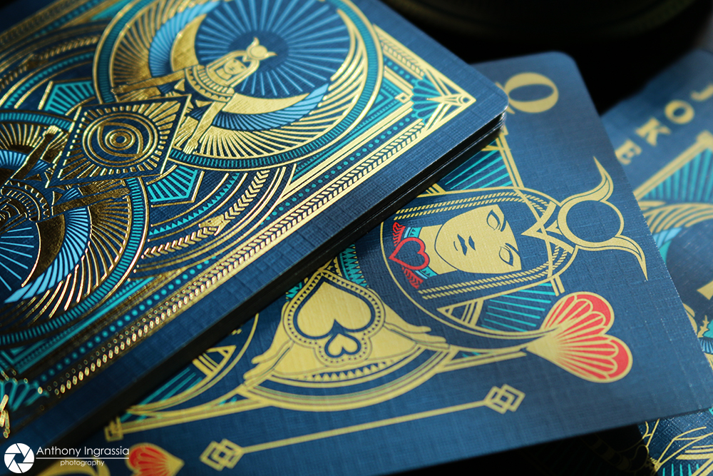
Osiris and Anubis feature two unique back designs, a beautiful set of custom court cards as well as custom spot cards, Ace of Spades and Jokers. The details across both decks are stunning and the color palettes are perfectly used on this theme. Both decks are presented in nice heavy stock tuck box, both featuring similar designs on the front, except the name of course, and on the back you have mirror versions of the actual back design. The detailed line work continues over the tuck flap and the decks are sealed with a striking custom “Stamp” like seal. Both decks have eye popping gold foil accents and a subtle embossing that makes them feel as luxurious as they look. The Anubis deck has an earthy color palette using browns and blacks as base colors and gold details that just pop off the cards. The hearts and diamonds do retain some red details in the pips on the spot cards as well as the royalty.   


The Osiris deck uses more of a bluish/turquoise color palette, again using brighter teal and gold colors to make the details jump off the cards. Just as the Anubis deck, the Osiris deck also retains that splash of red on the hearts and diamonds. While foil stamping card backs is becoming more readily seen in recent times, I have to say that the way it’s been presented on these two decks is nothing short of perfect. The detail coupled with the standard ink line work in the background is just stellar. It’s so amazing that honestly words can hardly do the decks justice. 

In a world of collectors who want to keep their decks sealed, I implore you, if you own either of these decks and haven’t opened them you’re really missing out on the overall beauty of these decks. And if you don’t own either, for the $18.00 price tag you couldn’t ask for more “Bang for your buck”. Steve did an amazing job with this project. The end result is just stunning, so much so I wonder if he even anticipated how well this Egyptian tandem turned out. Osiris and Anubis are most certainly on my top decks of 2016, pick a couple of these up, open them and enjoy them, you won’t regret it. 

You can keep up to date with everything Steve Minty is working on by following him on Facebook as well as his main site, which also features his store and all his wonderful works, past and present. 


The Collection segment is produced by Anthony Ingrassia of Kardify. No part of this article, images or video can be reproduced without written permission from the author and Kardify.com. 

Collections: Boardwalk Papers by The Blue Crown


Inspired by the Carnival atmosphere of the classic American Boardwalk, Boardwalk Papers by The Blue Crown did a truly stellar job capturing the "Atmosphere" of Coney Island and all of those other wonderful sea side summer walk ways that feature entertainment, food and fun.


The color palette used on this deck is a perfect fit to the inspiration, the earthy tuck paper color with it's beautiful typography and intricate line work just pop off the surface with some nice embossing and gold foil accents. The interior design is awesome, going with warmer colors and staying away from any stark white, really helps the look and feel of the presentation of the deck. The matching striped seal just finish the package really well.


The back design is spot on with it's mirrored ferris wheel design and continuing the intricate line work. The back also features a well balanced and designed frame to tie all the design elements together. The fan like design in the corners, which can also be a carry over of the ferris wheel design anchors not only the look but the overall concept of Boardwalk Papers.


Boardwalk Papers also feature a custom Ace of Spades and a set of Jokers, all of which pull heavily on typography. The pips and court cards remain pretty much standard in the deck, which should please those looking for familiarity in their playing cards, but have a bit more "Eye Candy" than a completely standard deck.


For me the biggest attraction to Boardwalk Papers is the perfect presentation of the concept. Some decks have flashes of what their trying to be or depict, but Boardwalk Papers truly nails what it's about in a really well thought out deck. At first glance there is no need to explain the deck, you know exactly what it's going for. Printed by the Expert Playing Card Co. which continues to open possibilities to designers and artists to make the end result a perfect match to the vision they had in mind. Still available in the market for about $10.00 USD, Boardwalk Papers is a really nice deck that shows some attention was spent on the project as a whole and not just a unique back design. Worth picking up as an addition to your collection as well as a unique usable deck of playing cards.


The Collection segment is produced by Anthony Ingrassia of Kardify. No part of this article, images or video can be reproduced without written permission from the author and Kardify.com. 

Collections: Antler by Dan and Dave


Released by Dan and Dave, Antler is a beautifully earthy deck and the blurb on the Dan and Dave web site is a spot on introduction to the inspiration behind this deck.
Born from the wild forests, rolling hills, and snow-capped mountains of Northern California, the Antler Playing Cards embody the majestic beauty of the great outdoors. 

The decks are available in four versions, the simple variation is the two color choices, Hunter Green and Deep Maroon. From there, the two color variation are offered in a Standard and Limited Edition version. The tuck for both versions is for the most part identical, both have a nice subtle embossing on a nice earth tone color palette. The only real difference from the outside is a very nice "Stamp" like perforated seal with the Dan and Dave logo.


The images in this piece are of the Limited Edition Deep Maroon deck, the cards themselves in each version are again pretty much the same with the exception of the back designs color palette. The Limited Edition version of each color is presented with a full color back design, while the Standard version is a monochromatic version of each signature color. The back design features mirrored "Bucks" in a familiar "Rider Back" design, with an intricate floral scroll work that breaks the border just a bit here and there. The Ace of Spades is perfectly designed for this deck, with a Buck head featuring some beautifully ornate design work around his antlers. The Jokers come in two colors, the colors of each deck, and have some really nice typography, script and floral accent.


The face cards, as in many playing cards offered from D&D, are color variation of standard-ish and familiar court designs. Again, the re-color blends in with the deck design and offers familiarity as well as usability. You can't go wrong with either version here, these would be the perfect outdoor traveling companion as well as game night my a fireplace. They definitely set the mood in the right surrounding. The cards handle really well, you can always be sure of that with any deck coming from D&D and if your on the fence on which version you prefer, the Limited Editions do come hand-wrapped in parchment before being placed in the tuck. I'll admit, while it has no real function, it's a beautiful touch to the decks presentation.


Both versions of the Antler decks are available on the D&D website, the Standard Editions are priced at $7.95 while the Limited Editions go for $11.95, neither of which is beyond most budgets. Beautiful work, awesome concept and presentation with an affordable price........what more can you ask for.

The Collection segment is produced by Anthony Ingrassia of Kardify. No part of this article, images or video can be reproduced without written permission from the author and Kardify.com. 

Collections: Chancellor by Encarded Playing Cards


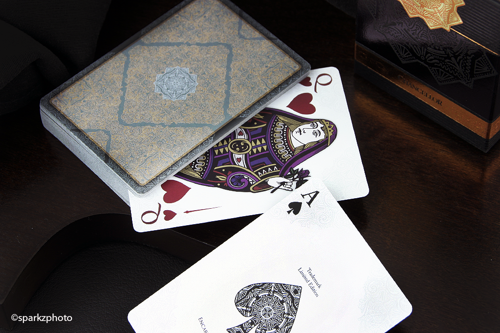
The second deck in the Encarded Signature Series, Chancellor, is the perfect follow up to the stunning series' launch deck Zenith. Chancellor took the bar that Zenith set and surpassed it with an elegant, strikingly original concept. Chancellor is just a beautiful piece of work top to bottom. The amazing tuck is only the "Cover" to this book and what lies within is just as impressive.

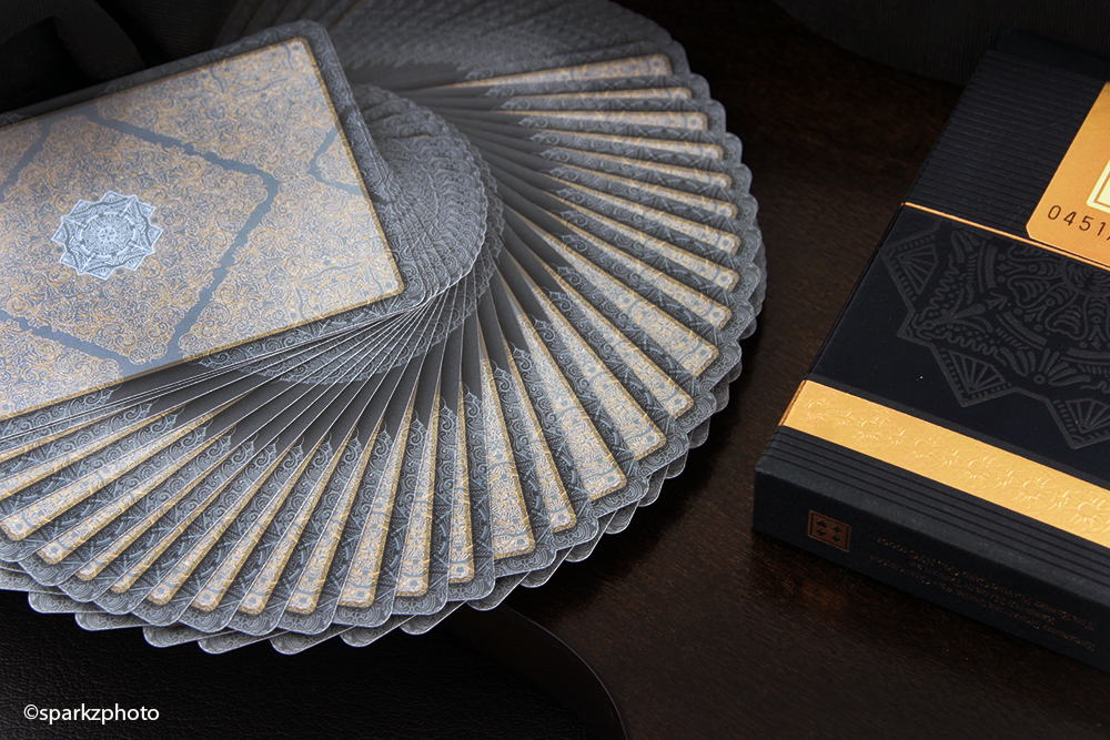
The tuck case for Chancellor is just stunning. A nice heavy stock fits the bill for this strong presentation. Featuring embossing, copper foil, black foil, and a seal like no other, one would think just by reading that list that this deck would be a bit much, bordering on gaudy. But the creative way all those elements come together on this deck is flawless. Chancellor's tuck also features a brilliant seal showcasing the "Main" image from the tuck case, accented by a faux Paul Carpenter Signature and the decks serial number and the Encarded logo on the back side.


The cards themselves are just as stunning as the box that houses them. Again, Paul Carpenter shows his attention to the smallest of details in the subtle fashion that's been part of his projects for a while. The faces have a beautiful, but subdued pattern in each corner, just strong enough to be noticed yet not distracting. Printed on Expert Playing Card Co,'s Master Finish, the cards have a nice snap and spring to them and handled exceptionally well. The Ace of Spades has an intricate design that's pulled from the tucks main design element. The intricate line work is also shared in the full sized pips of the other Aces in the deck. The Jokers depict a portrayal of a "Chancellor" like character, one designed in black and the other in a dark red.


If the tuck case wasn't enough, the back design on Chancellors is just amazing. Featuring four metallic inks, the line detail is just inspiring. The back design also has a truly amazing "Shadow Border" that creates the illusion of depth and dimension that has to be seen to be appreciated. The Court cards utilize a standard mirror layout, but with great detail to the wardrobe as well as being presented in full color giving them a more worldly European look and feel.


As mentioned Chancellor was printed by The Expert Playing Card Co. on it's Master Finish, only 1000 decks were produced and once the sale went live, they didn't last very long. I find it hard to write about decks sometimes because I feel like I'm just rambling on about what a great deck it is.

There are those decks we add to our collections that are well designed, well thought out and deserve to be there. Then there are some decks that become cornerstones, I have no problem giving Chancellor that label in my collection. Paul Carpenters talent and hard work are just mind blowing and his constant move into elements and things that haven't been done before make him on my Favorite Designers. Chancellor's selling price in the aftermarket has already swelled a bit from its launch price, but I would put this one on your radar at a price that your budget will allow and don't think twice about pulling the trigger if the opportunity presents itself, you won't be sorry.

So for anything that I couldn't put into words, I'll invite you to take a really good look at the images and everything that Chancellor has to offer. Absolutely stellar work by Encarded and Paul Carpenter.


 The Collection segment is produced by Anthony Ingrassia of Kardify. No part of this article, images or video can be reproduced without written permission from the author and Kardify.com. 
© all rights reserved
Kardify 2013