Responsive Ad Slot

Showing posts sorted by relevance for query Dot. Sort by date Show all posts

Cardistry: ANYONE To Release Black Dot Playing Cards


The team at Anyone will be releasing the Black Dot Playing Cards on 12th February, 19:00 CET online. The Black Dot is the sequel to the highly successful Red Dot Playing Cards, released back in 2017. Red Dot won the Sybil Award at Cardistry-Con 2018 in Hong Kong for 'Cardistry Deck of the Year'.

The new deck features an off-centered black dot on a solid grey colorway back. The deck was never released for individual sale and only released in limited quantities with every brick of Checkerboard by Anyone. Check out the performance video by Anyone featuring the Black Dot Playing Cards. The video was filmed in Tokyo, Japan.


[post_ad]

Detailed Look: Black Dot Playing Cards


The team at Anyone released Black Dot Playing Cards mid-February 2020 and they were quickly sold out. The Black Dot is the follow-up to the highly successful Red Dot Playing Cards, released back in 2017. Initially, Black Dot was never released for individual sale and only released in limited quantities with every brick of Checkerboard by Anyone. The deck features an off-centered black dot on a solid grey colorway back with standard face cards with the exception of the Ace of Spades and Jokers.

[post_ad]


[post_ad]



[post_ad]


[post_ad]

Special Edition White Dot Playing Cards by ANYONE

ANYONE first introduced the Red Dot deck in 2017, a release that quickly became iconic within the cardistry community. Today, the Dot series playing cards evolve once again with the arrival of the Special Edition White Dot Deck, a collab Davide Maccari.

Staying true to ANYONE’s recent minimalist design trend, this edition features hot foil printing in pure white on white, paired with subtle embossing that creates a unique interplay of light, shadow, and texture. The result is a deck that feels sleek, refined, and distinctly modern.

Only 500 decks were produced, priced at $28 each, and they sold out immediately upon release.

Dealersgrip and ANYONE Reveals New Decks


Cardistry groups Dealersgrip, and ANYONE have just revealed their new upcoming decks and both are truly unique in their own way.

ENTIRE

Dealersgrip's new deck, ENTIRE (pictured above) continues the abstract art series with an oval-shaped one-way card back. The face cards are looks almost standard with the exception of the jokers and Ace of Spades. From the teaser video (below), the court seems to have an oval-shaped design similar to the card backs. The tuck box features 4 small oval die-cut windows giving a view of the card back design within. This reminds me of Thanos' infinity gauntlet. The deck will be available online on 17th September.


DOT/CAP SPLIT RE-EDITION


On the same day, ANYONE has teased an intriguing image of a new deck series potentially called Anyone Space with the caption 'A1 2017 and 2019 playing cards study'. This looks like a new deck with the one-way split card back design of their Dot and Cap playing cards. Anyone is calling them the DOT/CAP SPLIT RE-EDITION. This has massive potential for future possibilities with multiple combinations of their previously released deck designs. This design will make for truly cool spreads, fans, and displays.

[post_ad]


DIVA VS Palette Playing Cards


Welcome to our first VS article by @decknowledgy. In this article, we will find out more about these two unique decks with seemingly similar designs but with an unexpected story about brotherhood.

Alex Matencio, the designer of DIVA Playing Cards, launched the deck on Kickstarter in 2018. Prior to the launch, he occasionally came across the Palette deck by ITS on Instagram and decided to push the reveal one day earlier, fearing that they would be called out for copying the artwork.

The two teams eventually got to know each other, one from France and the other from South Korea, and they realized that they had the similar vision to incorporate the Bauhaus art style into a deck of cards. Coincidentally, they even planned to launch their decks around the same time in 2018. What were the odds? “In Bauhaus We Trust, I guess?” said Alex.


DIVA
By definition, “diva” in Italian and Latin is the term for “goddess.” In English, it represents “the leading female singer in an opera” as well as “one who demands that attention be paid to his or her needs.” DIVA Playing Cards does just about everything listed above, no doubt.

The deck fully adopts the Bauhaus art style, giving the tuck a bright, flashy, and colorful demeanor. The back of the tuck features a feathery spread of all color schemes, elegant in the most audacious way. The feathery emblem repeats itself on a smaller scale on the tongue flap. The contrast between the complexity of the front with the subtleness of the back lends the tuck a very balanced smoothness to the eye. The ad copy on the bottom is listed as a chart, well-placed and cleans up the traditionally unappealing ad copy of other decks. Hence, the ad copy becomes a part of the overall aesthetics.


The cards themselves are smooth and buttery with the Cartamundi’s famous B9 finish. Design-wise, all aces consist of color patches, but the ace of spades stands out due to its full deployment of the blues, red, yellow, and gray. The aces of the clubs, diamonds, and hearts are reduced to blue, red, and white. The court cards are designed to be abstract outlines of kings, queens, and jacks. A single suit index is placed right above their heads. All kings, queens, jacks have the same design from suit to suit, but the color patterns show the difference between them. As for the pip design, I especially love the diamond which is rounded like an oval on the left and right. After all, the overall design of the artwork is always sharp on one edge but rounded on the others. Thus, the diamonds are a great touch to add to the consistency.

The back design is a colorful two-way design that pops while performing spreads and fans. The right-to-left thumb fan is especially catchy with all four colorways contrasting sharply from top to bottom: navy blue→yellow→red→sky blue. It is a perfect deck for display and flourishing.


Palette
There are two types of playing card designs that I love especially: fully custom art- oriented decks and semi-custom bold colored cardistry decks. The Palette Playing Cards is definitely the latter, and the key to their perfection is bold colors with clean, distinguishable borders that do not mess with readability. Oftentimes, cardistry deck designs venture too far into the WTF realm… And that’s why this deck is exceptional within that category. The whole theme of the deck is asymmetrical through abstraction.

The ace of spades consists of the four color patches that are used throughout, and through precision, forming a slanted spade leaning towards the abstract but still gentle, soothing, and readable. The stem of the spade is a simple dot, adding to the cleanness of the design. The same dot could be found on the top and bottom borders of the back design, bringing a focus to the seemingly random array of color patches. As much as the back consists of striped, squared, quarter circle, and triangular shapes, the checkerboard 4x5 composition makes it catchy, attractive, and pleasing. Finally, two thick black bands on the top and bottom encase this scene of abstract messiness between them, finished with a perfectly centered white dot on the band as mentioned before.


Red suits with dark wine red lend substance to the overall aesthetic, making the deck feel luxurious yet playful, not superficial and floaty. The deck handles perfectly, perfect for cardistry of course, but the gameplay capability is spot-on with the standard face layouts. The asymmetrical back design lends the deck the capability to perform four different thumb fans in the four orientations.

Overall
Both DIVA and Palette are great decks for cardistry given the flashy color patches in the display. In terms of the colorway, DIVA presents itself as the bright, playground type of spirit while Palette is subtler with the darker shades. What Palette lacks in brightness it redeems with the upper hand in gameplay, where the standard faces are definitely more readable and custom for players. In terms of fans, both decks have their advantages: DIVA bombards you with its array of colors although it only has two difference fans (left to right/right to left) while Palette boasts of variety with four fans although the colors are toned down a bit.


There is no win or lose in this competition as both decks stand well beside (not against) one another. After all, the Bauhaus blood and genes run deep within these two decks as if they were meant as a set even when created by different teams in different countries. In Bauhaus they trust, and therefore, they bond in brotherhood in the making.


[post_ad]

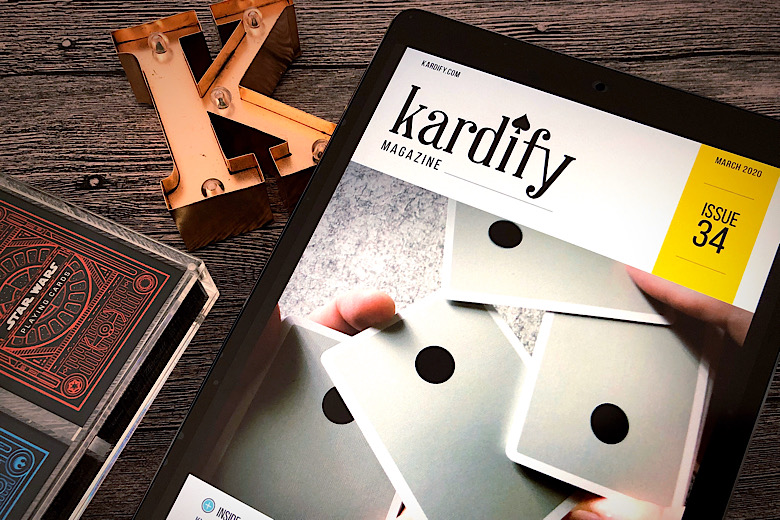
Issue #34 of Kardify Magazine is Here!


Issue #34 of Kardify Magazine is now on Patreon! Patrons who pledged $3 or more on will be able to download the latest issue from our Patreon page. Issue #34 compiles selected articles published from mid-February to mid-March. Deck images, articles, and news to keep you informed and up-to-date with the latest playing card news, releases, and previews. If you love playing cards, you will love Kardify Magazine! 

Also, don't forget to check out our other cool reward tiers on Patreon! The new tiers include monthly desktop and smartphone wallpapers, mystery deck shipped to you every 4 months of ongoing contribution, social media shout-outs, and multiple sponsorship tiers! Check it out!

Funds received from the magazine will help us keep the site running and growing, and bringing new quality content to you. Our aim is to support designers by backing on crowd-funded projects and supporting magic and playing cards retailers with their new releases. If you want to support us, please head over to our Patreon page. If you have an idea for an article you would like us to pursue, do get in contact with us. We hope you enjoy the read. In this issue:

Black Dot: A detailed look at Anyone's highly sought-after Black Dot Playing Cards crafted for Cardistry... sold out in less than 3 hours.

Trident & Sword:  Kevin Yu's latest deck with eye-catching tucks smashes its funding goal on Kickstarter! Check it out....

Chocolate Pi: The second deck in the Kings Wild Pi Slice series comes with a new fresh chocolate color scheme.

+ The House of Magic & CardistryA look inside Cartamundi's EPIC night for the cardistry and magic community in NYC to celebrate the recent acquisition of the USPCC.

Italia Divina: Find out more about Thirdway Industries' new deck that merges travel guides and playing cards.

The Three Stooges Deck: A cool collab between Whispering Imps Production and Kings Wild Project, over a year in the making.

Arcadia Signature Edition: Find out more about the latest deck by Christian Ellingstad, a follow-up to the Arcadia deck series.

Aristo Steampunk:  A fully custom deck inspired by XIX century industrial steam-powered machinery and the American "Wild West" sci-fi world.

… and more! 56 pages of articles and deck images. Enjoy!

Issue 33 of Kardify Magazine Now on Patreon


Issue #33 of Kardify Magazine is now on Patreon! Patrons who pledged $3 or more on will be able to download the latest issue from our Patreon page. Issue #33 compiles selected articles published from mid-January to mid-February. Deck images, articles and news to keep you informed and up-to-date with the latest playing card news, releases and previews. If you love playing cards, you will love Kardify Magazine! 

Also, don't forget to check out our other cool reward tiers on Patreon! The new tiers include monthly desktop and smartphone wallpapers, mystery deck shipped to you every 4 months of ongoing contribution, social media shout-outs, and multiple sponsorship tiers! Check it out!

Funds received from the magazine will help us keep the site running and growing, and bringing new quality content to you. Our aim is to support designers by backing on crowd-funded projects and supporting magic and playing cards retailers with their new releases. If you want to support us, please head over to our Patreon page. If you have an idea for an article you would like us to pursue, do get in contact with us. We hope you enjoy the read. In this issue:

Monarch Mandarin:  To celebrate the Lunar New Year, Theory11 has released a brand new limited edition Monarch! Find out more.

Sovereign: Jody Eklund’s latest deck reimagines the courts of a standard playing cards with gorgeous illustrations. Check it out....

VoidA new cardistry brand by Scott Black. VOID is the first offering and explores the illusion of depth throughout the decks’ entire design.

Two NEW Gatorbacks: Find out more about David Blaine’s new releases. The Gatorbacks are one of his most collectible deck series.

Top 12 Most Funded Decks on Kickstarter: Have a look at the 12 most funded decks on Kickstarter. List updated with three new entries all breaking the $140k mark.

Four New Kings Wild Decks: Jackson Robinson has just released four new decks to non-Kings Wild Short subscribers. Find out more!

Black Dot: The team at Anyone released the highly sought-after Black Dot Playing Cards... sold out in less than 3 hours.

Lucky:  The fully custom deck by Doc’s Playing Card Co. and design studio Native Tongue. Lucky Playing Cards is luxurious yet practical and functional.

… and more! 56 pages of articles and deck images. Enjoy!

Cardistry: 5 Things You Didn't Know About Diva Playing Cards by Alex Matencio


[Update] Diva Playing Cards are now LIVE on Kickstarter!

Created by Alex Matencio (Instagram: @alxmtnc), Diva Playing Cards is a vibrant geometric deck designed with cardists in mind, launching on Kickstarter 17th March. The deck was born after Alex met with Lucie Leger and Claire Fournier in May last year. They spoke to Alex about designing a deck of cards after learning that he is a designer.


According to Alex,
I had this idea of customizing a deck since I started Cardistry back in summer 2015, but never really found a solid idea. To be honest I simply wasn’t really dedicated to it. It’s only after we had this conversation the three of us that I came up with a back design idea a week later. I showed them the result and they loved it! I worked diligently until I finished designing and customizing all 54 cards.
Here are 5 things you didn't know about Diva Playing Cards:

1. The name Diva came after Claire & Lucie, who, Alex believed, are the real Divas.
Alex told Kardify, "It actually has a long story, I didn’t come up with it instantly. But long story short, I named it in honor of those two young French Divas."


2. Street Art.
For the Diva teasers, Alex often shoots in locations in Paris with street art.
"I moved back in 2015 in the 13th arrondissement of Paris, where I discovered the quite astonishing street gallery of Galerie Itinerrance, which employs various worldwide artists to give life to this « low-cost » neighborhood of Paris. Trust me on this, when you’re surrounded by aged, gray-ish social housings (mostly towers) in a city of predominant gray clouds, but spot around the corner an immense artwork covering an entire facade right in between of the splenetic ambiance and insipid colors, it warms your soul and makes your day. Street art significantly changed the way I see art today." Beyond street art, Alex's main inspiration is the 3D artist Peter Tarka (Dribble:   Behance:   ), who endorses geometric design as its best.


3. Geometric Art
The second inspiration is the late Ukrainian Sonia Delaunay (1885 - 1979), and her modern and geometric art of her time. "Although you will see more in the near future how much of an influence she became to me, she has her part in Diva as it is. My upcoming deck is more complex."


4. Cardistry-Con 2016
Adding to the list of inspiration (a few might have already noticed), is the Berlin CC16 deck by Next Exit, but contrary to what people may think, it is not the main. "When I spotted the design for the first time before the Con, I realized how modern card design could evolve like today if done well. It is for me a major turn in deck design - not mentioning the Dot deck by Anyone Worldwide. While the geometric genre is older than most of our parents, it remains a strong compound of today’s flat art since the rise of vectors, and I’m happy to see it making its way into Cardistry this well. Since I’m into web/app design and flat illustrations (conceived for the web), I have to say that flat design is something I deal and work with on a daily basis, and, even if it is not that apparent in Diva, it has its huge impact on the way I conceive art today."


5. Colors
The colors of Diva Playing Cards are highly inspired by Alex's mother, Patricia Matencio. "It’s an actual very unconscious influence. She’s the eccentric kind of artist, who will use various vivid colors of all genres to enlighten her environments such as her home decoration, atelier, and garden. Great against melancholia. It’s only a few months after I started communicating about the Diva deck and investing about my own color choice, that I realized I took inspiration from my own home. Mothers always tend to become an influence in your way of being or seeing things in life."

[Update] Diva Playing Cards are now LIVE on Kickstarter!

Diva Playing Cards be available on Kickstarter, March 17th! The deck will be printed by Cartamundi on their famous B9 stock. Follow Diva Playing Cards on Instagram to get updates on this eye-catching deck.


Crafted for Cardistry, Springs Playing Cards by Wonder Cards


Produced by Wonder Cards and designed by the Red Dot Design Award Winner, Laita Studio, Springs Playing Cards are crafted for cardistry and magic in mind.


The deck sports a vibrant green/dark blue colorway with a 3D circular element on the top left and bottom right corner of the card backs. The design element makes for a mesmerizing display and looks good in motion. 


With the exception of the Ace of Spades and Jokers, the faces cards are pretty much standard with an updated color palette on the suits and the court cards. 


Springs playing cards are kept secured in a high-quality tuck box that features a wrap-around circular element design similar to the card back in vibrant blue and green colors. 


Printed by Cartamundi and pledge starts at €10 on Kickstarter.

[post_ad]

Deck View: My Turn Mixtape Vol. 2 Playing Cards


Hype. Cardistry. Mashup.

The My Turn Mixtape is a collection of Hype Decks rolled into one avant-garde design created by the popular cardistry personality, Michael "My Turn" Stern. This deck may not be for everyone due to the seemingly chaotic design elements. However, cardists will be able to appreciate and quickly identify the various streetwear-inspired playing cards featuring minimalistic, bold, and trendy geometric designs showcased.

The My Turn Mixtape, Vol. 2 was unveiled during Cardistry-Con HK and the card back features design elements from the CC2017 deck, Red Dot, and Checkerboard by Anyone Worldwide and Dealergrip's Brush. The face cards are pretty much standard with the exception of the Ace of Spades and Jokers.

I personally think the Mixtape is brilliant, especially what it stands for- to celebrate the hype cardistry decks released over the past year in intriguing mashup back design. The deck is packaged in a stunning rose gold foil tuck case sealed with a micro-perforated rose gold foil seal. Printed by the USPCC on crushed stock with Air-cushion finish.

[post_ad]

Deck View: The Different Deck White Edition

Creative. Art. Symbolism.

The Different Deck is a reinvention of traditional playing cards, where each card is inverted—a club of 3s instead of a 3 of clubs, a diamond of 5s instead of a 5 of diamonds. Crowdfunded by Teach By Magic in 2014, the deck is a fusion of art, symbolism, and hidden elements, featuring over 100 languages and numeric systems, along with references to science, math, history, and mythology.

Inside, the deck is fully custom. Every dot, swirl, and hidden item was placed with intention. The Queen of Spades, for example, features “queen” in multiple languages, a queen chess piece, and Queen Elizabeth’s signature.

More than just a deck, Different Deck blends creativity, cultural exploration, and the love of magic into a truly one-of-a-kind collectible. Printed by the USPCC.

News: Ellusionist Releases the Latest Version of Sleepers Playing Cards


Yesterday, Ellusionist released for sale the latest version of Sleepers Playing Cards, the Insomniac Edition. This is the second release in the series, following the original back in 2015.


This minimalist deck has been designed by Oban Jones and features brand new pips, ornamental minimalism card backs and a gorgeous blind embossed tuck box.


According to the product page,
Every line, dot and letter is used to it's full potential. Beauty and function colliding.

The result is a practical deck of playing cards with simple and bold aesthetics. The Insomniac Edition has been crafted with cardistry and magic in mind.

Available now for $10 from ellusionist.com

Kickstarter: 5 Things You Didn't Know About Innocence Playing Cards


Now funding on Kickstarter, Innocence Playing Cards is an intriguing deck with detailed artwork by Daniel Schneider. The deck features a clean modern design with well-organized design elements that match the aesthetics of the deck. The image of the woman is prominently featured throout the deck- card backs, Ace of Spades and jokers. With the exception of the Queen of Clubs and the King of Diamond, the court cards, pips, and indices are standard.

Here are 5 things you didn't know about Innocence Playing Cards:

1. Details
Daniel love the level of detail in the Split Spades deck and always wanted to design his own enormously detailed deck of cards. The Innocence deck is the result.


2. Personal
The Innocence deck is a very personal deck. That's why - compared to the Black Roses Playing Cards - all court cards have standard faces besides the Queen of Clubs and the King of Diamonds.

3. Dots
The Innocence deck wasn't immediately created as a vector graphic. After it was vectorized, the dots weren't clean enough or too small to get printed. Almost every dot on the back and on the Ace of Spades had to be redrawn. Only the little seal sticker design was drawn with 1178 dots.


4. Seal
The hand on the seal sticker symbolizes a wolf. It's a tracing of the person's hand who has drawn the woman on the back design. It's her spirit animal.


5. Name 
The deck name was inspired by an Avril Lavigne song with the same title. The very first prototype of this deck had a quote from the song on the sides of the box. For copyright reasons, it has been removed from the final design.

Pledge starts at €10 and Innocence Playing Cards will be printed by the U.S. Playing Card Co. on Classic paper stock with Air Cushion Finish.

On Kickstarter, Sisterhood Playing Cards by Rosemary Reid

When you are asked about who are the magicians you know, chances are most of your answers would be male magicians. Ever wondered why the magic community lacks female magicians? This is the question that is frequently asked by professional Canadian magician Rosemary Reid.

Eventually, she would conduct a groundbreaking survey on 230 women magicians that would spark the creation of a custom deck of cards. Firstly introduced during the 52 Plus Joker Convention 2022, the deck is currently seeking funds on Kickstarter, Sisterhood Playing Cards is a deck that sparks essential conversations about women.

This beautiful deck comes in two colorways: Red/Gold and Blue/Silver. The former uses mainly red color with gold accents, while the latter uses mainly blue color with silver accents. Two designers and artists from Toronto, Canada worked together in the creation of this deck: Brendan Hong for the overall design of the front and back of the cards as well as the tuck box and the power Ace for the deck; and Kaitlynn Copithorne for the court cards, custom pips, and values for each of the number cards.

The tuck box features premium matte stock with metallic hot foiling and embossing. The front side features the deck’s title with the graphic art of a heart with repeating patterns and a central flower circle. The back of the tuck mirrors the card back design done in either red or blue hot foiling.

Also, the box comes with an interior printing of a repeating pattern of intersecting circles with a dot in the middle of each circle. The tuck box is capped with a matching colored foiled seal.

The card back design is a mesmerizing artwork combining antique, vintage, and modern styles. You would notice a lot of uses of natural design elements like flowers and leaves. A classical yet custom design that works well for magicians, collectors, cardists, and anyone who appreciates beautiful artwork. The numbered cards for this deck are all standard designs with relatively smaller pips

The court cards are the showcase of the deck. Each of the courts represents a stand-out woman character that shows each virtue and profession. They each will be described thoroughly in the free printed guide.

The power Ace for this deck is the Ace of Hearts, with its design based on the artwork seen on the front of the box. This Ace is completed with the deck title and year. The Jokers featured a diptych artwork of the Queens holding threats with a connecting initial “S” of the deck’s title – gold ribbon for the Red/Gold edition or silver ribbon for the Blue/Silver edition.

The deck will be produced by TWPCC and pledge starts from $15 for a single deck between the two color variants on Kickstarter.

The Virts Unveils Virtuoso P1 SG Deck


The Virts has announced the launch of the Virtuoso P1 SG, a special edition deck created to honor Singapore’s 60th anniversary. Co-founder Huron Low revealed the design to the brand’s launch list, highlighting both its symbolic meaning and unique cardistry features.

The back design of the deck draws inspiration from Singapore’s transformation from a small “Little Red Dot” into a city of skyscrapers. At its center sits a bold crimson circle, surrounded by a striking PRISM pattern. Unlike previous Virtuoso releases, the PRISM extends all the way to... and even beyond the edges of the card, symbolizing how the nation expanded beyond its limitations through unity and resilience.


The design flows seamlessly from back to face, forming tapered red bands that frame circular arrays. When the cards are spun, the lines animate like fan blades, while spreads reveal blooming patterns reminiscent of traditional Chinese fans. 

The most striking feature, however, comes when the deck is spread with its special portrait Flag Card: together, the cards transform into the Singapore flag. A step-by-step video tutorial has been produced so that even newcomers can easily achieve the effect.


Each deck comes with four Art Cards that deepen the storytelling experience. Inspired by classic digital watch displays, they form the number “SG60” to commemorate the nationwide celebration. On their reverse sides, collectors will find a Cover Card, a Story Card detailing the deck’s inspiration, a Flag Card for multiple flag transformations, and a Color-Block Card for simplified displays of the national symbol.


Because official permission to use the Singapore flag expires at the end of September 2025, the Virtuoso P1 SG will only be available during the anniversary celebrations. After a decade of waiting, the original SG50 version was cancelled in 2015 due to lack of approval, Virtuoso finally realized its long-held vision.

The deck will be available for $18 for a limited time on 25 September, 10am (EDT).
© all rights reserved
Kardify 2013