Responsive Ad Slot

Showing posts sorted by relevance for query Edgy. Sort by date Show all posts

Kickstarter: 7 Questions with Chris Edgerly of Dia de los Muertos Playing Cards


Dia de Los Muertos Bicycle Playing Cards is a Deck inspired by the art and traditions of the Day of the Dead -  a traditional Meso-American holiday dedicated to the ancestors; it honors both death and the cycle of life. Created by the team at Edgy Brothers, this beautifully illustrated deck pays homage to the spiritual and cultural event as it is celebrated today: full of color, detail and character.

We caught up with Chirs Edgerly, one of the founders of Edgy Brothers to talk about his company, the inspiration behind the Dia De Los Muertos Playing Cards, the evolution of design of the deck and Kickstarter.

Can you tell us about yourself and what is your design background?
Our company, Edgy Brothers, started in 2011 mainly to do t-shirt designs. It was myself (Chris Edgerly) and my wife (Geraldine Planchart) and my brother David Edgerly - our resident artist. But David was so busy doing freelance work that we could only devote so much time to getting the designs going. Dave's got the design background - he's worked in graphic design, animation, illustration, you name it. Geraldine's and my backgrounds are more in the performing arts, though we've found that gives us a valuable p.o.v. for design. You're constantly thinking of not just the visual idea, but how it connects with an audience, how it tells its story.

This is Edgy Brothers’ first Kickstarter Project. Why Kickstarter?
Kickstarter is the perfect storefront. They've done all the heavy lifting for you. The backers are already there, looking all over the site for something to inspire them. Some are niche backers, who pledge in just one area, and others are generous across a wide landscape of concepts. Naturally you've got to do whatever you can to pull other card enthusiasts into the site to see your work, but in this case, virtually every hardcore collector knows about Kickstarter.


What is your inspiration behind the Dia De Los Muertos Playing Cards? How did you come up with the idea?
We've always been inspired by Dia de los Muertos. One of our first t-shirt designs was of a Flamenco-dancing skeleton. We've still got a few shirts of it (we sell them on our site.) And my wife Geraldine is Venezuelan, and everyone in the Latin culture knows Dia de los Muertos and the strong connection to those who have passed on. It's such a wonderful, mysterious, vibrant aesthetic, and, like Latin culture, is also quite bold. Hard not to be inspired by that. So, the idea then was how best to represent that on a deck of cards, keeping the modern, popular style of Dia de los Muertos in tune with the older, more historic side of it.

How much time did you spend working on the deck?
We spent a couple of months, at least. David had just finished the art work for a successfully funded campaign he did with a couple of friends, the Edgar Allen Poe deck, and was ready to jump right in with this one. We had to discuss the concept for a bit before we were happy with what card would be represented by what character, and from there he started sending us designs for notes (he lives in Austin, we're in Los Angeles.) After that, it was back and forth for weeks, tweaking, sometimes starting from scratch, etc. Meanwhile we also worked on the project page and everything else that comes with running a campaign, as we found out.

Can you briefly go through the design evolution of one of your unique card design?
Let's take the Jack of Spades and the Jack of Hearts. You'd think they're both Jacks, no big deal, just a minor difference here and there, right? But they were elusive. The color scheme was crucial - we knew we wanted Mariachi for the Jacks, but once we juxtaposed the red of the Heart with the colors inside the border and the border itself, it didn't always work. And then what works with the Heart doesn't work with the black of the Spade. So, after this long back and forth we finally realized that the solution was two different borders: one more rustic and bronze/copper shaded for the Heart and one more silver/grey for the Spade. Then we had to deal with the negative space of the card design, which was harder to fill with a skeleton, being as they're obviously slimmer than a person, unless you want to do a bulky, broad skeleton and that didn't work.

So, we found ways to put filigree in just the right spots to complete the design. In the interim, we toyed with adding and subtracting different colors and flowers, juggling all these classic Dia de los Muertos elements that we wanted to include but some of them just didn't work with the rest of the design. It's knowing what to leave out sometimes. And while all this is going on, David is methodically cranking out this unbelievable art work and you hardly want to reject any of it because you know on your best day you couldn't do that yourself. But the perk of being family is you get to be honest. And he prefers being challenged instead of having someone who just says "yes" to everything.

57% of the top projects in 2012 missed their delivery dates? What are your thoughts?
We studied a lot of campaigns - and not just up until they got funded. We looked at their post-funding updates, at comments from backers who were sometimes understandably impatient with a very loooong fulfillment process. And we realized that both sides have to understand the other for this all to work. Backers who get behind a lot of campaigns are the coolest. They know fulfillment takes months, and they accept it. In fact, they're suspicious of creators who promise short fulfillment windows.

Newer backers, however, are amazed at the window of time between when they pledge their money and when they get their deck. But Bicycle - who almost everyone uses - has their process, and it takes weeks. And that's assuming you've got the art work finished as soon as the campaign ends, which doesn't always happen. Then you've got to use a good fund manager (we're using Backerkit for this campaign) to keep everything in order and communicate with your fulfillment center so things get shipped on time and to the right place.

They key is being realistic. If you've got several different add ons and complicated pledge levels, you've got a lot of sorting out to do before everyone gets what they pledged. And communicating with backers is crucial. You have to use regular updates to explain where you are in the process so they don't think you forgot about them. To help with that, we pledge campaigns regularly so we can not just support the creators but to get a sense of what it's like to be a backer and experience that wait.


Finally, what are your favourite playing card decks? 
There are too many to mention. Some we only found about after they had ended because we're so new to Kickstarter, and you just kick yourself for not being one of the early backers. Uusi's Pagan deck was very cool and original. House of Playing Cards' Imperial deck had a nice design choice as well but it was also over when we found it. But we managed to back Elite's One Million deck, the Steampunk Goggles deck, and the Diploma Bicycle deck, which unfortunately didn't get funded. We also loved Jackson Robinson's Federal Decks, which were long since closed after we discovered them. We did back his Independence deck.

We're just like any backer - we're looking for something to surprise and amaze us. Lot of that to be found on Kickstarter. We plan on mentioning other ongoing campaigns in one of our updates a little later in our campaign. Gotta send out your support.

That's very nice Chris! Congrats on reaching the funding goal! :)

Pledge starts from $12 and the Dia de Los Muertos Bicycle Playing Cards will be the USPCC. There are also multiple rewards that are waiting to be unlocked once the project hits its stretch goals. The most notable is the black deck at $25k and painted deck at $50k! Add-ons such as dice, dealer coin and shot glass are available.


Kickstarter: Dia de los Muertos (Second Edition) Playing Cards


Edgy Brothers are back with the Second Edition of their popular Dia de los Muertos playing cards, inspired by the art and traditions of the Day of the Dead- a traditional Meso-American holiday dedicated to the ancestors. Already successfully funded on Kickstarter, this dynamic deck continues to gain support and is fast approaching its first stretched goal. We asked Chris Edgerly about the motivation behind the Second Edition,
Dia de los Muertos is a rich tradition, and from a design standpoint it's so full of color and detail. The response to the 2014 campaign was amazing but we decided to make those designs Limited Edition, so we restricted ourselves to the one order from USPCC to fulfill the pledges and promised to never make them again. As a result, the 7500 or so decks we printed of those three designs (USPCC never gives you an exact count, so we're a little over that total) represent the entirety of what exists in the marketplace. And at this point we're almost at the end of our inventory; in fact, we're down to literally the last two dozen available Painted Decks, and those are likely to be gone in the next week or so, and the Black and Original designs are probably not going to last much longer than a month. Aside from a few dozen decks we're keeping for ourselves, everything else has been sold to customers on our website, or bought by wholesalers for their sites.

With a new design and new illustrations, the Second Edition is a continuation of the themes explored in the first - the spirit, art and tradition of the Dia de los Muertos. Edgy Brothers have added more depth of field, vibrancy and detail to a design that is a true evolution from the previous edition.
If we wanted to do Dia de los Muertos again, it had to be new. And we wanted to revisit the concept because Dave, our artist, has really gotten comfortable with the playing card medium. He's brought a depth of field, level of detail and vibrancy that the First Edition honestly can't touch. In all likelihood, we just don't see how we can do another Dia de los Muertos campaign after this; never say never, but we'd have to really wrack our brains to top this one. We'd much rather let this be our statement on the concept. The initial response has been just as enthusiastic as last year, so we're pretty thrilled with that. We still have a few surprises left in the campaign, though. The Black deck is going to be a real step up from last year's. Not to mention another little surprise we've got cooking in the add on department. All in all, we've got a really fun campaign going, so we hope more people check us out.

Pledge starts from $12 and the Dia de Los Muertos Second Edition Playing Cards will be printed by the USPCC. There are also multiple rewards that are waiting to be unlocked once the project hits its stretched goals. The most notable is the Painted deck at $18k and the Black design deck at goal to be set during the campaign. Add-ons such as dealer coin and uncut sheets are also available.

Crowdfunding this Week: 10/18


Welcome to Crowdfunding this Week, where we select some of the best playing card projects on the various crowdfunding platforms this week. We have three projects for you to check out:

Triple Vision Playing Cards [First Look]

Playing cards with a retro 3D design for cardists, magicians and card collectors.

Kickstarter project by: One Widow Playing Cards
Current Status:  15% Funded
Pledge Amount: $12 for single deck
Ends: November 16th, 2015


Royal House Playing Cards

A USPCC produced, Edgy Brothers designed, limited edition deck of custom playing cards inspired by historic Royal Houses of Europe.

StartNext project by: Edgy Brothers
Current Status: 43% Funded
Pledge Amount: $11 for single deck
Ends: November 15th, 2015


PAGAN Otherworlds

The LE Blue Pagan deck on this project will share the same courts as the original deck, but with a new joker.

Kickstarter project by: Uusi
Current Status: 122% Funded
Pledge Amount: $40 for a tarot-playing card combo
Ends: November 17th, 2015


Usagi Playing Cards: Classic Dots

A modern deck of high-quality playing cards.

Kickstarter project by: Julian Stiber
Current Status: 21% Funded
Pledge Amount: $13 for single deck
Ends: November 12th, 2015


Crowdfunding this Week: 11/1


Welcome to Crowdfunding this Week, where we select some of the best playing card projects on the various crowdfunding platforms this week. Three projects for you to check out this week:

Bicycle Middle Kingdom Playing Cards

China-inspired playing cards featuring all-custom line art, printed by USPCC.

Kickstarter project by: Doug Frye
Current Status:  73% Funded
Pledge Amount: $12 for single deck
Ends: November 25th, 2015


Bicycle Limited Edition Black Rose Playing Cards

The Bicycle Limited Edition Black Rose deck is a dark yet beautiful design with a cryptic message.

Kickstarter project by: Collectable Playing Cards
Current Status: 46% Funded
Pledge Amount: $15 for single deck
Ends: November 28th, 2015


Royal House Limited Edition Playing Cards

Relaunched. A USPCC made, Edgy Brothers designed deck of custom playing cards inspired by historic royal houses of Europe.

Kickstarter project by: Edgy Brothers
Current Status:  77% Funded
Pledge Amount: $11 for single deck
Ends: November 19th, 2015

News: People Are Talking About Mondrian Playing Cards. Here Are 5 Things To Know


You’ve probably seen this all over social media, the all-new Mondrian Playing Cards from Got Magic?. The deck combines simplicity and bold design and with cardists and magicians in mind. Here are 5 things we know about the deck,

1. The deck has been designed by Nicholas Earl, founder of Got Magic? and Toomas Pintson, an Estonian card magician.


2. As the name suggest, Mondrian Playing Cards are a modern rendition with direct inspiration taken from Piet Mondrian.
The design features an abstract of primary colors with horizontal and vertical lines. The simple and clean Mondrian design is distinctly recognizable.


3. The standard courts are enhanced with custom Mondrian blue, yellow and red.
The custom ace of spades features sharp angles with the Mondrian design inside the spade give it an edgy look while still being elegant.


4. The tuck case is made from synthetic soft-touch paper. 
The tuck comes complete with a sculpted matte silver foil of the original signature of Piet Mondrian, giving it a luxurious look and feel. Also, the interior of the tuck is lined with matte silver foil.

5. Manufactured by the United States Playing Card Company and printed on crushed Bee stock. Super smooth!

Designers: Big Blind Media Interview Part I- Owen Packard Talks About Upcoming Karnival Elite Playing Cards


Based in the UK, Big Blind Media is a magic media and playing card company known for their "heavy metal" and edgy design work in both their magic videos and on their line of Karnival playing cards.  Makers of the darkest playing cards on the market such as Karnival Inferno, Karnival Assassins and Karnival Death Heads (images below); Big Blind Media is not afraid to push their capabilities and push the limits of what USPCC feels comfortable with printing. Fans know them for it. Fans love them for it.  Fans keep coming back for it!

Big Blind Media  is run by Owen Packard, who is also a guitarist in heavy metal band Earthtone9. One listen to the band's aggressive style and you will understand where Big Blind Media gets their vision. Owen does the same for the magic and playing card industry that he does with his band - always driving new ideas louder than ever each time he goes to work.

With that, TuckCase.com spoke with Owen as well as designer Sam Hayles as they gear up to release the next deck in the Karnival line of playing cards - Karnival Elite playing cards. In this two part post, you will learn the story behind Karnival Elite directly from Owen and Sam in two exclusive interviews only on TuckCase.com....


Tuck Case: Your next deck, Karnival Elite, is coming out rather soon, do you have a release date in mind?
Owen Packard: Yep - we are looking at mid-July for the Karnival Elite to land. It is always a loooooooooong process from first thought to release date, and we get very impatient waiting ha! But each step of the process is quite involved, so it can take a long time to get a new deck into somebody's hands!!!

Tuck Case: Why the Karnival Elite playing cards? What inspired the idea behind Elite?
Owen Packard: Well, we wanted a deck that was slightly more elegant. Something that embraced everything that defines the Karnival range (edginess, rock 'n roll, etc....) but presented a more baroque and refined vibe. Sam (Hayles - designer) and I talked at length and fiddled with a lot of ideas before we settled on this look. We are really pleased with it. It's clearly a Karnival Deck... but it's something a bit different too.

Tuck Case: What stock will the Karnival Elite playing cards have?
Owen Packard: It'll be on the standard USPCC stock. We don't tend to fiddle with the stock too much - we just use the tried and tested USPCC stock (and finish) for that unparalleled feel and quality.

Tuck Case: In a post on BMPokerworld.com it was said that there will be 5000 printed for the release? Is this a one time only limited release?
Owen Packard: Yep - just 5000!!!!

Tuck Case: In the same press release from BMPokerworld.com, it also mentioned there will be a Standard Red Bicycle 7 of clubs face up in the center of the pack. Why is this being done?
Owen Packard: Aha. Well, let's just say that magicians might be able to find a use for an errant card from another deck being face up and SEALED INSIDE a deck of Karnival Elite's!!!

Tuck Case: As a UK based company, what challenges do you face working with a US based production company USPCC?
Owen Packard: We work with USPCC via their European sister company Fournier, so there are a lot of people involved in each step of the process ha! But to be honest it is not too much of a headache. We have a US office in Florida too, so we have all global positions covered. We have been doing decks with USPCC for over 5 years now, so we have the system pretty much down, and we have a great relationship with them. And let's face it - if you want the best playing cards - you want BICYCLE!

Tuck Case: Karnival Elite Designer, Sam Hayles, has designed all of your decks, correct? How did you team up with him?
Owen Packard: Sam and I go way back. He has worked with a lot of the heavy metal and rock bands I know over the years. In fact, Sam has done the artwork for the last two albums my own band released. So we are close anyway. I would use Sam on ANY project that needed a design element. I love his work. I love his style. Plus he has an amazing ability to take ideas and generate something cooler than you can even imagine.

Come back tomorrow to read the Part II of the interview with Big Blind Media as you will hear from designer Sam Hayles.


Ravn X Released as Kickstarter Campaign Hits 310% Funding Goal!


Just as we published the article for the RAVN IIII Kickstarter campaign last week, designer Stockholm17 and magician Caroline Ravn has hit the 310% funding goal in just 5 days. By achieving the stretched goal, backers have unlocked the exquisite Ravn X deck.


Not only does the deck sound cool.. it looks incredible! According to the backer update,
Finally, it is time to release RAVN X. X because it sounds cool, and X as 10 in roman numerals because it is the 10th variant of the Ravn series (including Ravn Summer Ale LTD).

Inside, the deck will have similar face cards to the two Ravn IIII decks. The card backs sport a red/black colorway giving it an elegant and edgy look. The tuck comes with embossing and 2 foil- red and black printed on black stock paper.

RAVN X is available as on add-on during the Kickstarter campaign for $18.50.

[post_ad]

7 Questions with Duane Cardinez of CLUB PITCH Playing Cards


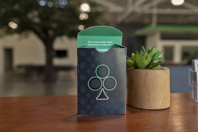
CLUB PITCH Playing Cards are an intriguing deck. They are minimal, yet intricate. Bold, yet still traditional. Currently funding on Kickstarter, the deck is a collaboration between card enthusiast, Duane Cardinez, and Pitch, a full-service advertising agency in Culver City, CA. It started as an identity exploration, manifested into a passion project.

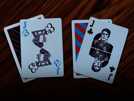
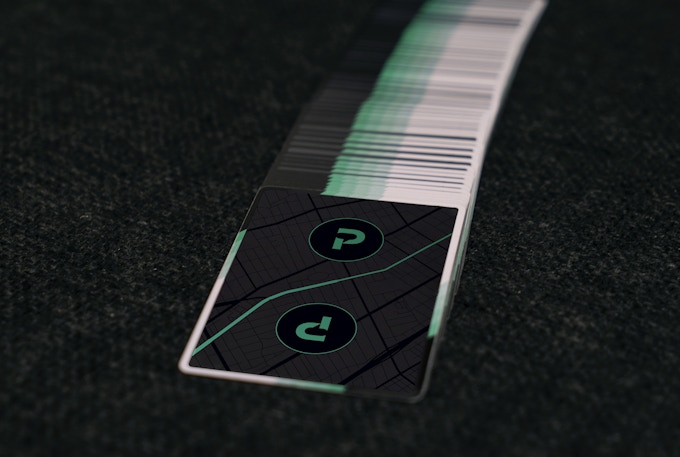
The card backs sports a distinct black colorway with broken borders on both sides, giving the deck a sense of mystery. Meanwhile, the faces are designed with bold & bright elements. Number cards hold more appeal with black or white text set against a vibrant green background. The Courts are framed in green and have a splash of white to set them apart from number cards and add impact to your royal hand.

Earlier this week, we had a quick chat with Duane about his design background, inspiration, and design process behind the CLUB PITCH deck.


For those of us who don’t know, can you tell us about yourself and what is your design background?
I’m originally a Brooklynite (BedStuy massive) and studied design at Northeastern in Boston. Growing up, I was making board games for my friends and me to play on the ride to school or creating comic books to distribute. Professionally, I’ve worked on converting warehouses into usable government buildings all over Massachusetts, made skate paraphernalia, and helped convince Burger King to partner with Iron Man. I got into cards a couple years back after seeing a Cardistry Wizards video on YouTube, featuring Jaspas and his crew. I was with my co-workers at the time and we all thought, “we are going to get good like this.” (Half joking) Well, that didn’t happen, but we did get into collecting. At the time we had a casino client that we came so close to creating a series of custom cards for and although it never came to fruition, I have made and kept some valuable connects with The United States Playing Card Company and Expert Playing Cards.

Can you describe the CLUB PITCH Playing Cards and why you’re passionate about it?
I’m actually 10 minutes away from being the longest employee at PITCH (an LA-based ad agency). I’ve seen it evolve and mature from basically a startup to the successful business it is now. Safe to say I know the brand well and was excited to be involved in the company branding refresh last winter. What resulted was a more edgy take on the word mark and a simple color change. We have a lot of young blood at PITCH and I saw the new take on our brand identity like we were an up & coming rock band. The next step was fantasizing all the things we could see our branding on and one of those products was playing cards.


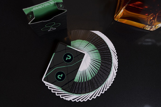
Design-wise, CLUB PITCH cards are based on our new signature green and takes cues from things found in our office. The back is a black on black rendition of a Culver-LA map found in our main conference room. It also relates to the mantra found on the jokers which state “Find Your Sound, Find Your Story.” We have always had a tree inside our building, which is where the focus on the suit of clubs is derived. The design the cards make when they fan, was inspired by patterns on folding fans that I’ve always loved.

Walk us through the process you took to design this unique deck. How did you come out with the idea and how did you get to this finished product?
My first inspiration was an Aroundsquare concept deck by Hubert Konicki which was a black and greyscale back with a rainbow front. When PITCH’s approved color palette was finalized, it was pared down to black, white and green. There weren’t enough colors to get the same effect going as Konicki’s deck, so I thought about how else to get the same color contrast. I still wanted a simple, almost all black backside that would scream color when you see the front. The green was the obvious choice and I built from there. The classic black and red became black and white. The white pips on the Black Tigers always looked sexy to me, so from there, things fell into place.


The courts cards and aces were next to get incorporated. My original plan was to give all the high cards a white backdrop so that when you were playing a game, you really felt like you got a hot hand. But I quickly realized you would probably see the edges and it would end up being a nightmare. Besides, I already established that red was white and that wouldn’t fly on a white background. So, I tried the court cards with a green border and I instantly loved it. The pips were something I had been playing around with for a while so that fell into place pretty easily. I always wanted to see an Ace of Spades where you can see his cousin club inside of it. The font was a narrow version our PITCH font.

What was your most brilliant breakthrough when designing the deck?
A design we have been playing with internally incorporates our company’s philosophy (“Find Your Sound, Find Your Story”) and it shows the two phrases interlocking in a 70s-style design that up close resembled a maze or map. I thought it was so clever to make a design out of the gridlines used to create said design and feature that as the back art. Just two simple “P” logos would don the top. It would further emphasize the fact that the card fronts were to be the hero, and now the Jokers are the main event. However, I just recently saw some video footage of the cards and I hated the backs. I think every designer comes to this point in the design process. I tried the obvious choice of adding the design of the tuck displaying the architecture of the pips, but it made it more ornate than desired. One day I was looking at our main conference room and the Culver-LA map from across the office and I had my “Eureka!” moment. It wasn’t as easy to incorporate as I thought, but I mulled it over for a few nights and I found that the intersection at Venice and Crenshaw makes an almost yin yang shape that I love. Incidentally, I was actually living around that area when I first discovered cardistry. More importantly, in reinforces the “Find Your Sound, Find Your Story” design on the Joker and it ties it all together. It was the last change I did, days before launch, but it was worth it.


From Kickstarter project page, what are a few of your favorite reward levels and why?
I figured the Early Bird 2 deck reward would be the most popular. You want one to break in and one to save. I think the price point is very fair as these are not meant to be highly ornate. They are simply a more stylish take on classic designs. But in a way, $9 cards are a steal for a custom run. The Care Package is similar to what we give new clients (minus the cards) so that’s pretty boss, too.

What’s next? Can we expect more deck designs in the future?
Professionally, we are already talking about sequels. There is nice momentum here after relocating into a new building, hosting an open house party and now this product launch. Personally, I would like to create my own 3-part series. One from USPCC, one from EPC and one from Cartamundi. The idea is that each design would utilize what makes each company great. Dreams.


Finally, what are your favorite playing cards?
My favorite cards of all time would probably be Dan & Dave Makers. They are the perfect deck for me. The pips, the tuck design, the long seal - all unique and inspiring elements. The National Playing Card Collection Day Deck from 2017 is pretty luxurious. I missed out on that year, but I was able to cop the one from last year. As far as favorites that I own, I have to give props to the Blood Kings. The simplicity and strong color pop of red were inspiring for the CLUB PITCH deck. Especially fond of the jokers which is a highly stylized ax and sword. I’m also quite fond of my Jimmy Fallon cards by Theory 11. The court cards have a high-class art deco style and the stamp is a unique shape that screams NYC in the 30s.

Thank you for your time, Duane! At the time of writing, the project is 42% funded with 20 days to go. If you want to support CLUB PITCH Playing Cards, you can find it on Kickstarter here!


Pledge starts from $10 and the deck will be printed by the USPCC.

[post_ad]

Kickstarter: Devastation (Silver Edition) Playing Cards


The Devastation Silver Edition Playing Cards is an elegant set of playing cards that depict the men who invented weapons of devastation and famous nurses. The deck is based on Black Ink's most successful Kickstarter projects to date, the Devastation series, launched back in 2015.


The deck will have fully custom illustrated courts, aces, and jokers using predominately red/black colorway giving it an elegant, edgy and timeless look.


The artwork Aces and jokers are symbolic illustrations which remind us of the stark weight of war.


The Silver edition tuck box includes stunning hot foil stamping on a linen-textured specialty paper with crisp embossing.


Only 1000 will be printed by Legends Playing Card Co. on their Classic Finish card stock. Intricate details, beautiful composition, and a great theme... this deck is one that you will not want to pass up!

Available now on Kickstarter for $13. Upgrade such as the wrapped signature label (hand-signed and numbered), deluxe genuine leather case and wooden case is available.

Card Radar: MADDECK Playing Cards


The MADDECK is a series of playing cards featuring illustrations by designer Ozlem Olcer. The deck was created for PAG, an Istanbul-based design company developing projects and manufacturing products in collaboration with graphic artists and illustrators.


The name MADDECK (short for ‘Magicians, Astronauts & Dancers’) was given after the first 3 dream jobs of the designer as a child. The deck combines unusual and edgy designs with an innocent feeling, much like the designer herself.


This is reflected on the deftly hand-drawn ornate but legible suits and also on the expressions of the beautiful cubistic styled rendered courts. The Joker of the deck is King Puhu, the famous and beloved drawing of Ozlem Olcer.


The deck was selected for the 'Destination Istanbul’ events, held in MOMA stores in NY and Hong Kong back in 2010.


MADDECK is sold in a box of two decks with different back colors: Red and Blue. The decks are printed on 330g black core paper imported from Germany.

Kickstarter: 7 Questions with David Traina of Borderline Playing Cards


Borderline is a deck of custom playing cards that celebrate the vibrant culture on both sides of the southern border. Created by Traina Design, this lovingly crafted deck showcases bilingual designs that depict the unique culture and colorful characters seen in and around the US/Mexican border.

The face cards of Borderline features 26 unique characters that capture the rich personalities from both sides of the border. Instead of the typical kings, queens and jacks, there are bikers, luchadores, Hollywood starlets, Mexican señoritas, small town sheriffs and federalise.

We caught up with David Traina, President and Creative Director at Traina Design to talk about his company, the inspiration behind the Borderline Playing Cards, the evolution of design of the deck and Kickstarter.

Can you tell us about Traina Design and your design background?
Traina Design is a brand communications firm located in San Diego. We work with visionary companies to emphasize their strengths, establish their voice and build their business. Our clients hail from a variety of different industries and our capabilities span all aspects of customer engagement, from print to video, interactive to advertising, and social to event creative. We thrive on variety. We abhor mediocrity.

I personally started working in advertising at age 15, working summers at a large ad agency in Atlanta. After graduating from BYU, I spent a couple of years working for a small design firm in Provo. Then I moved to Seattle where I spent two years at a renowned annual report firm and three more at a full-service agency. In 2012, I moved to San Diego and not long after launched the business from my home office. Today, Traina consists of 11 full-timers and an army of contractors and partner vendors.


This is your first Kickstarter Project. Why Kickstarter?
There are two reasons why we chose to crowd fund - finances and curiosity. First, producing a deck of this quality through USPC, with its elaborate, copper foil embossed box and custom-illustrated face cards, isn’t cheap. We need the support of fellow designers and playing card enthusiasts to make this dream a reality. The second reason is pure curiosity. We've had friends launch Kickstarter campaigns, but have never been through the process ourselves. We felt that Borderline was a perfect match for Kickstarter's format, and it has been a labor of love from the beginning.

What is your inspiration behind Borderline Playing Cards? How did you come up with the idea?
For years we've wanted to design a deck of playing cards. Late last year we saw our opportunity. We tossed around dozens of ideas over the course of several weeks and finally, as we stood around our ping-pong table brainstorming one day, the idea sprouted. We decided to create a deck that features the amazing cultural heritage right in our backyard. The "mirror-image" nature of playing cards was the perfect way to contrast both the characters and the languages on either side of the U.S./Mexico border.

How much time did you spend working on the deck?
We spent three months on the design and custom illustrations. Once completed, we spent hundreds of hours producing our Kickstarter video, our image library, outreach, etc.


Can you briefly go through the design evolution of one of your unique card design?
First we spent days determining what characters to feature, and who their natural parallels should be. We considered every conceivable personality, but ultimately landed on the 14 that you see in the deck. Once we agreed on a pairing (for example, the biker vs. the luchador), rough sketches were drawn up and routed through the entire team for feedback and suggestions. It was truly a team effort, and everyone's input had equal weight. The illustrations would then go through at least half a dozen refinements before they were finally polished and ready to go.

What are your thoughts about the continuous strong growth of playing card projects on Kickstarter?
The bottom line is that designing a deck of playing cards is a pipe dream of every conscious designer, and before Kickstarter there was simply no way to get it done. There are scores of players worldwide who never knew playing cards could have so much artistic life, and Kickstarter is the ideal distribution channel to bring these two groups together. As more people discover this movement, from both a designer and player point-of-view, it's going to continue to explode.


Finally, what are your favorite playing card decks? 
Since we began this process nearly one year ago, I've been blown away by dozens of amazing decks that I've seen on Kickstarter. I love the Edgy Brothers’ Dia de los Muertos deck and I’ve always drooled over the JAQK decks. Also, as a designer, I'm a big fan of anything with typographic elegance, or anything along the lines of Hundred Million's CMYK deck.

Thank you David for your time and sharing with us your Kickstarter project! All the best!


Pledge starts from $12 and Borderline Playing Cards will be printed by the USPCC. Also, add-ons such as shirt and uncut sheet are available.


Kickstarter: 7 Questions with Chris Staples of Fall of Troy Playing Cards


Inspired by ancient greek design and scenes from the legendary Greek mythology, Fall of Troy playing cards is the first playing card project from designer Chris Staples. This hand-illustrated deck tells the legendary story of the Trojan War, an epic tale of love, revenge, sorrow and bloodshed.

Fully custom, this deck features illustrated custom Faces, Courts, Aces, Jokers, Tuck and an eye-catching back design, striking the balance between ancient styles and modern layout. The deck puts you right in the middle of the Greek mythology!

We had the opportunity to chat with Chris about the new project, it's inspiration and design process. We hope you enjoy some of the background to the Fall of Troy deck.

For those of us who don’t know, can you tell us about yourself and what is your design background?
I’d be happy to tell you about myself and thanks Ivan, for sharing the Fall of Troy campaign with your readers.

Design has been a part of my professional life for nearly twenty years. I’ve worked in animation, advertising, music and film for some big studios such as Disney, Dreamworks, Warner Bros and Cartoon Network. I am currently the Creative Director for umigo.com, an animated, interactive project funded by the US Dept. of Education. More of my work can be seen on my website.


This is your first playing card project on Kickstarter. Why Kickstarter?
I have been funding projects over the years through Kickstarter. When I decided to launch my own campaign, Kickstarter was the crowdfunding resource with which I was most familiar. Kickstarter also supports the thriving custom playing card community that inspired my own project.

Can you describe the Fall of Troy Playing Cards and why you’re passionate about it?
The Fall of Troy ][ Epic Playing Cards is a custom, poker-sized deck of playing cards. The backs and faces feature hand-illustrated artwork, inspired by ancient greek design. The court cards display characters and scenes from the legendary Trojan War.

Like so many people, I have been interested in ancient mythology for most of my life. I love these stories and hope that others will discover them through the Fall of Troy cards and love them too. Or, perhaps they will rediscover something that they used to know and love.


Walk us through the process you took to design Fall of Troy Playing Cards. How did you approach this project and get to this finished product?
Once I knew that I wanted to explore the Trojan War in the form of playing cards, the process went something like this… Research, research, research. Design. Trash. Research. Design. Trash. Drink. Research. Design. Hooray! 

This took a few months.

At that point, however, I was happy with the development of the style and ready for production. Production begins with finding inspiration in ancient art. My primary focus was on a particular form known as red-figure pottery, developed in Athens around 520 BC. I often combine aspects of multiple pieces in order to create an element that works in playing card form. This means considering elements of symmetry and the inclusion of the suit graphics. I also consider the story of the character being portrayed and how it relates to the story of the court card. I’ve written some short articles on that aspect that are posted as updates on the campaign page. The rest of the process is the meticulous work of laying out the artwork to function first as a playable deck of cards and second as a stack of mini canvasses. Following this is the printing stage which, in this day and age, is a dream come true for a kid who was designing Variety covers in the 90’s.

What was your most brilliant breakthrough when designing the deck?
My favorite breakthrough on this project has been connecting the King of Hearts with Ajax of Salamis. I wrote a short article about it as a campaign update. Check it out. And please hit the like button. :)


Were you aware of the different deck of playing cards out there and did any decks inspire you?
Yes, I’ve backed a few custom decks. Leonardo, by Dent-de-Lion du Midi and all of Uusi’s stuff have been a big source of inspiration. Of course, there are so many more great decks out there. I need to sell my cards just to support my custom card habit. Between me and you, I had to set up an KS account that is just for cards. That’s normal, right?

Haha... I think so. ;) Finally, what are your favourite playing card decks?
So many. Maybe it would be quicker to list a few of the amazing artists out there… As mentioned Dent-de-Lion du Midi and Uusi. Jackson Robinson, Alexander Chin, Steve Minty, the Edgy Brothers… and so many more. I’m also excited about the new technologies available as seen in the decks made by companies like MPC. Did I mentioned that I may have card collecting problem? Please support my habit by backing The Fall of Troy ][ Epic Playing Cards. Thanks again Ivan. Cheers!

No worries! Thank you for your time, Chris! At the time of writing, the project is only 49% funded with 21 days to go. If want to support Fall of Troy Playing Cards, you can find it on Kickstarter here.


Pledge starts from $12 and the Fall of Troy Playing Cards will be printed by Make Playing Cards (MPC). Add-ons such as uncut sheets and art prints are available.


Top 12: Playing Card Decks for Halloween 2015


With Halloween just a few days away, we've compiled the best playing cards for All Hallows' Eve just for you. Behold! The Kardify Top 12: Halloween 2015 Edition, with enough ghosts, pirates, killer jokers, villians and skulls to keep your spine tingling through the night.

Difficulty scale from easy (1) to difficult (5). If you have one that we haven't discovered. Do feel free to share.


12. Sleepy Hollow


Over a year in the making, the Legend of Sleepy Hollow Playing Cards were conceived by playing card designer Derek McKee and masterfully illustrated in France by J.C. Desevre. This incredibly intricate and detailed deck of playing cards depicts artwork and characters from the popular Sleepy Hollow legend including Ichabod Crane & the Headless Horseman.

Difficulty: 1
Price: $10


11. The Evil Deck


Captivated by villains and his love for drawing creatures, Giovanni Meroni decided to embark on a playing card project to create a fun, colorful and dynamic theme for a deck. After illustrating all 54 creatures by hand, the Evil deck is born. The deck features fully custom face cards, embossed tuck coated with UV supergloss, interior printed and neatly packaged with a custom seal. Definitely a fun deck for All Hallows' Eve.

Difficulty: 1
Price: $14.95


10. October Second Edition


Fulton's October Playing Cards is a frightfully fun and whimsically deck featuring the illustrated artwork of Steven Noble. Packaged inside the box you will find one tricked out deck of playing cards. Everything from the back design, ace of spades, jokers, and court cards were customized. The deck features a superior dark-charcoal and black box, while also incorporating an asymmetric design that proudly features the back illustration of the cards within.

Difficulty: 1
Price: $10


 9. Revelation


Revelation is an extraordinary deck of playing cards inspired by medieval cathedrals and their gothic style. This meticulously hand-illustrated deck features gothic details, symbolic carvings and stained glass ornamentations from the stunning Nidaros cathedral in Norway. Fully custom, the Revelation tuck box, jokers, Ace of Spades and the eye-catching backs features artwork inspired by the beautiful stained glass of the cathedral while the illustrated skeleton courts pays homage to the silent skeletons of Norwegian royalty still resting in Nidaros’ catacombs. A strangely beautiful, simple and visually stunning theme.

Difficulty: 1
Price: $10


8. Requiem


Requiem Playing Cards is a stunning deck masterfully crafted by Lorenzo Gaggiotti of Stockholm17. This unique deck is 100% custom and features darkness & pain as a theme. The illustrations for the Courts, Jokers and Aces are very dark. The suits are made out of broken Hearts, Clubs with thorns, cracked Diamonds and dry leaves as Spades. Pips are unique and the gold metallic ink on this blood red deck gives it a touch of elegance.

Difficulty: 1
Price: $20


7. Neverland


Here's a delightful deck! Designed by Nat Iwata, Neverland is a beautifully illustrated deck of playing cards based on J. M. Barrie's timeless classic Peter and Wendy. The deck is Bicycle branded and features fully custom courts, aces, pips jokers and rich full card backs.

Difficulty: 1
Price: $10


6. Steampunk Bandits


From the guys at Gambler's Warehouse, Steampunk Bandits is a beautiful designed deck based on contemporary artists’ depictions of the bandits themselves, oft portrayed as skeletons. Not just for fans of Steampunk, this exquisite deck features unique art for all four suits of court cards, incredible colours and beautifully embossed tuck.

Difficulty: 1
Price: $15


5. Venexiana Dark


Dark Venexiana Playing Cards is the follow-up to the original Venexiana deck. Designed by Lotrek of Half Moon Playing Cards, the story continues the journey to the dark heart of 18th century Venice. Venexiana Dark features a series of obscure and marginal characters who complete the picture of this haunting city from thieves, assassins, prostitutes to wicked noblemen and masters of deception.

Difficulty: 1
Price: $15


4. No. 17 (Bicycle Branded) Playing Card 


No.17 is a stylish deck of playing cards designed by Lorenzo Gaggiotti. This will be his second deck on our Halloween list. There is no specific theme in this deck, it´s quite eclectic. The deck is 100% custom and features a Bicycle branded tuck with subtle embossing,  the now familiar Jester on the front and a stunning back that carries a beautiful line work!

Difficulty: 1
Price: $20


3. Midnight Calaveras


Designed by Chris Ovdiyenko of Dead On Paper, the Midnight Calaveras playing cards are inspired by and pays homage to Jose Posada, a famous Mexican printmaker who worked at the time of the Mexican Revolution. All artwork is hand drawn and features metallic printing on the cards, foils and embossing on the tuck.

Difficulty: 1
Price: $16


2. Dia de los Muertos


Dia de Los Muertos Playing Cards is a Bicycle-branded deck inspired by the art and traditions of the Day of the Dead; it honors both death and the cycle of life. Created by the team at Edgy Brothers, this beautifully illustrated deck pays homage to the spiritual and cultural event: full of color, detail and character.

Difficulty: 2
Price: $28


1. Joker and the Thief Playing Cards


A truly impressive deck! The design invites attention while striking a balance between style and functionality. The back design is not only intricately beautiful but aesthetically and sentimentally appealing. The themes and connotation from back design continue throughout, you may even start to see a story forming as you look through them!

Difficulty: 1
Price: $15


The selection expressed in this top12 are solely those of the author. Images for Sleepy Hollow from whisperingimps.com, October Second Edition from dananddave.com, Steampunk Bandits from gamblerswarehouse.com, Midnight Calaveras from deadonpaper.com, Revelation, No17 and Joker & the Thief by Anthony Ingrassia. Evil deck, Requiem, Venexiana Dark and Dia de los Muertos by Ivan Choe.
© all rights reserved
Kardify 2013