


CLUB PITCH Playing Cards are an intriguing deck. They are minimal, yet intricate. Bold, yet still traditional. Currently funding on Kickstarter, the deck is a collaboration between card enthusiast, Duane Cardinez, and Pitch, a full-service advertising agency in Culver City, CA. It started as an identity exploration, manifested into a passion project.
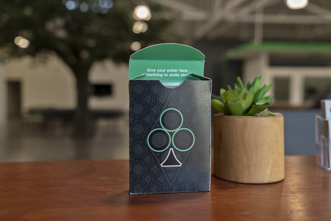
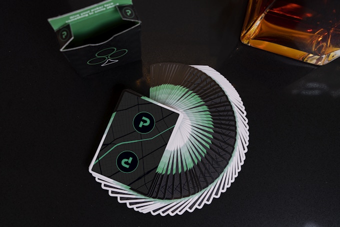
The card backs sports a distinct black colorway with broken borders on both sides, giving the deck a sense of mystery. Meanwhile, the faces are designed with bold & bright elements. Number cards hold more appeal with black or white text set against a vibrant green background. The Courts are framed in green and have a splash of white to set them apart from number cards and add impact to your royal hand.
Earlier this week, we had a quick chat with Duane about his design background, inspiration, and design process behind the CLUB PITCH deck.
For those of us who don’t know, can you tell us about yourself and what is your design background?
I’m originally a Brooklynite (BedStuy massive) and studied design at Northeastern in Boston. Growing up, I was making board games for my friends and me to play on the ride to school or creating comic books to distribute. Professionally, I’ve worked on converting warehouses into usable government buildings all over Massachusetts, made skate paraphernalia, and helped convince Burger King to partner with Iron Man. I got into cards a couple years back after seeing a Cardistry Wizards video on YouTube, featuring Jaspas and his crew. I was with my co-workers at the time and we all thought, “we are going to get good like this.” (Half joking) Well, that didn’t happen, but we did get into collecting. At the time we had a casino client that we came so close to creating a series of custom cards for and although it never came to fruition, I have made and kept some valuable connects with The United States Playing Card Company and Expert Playing Cards.
Can you describe the CLUB PITCH Playing Cards and why you’re passionate about it?
I’m actually 10 minutes away from being the longest employee at PITCH (an LA-based ad agency). I’ve seen it evolve and mature from basically a startup to the successful business it is now. Safe to say I know the brand well and was excited to be involved in the company branding refresh last winter. What resulted was a more edgy take on the word mark and a simple color change. We have a lot of young blood at PITCH and I saw the new take on our brand identity like we were an up & coming rock band. The next step was fantasizing all the things we could see our branding on and one of those products was playing cards.
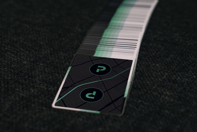
Design-wise, CLUB PITCH cards are based on our new signature green and takes cues from things found in our office. The back is a black on black rendition of a Culver-LA map found in our main conference room. It also relates to the mantra found on the jokers which state “Find Your Sound, Find Your Story.” We have always had a tree inside our building, which is where the focus on the suit of clubs is derived. The design the cards make when they fan, was inspired by patterns on folding fans that I’ve always loved.
Walk us through the process you took to design this unique deck. How did you come out with the idea and how did you get to this finished product?
My first inspiration was an Aroundsquare concept deck by Hubert Konicki which was a black and greyscale back with a rainbow front. When PITCH’s approved color palette was finalized, it was pared down to black, white and green. There weren’t enough colors to get the same effect going as Konicki’s deck, so I thought about how else to get the same color contrast. I still wanted a simple, almost all black backside that would scream color when you see the front. The green was the obvious choice and I built from there. The classic black and red became black and white. The white pips on the Black Tigers always looked sexy to me, so from there, things fell into place.

The courts cards and aces were next to get incorporated. My original plan was to give all the high cards a white backdrop so that when you were playing a game, you really felt like you got a hot hand. But I quickly realized you would probably see the edges and it would end up being a nightmare. Besides, I already established that red was white and that wouldn’t fly on a white background. So, I tried the court cards with a green border and I instantly loved it. The pips were something I had been playing around with for a while so that fell into place pretty easily. I always wanted to see an Ace of Spades where you can see his cousin club inside of it. The font was a narrow version our PITCH font.
What was your most brilliant breakthrough when designing the deck?
A design we have been playing with internally incorporates our company’s philosophy (“Find Your Sound, Find Your Story”) and it shows the two phrases interlocking in a 70s-style design that up close resembled a maze or map. I thought it was so clever to make a design out of the gridlines used to create said design and feature that as the back art. Just two simple “P” logos would don the top. It would further emphasize the fact that the card fronts were to be the hero, and now the Jokers are the main event. However, I just recently saw some video footage of the cards and I hated the backs. I think every designer comes to this point in the design process. I tried the obvious choice of adding the design of the tuck displaying the architecture of the pips, but it made it more ornate than desired. One day I was looking at our main conference room and the Culver-LA map from across the office and I had my “Eureka!” moment. It wasn’t as easy to incorporate as I thought, but I mulled it over for a few nights and I found that the intersection at Venice and Crenshaw makes an almost yin yang shape that I love. Incidentally, I was actually living around that area when I first discovered cardistry. More importantly, in reinforces the “Find Your Sound, Find Your Story” design on the Joker and it ties it all together. It was the last change I did, days before launch, but it was worth it.

From Kickstarter project page, what are a few of your favorite reward levels and why?
I figured the Early Bird 2 deck reward would be the most popular. You want one to break in and one to save. I think the price point is very fair as these are not meant to be highly ornate. They are simply a more stylish take on classic designs. But in a way, $9 cards are a steal for a custom run. The Care Package is similar to what we give new clients (minus the cards) so that’s pretty boss, too.
What’s next? Can we expect more deck designs in the future?
Professionally, we are already talking about sequels. There is nice momentum here after relocating into a new building, hosting an open house party and now this product launch. Personally, I would like to create my own 3-part series. One from USPCC, one from EPC and one from Cartamundi. The idea is that each design would utilize what makes each company great. Dreams.
Finally, what are your favorite playing cards?
My favorite cards of all time would probably be Dan & Dave Makers. They are the perfect deck for me. The pips, the tuck design, the long seal - all unique and inspiring elements. The National Playing Card Collection Day Deck from 2017 is pretty luxurious. I missed out on that year, but I was able to cop the one from last year. As far as favorites that I own, I have to give props to the Blood Kings. The simplicity and strong color pop of red were inspiring for the CLUB PITCH deck. Especially fond of the jokers which is a highly stylized ax and sword. I’m also quite fond of my Jimmy Fallon cards by Theory 11. The court cards have a high-class art deco style and the stamp is a unique shape that screams NYC in the 30s.
Thank you for your time, Duane! At the time of writing, the project is 42% funded with 20 days to go. If you want to support CLUB PITCH Playing Cards, you can find it on Kickstarter here!
Pledge starts from $10 and the deck will be printed by the USPCC.
[post_ad]

No comments
Post a Comment