Responsive Ad Slot

Showing posts sorted by relevance for query Nicolai Aaroe. Sort by date Show all posts

7 Questions with Matt Preuss and Nicolai Aaroe of Märchen Playing Cards


A collaboration between Forge Arts and Nicolai Aaroe, Märchen Playing Cards brings the mysterious world of German legend to life. The cards celebrate Germanic culture from the Brothers Grimm to the cuckoo clock, with lavish designs.

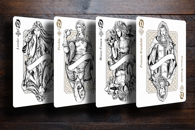
Fully custom, the Märchen back design decorated with an entrancing blend of scrollwork, foliage, and heraldic crests. The courts are meticulously illustrated in exquisite detail by Nicolai each featuring a different German legend. All face cards will be printed with metallic gold inks. Stunning!


We managed to have a quick chat with Matt Preuss from RarePlayingCards and Nicolai about Forge Arts, designing Märchen Playing Cards and their plans for the future.

For those of us who don’t know, tell us a little about Forge Arts?
Matt: Forge Arts is our new custom label brand for RarePlayingCards.com. This new brand will be comprised of originally designed decks of playing cards that we collaborate on with very talented artists from around the world.

Our experience with RarePlayingCards.com has attributed to our passion for custom decks with unique, elaborate artwork and interesting themes. We finally wanted to bring to fruition the fun ideas that we have thought of over the years that would appeal to the community.

Forge Arts as the project creator for Märchen is now building its foundation on Kickstarter. It is important to note that while Märchen Playing Cards might be our very first deck, everyone involved in the project is very experienced in the field and we are very confident that this is going to show when the decks are manufactured.


What do you guys love most about being a designer? And what are some favorite projects you’ve worked on?
Matt: Nicolai Aaroe, the lead artist of Märchen, has worked on several successful decks in the past including Indictus, Dominus, Midgard and more. Nicolai will address the design aspect of Märchen.
Nicolai: The freedom to do whatever you want to do with a theme is very appealing to us and we do our best to work within some of the more acknowledged standards for poker playing cards, in relation to pips, values and indexes. For Märchen, we want it to be as unique as possible while still playable. The Germanic theme is something that is appealing to us personally, and being able to draw inspiration from the local area and geography was an absolute plus.

Can you describe the Marchen Playing Cards? and why you’re passionate about it? 
Matt: Märchen brings the mysterious world of German legend to life. The cards celebrate Germanic culture from the Brothers Grimm to the cuckoo clock, with lavish designs. Being our premiere deck, Märchen has been a blast to work on. We’re passionate about German folklore particularly and this project allows us to use our shared creativity to create a premium deck of cards that will be cherished by any collector. We really got a taste for creating decks ourselves and we already have our next idea planned well.


Talk to us a bit about going from the first draft to the final version. How did you get to this finished product?
Matt: Getting to the finished version was an exciting journey. Today there exists many types of custom decks with various themes, but we have yet to see one with a heavy Germanic element.

The first draft was loosely derived from a central idea of a Germanic themed deck. Starting with the court cards, we then took inspiration from various folklore and legends that stemmed from that region. We researched characters that would fit well with the court cards and bolster the story of the deck. From there we included the joker cards comprised of a cuckoo clock, castle, tree, and crest. Finally, we polished every design and character into the final version.

What was your most brilliant breakthrough when designing the deck?
Matt: Deciding to have two separate editions of the deck was the biggest breakthrough. This allowed us to expand our creativity since the Schwarzwald edition is tied to the Black Forest and the Hamelin edition is tied to the medieval towns and castles of a past era. This creates a contrasting element to the deck that really gives it life.

What’s next? Can we expect more deck designs in the future?
Matt: Absolutely! We already have another project ready to go that we’re excited to announce in the near future. However, our primary focus right now is to fully fund and produce a high-quality debut deck for all of our backers.


Finally, what are your favourite playing cards?
Matt: No. 17 Le Chat Rouge by Stockholm 17
Nicolai: Magna Carta by Seasons Playing Cards

Thank you for your time, guys. At the time of writing, the project is 72% funded with 20 days to go. If you want to support Märchen Playing Cards, you can find it on Kickstarter here!


Märchen will be available in two editions: Schwarzwald (dark green) and Hamelin (cream) Edition. Each tuck box will be sealed with an individually numbered sticker draped in a stunning, deep red color. Pledge starts from $14 and the deck will be printed by Legends Playing Card Co. on their diamond finish card stock. Dealer chip, companion booklet, and uncut sheets are available as an add-on.

Kickstarter: Hunter of York Playing Cards by Nicolai Aaroe


Funded in 48 hours, the Hunter of York Playing Cards are inspired by the witch-hunting era and the Tulip Mania set in York, 1636. This is the first volume in the Florus Drama series by artist Nicolai Aaroe.


These enchanting decks have been Nicolai's ‘go-to’ project for the past 3 years. He started working on the design about the same time the Indictus Playing Cards was launched on Kickstarter. The deck design has been kept a secret up until now and the reactions have been overwhelming.


Hunters of York started off as a theme that captures the tension of affection between a man and a woman in the renaissance era. The court characters have been illustrated in collaboration with another Danish master of the pen, Martin Helgren. On the design, Nicolai told Kardify,
I had so many ideas about the concept of ‘the hunt’ that the theme needed to be expanded with more factors of ‘hunt and ambition’. Hunters of York is set in 1636 and it is very much inspired by the Tulip Mania of that time to give it an authentic and historic touch of elegance in the form of floral artwork. The fact that the movie Tulip Fever came out in the end of the development process was pure coincidence, but it formed an obvious inspiration to the final touches of the designs.


This project has been hugely influenced by the ideas generated through creative sparring with Marianne Larsen. She has really made a great impact on major design choices, such as the beautiful tuck boxes.


The original designs were discarded completely and new designs were made based on fresh ideas and a rich sparring on the elements of what makes a great and interesting tuck case.


With the successful funding of the deck, Nicolai is motivated to continue working on the second volume in the Florus Drama series. Nicolai continued,
Florus Drama is a series where I will experiment with colors and story telling in a very unique way, blended with deluxe features on every aspect of the design process.


Two editions of the Hunter of York Playing Cards will be made available during the Kickstarter campaign- Master and Mistress Edition. The decks will be printed by NPCC and pledge starts at DKK$89 (USD$14) on Kickstarter.

[post_ad]

Kickstarter: Vittoria Playing Cards by Nicolai Aaroe


Vittoria Playing Cards is the second volume in the Florus Drama series of fine art playing cards by artist Nicolai Aaroe. Funded in under 24 hours on Kickstarter, the deck artistically capture the mystique of the black masquerade and the elegance of Venetian tradition.


The Florus Drama series is where Nicolai challenge his comfort zones and experiment with color, floral patterns, and historical interests. While the first volume in the series, Hunters of York, is based on the Tulip Bubble Nicolai needed a historic starting point for Vittoria to keep the design as authentic and relevant as possible. On the inspiration Nicolai said,
The mystique and suspense of Stanley Kubricks movie Eyes Wide Shut really got under my skin and has never really left me. The masquerade scene has unnerving suspense and dark atmosphere that I find really captivating. What I find particularly interesting is the secretive behavior of every character involved in the ceremony. This conduct and their serious facial expressions is something that I wanted to transfer over to the face cards of Vittoria directly. There is not a happy mood about these courts, which has been my artistic vision all along. This makes you wonder about their desires, darkest secrets and objectives. The only smile you see is the very spiteful one by the Jack of Hearts, who is wearing a Joker costume.

The fully custom deck is designed in collaboration with Martin Helgren. The face cards are based on extensive research and present authentic Venetian mask types. All courts are illustrated by hand with unique color schemes. On the theme, Nicolai continued,
It was not until I visited Venice with my wife in 2014 that I felt a creative urge grow within me to design a deck of cards based on the history of the Venetian carnival. I find this city as magical and fascinating as the magnificence of Italian architecture and art. So this particular piece of Italian history coupled with my dark art style formed the foundation of Vittoria Playing Cards several years ago.

Two limited edition decks with deluxe features in a dark Venetian theme are on offer during the Kickstarter campaign- Volto and Bauta. For the Volto edition, the card backs are printed with vivianite blue Pantone and golden metallic ink. Tucks are manufactured with a genuine Italian black matte stock, gold metal foil, black varnish, custom shape seals and exquisite embossing. The tuck interior is embellished with gold foil Italian floral ornamentation. The Volto face cards come in a vivid and rich color scheme with black and Azalean red suits.


Meanwhile, the Bauta edition represents the power of simplicity and secrecy. The Bauta edition tuck is manufactured with a genuine Italian black matte stock, gold metal foil, selective varnish, custom shape seals and exquisite embossing. The card backs are printed with black Pantone and golden metallic ink. Inside, the Bauta face cards have a washed out color scheme with black and golden suits.


The decks will be printed by NPCC and pledge starts at $13 for a deck on Kickstarter. Also, add-ons suck as dealers coin, deck pouch, brick boxes, and booklet are available. Don't miss out!

[post_ad]

Nicolai Aaroe's Vittoria Di Viritas Playing Cards


The enchanting world of Vittoria Playing Cards receives a captivating makeover in the form of the Vittoria Di Viritas project, a Kickstarter by Nicolai Aaroe.

Borne out of the success and acclaim garnered by the Vittoria Di Fiore Di Ferro experimental release, the design team dives deeper into the realms of Venetian embossed gold. This time, the focus intensifies on intricate details and embossed elements, crafting a visually stunning and technically impressive art project.

The project introduces two editions, each with its distinct character. The Duplice edition, meaning ‘double’ in Italian, showcases two-way court illustrations and a unique back design. The Singolo edition, meaning ‘singular,’ boasts one-way Vittoria court illustrations, setting it apart in the series.

The tuck cases, glossy and embossed, are a testament to the creator’s commitment to artistry. These designs forgo metal foil, relying instead on strategic embossing on glossy stock to simulate the appearance of elegantly embossed Italian gold ornamentation.

The court characters, illustrated by the talented Nicolai and Martin Helgren, present authentic Venetian mask types and clothing. Through extensive research, these artists breathe life into the courts, infusing them with unique color schemes and re-illustrated masks or clothing for a refreshing take on tradition.

The project goes beyond just cards, offering a range of exquisite boxes. From standard boxes to deluxe half-brick boxes with gold foil to the impressive Ultimo Hardbox, backers have a plethora of options to house these artistic wonders.

Printed by MPC on M31 linen finish with a print run of 3,000 for each edition. Pledge starts at $15 on Kickstarter.

Card Flash: Culminus Playing Cards


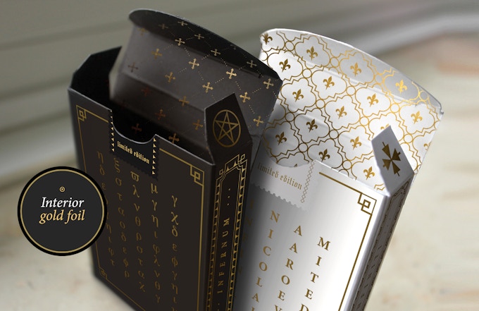
Currently in fulfillment, Culminus Playing Cards by Nicolai Aaroe are inspired by the eschatological literature of the postexilic period. Culminus is represented by two meticulously crafted deck, Infernum (evil) and Infiniti (good).


Both decks feature matte tuck cases, embossed artwork, and exterior and interior gold foil. Infernum comes in a Black-brown stock and Ivory matte stock for Infiniti. The gold on white on the Infiniti is especially stunning.


Inside, the cards are fully custom with distinctive pips, ornamentation on the indices and hand-drawn courts. As expected, the artwork is top notch as always and what you come to expect from Nicolai Aaroe and award-winning illustrator Patrick Leis.


Both decks are printed by NPCC and handle reasonably well. Overall, the decks are very well done! If you've backed the project, you won't be disappointed.

First Look: Märchen Playing Cards by Forge Arts


[Update] Märchen Playing Cards are now LIVE on Kickstarter!

Forge Arts in collaboration with artist Nicolai Aaroe have revealed Märchen Playing Cards, their new deck of playing cards launching on Kickstarter tomorrow (7 Feb).

Märchen brings the mysterious world of German legend to life. The cards celebrate Germanic culture from the Brothers Grimm to the cuckoo clock, with lavish designs. Fully custom, the faces of the cards are drawn in metallic gold inks, protected by a matte finish.


Two limited editions will be available in the campaign: a green tuck box representing the enchanted forest of the Schwarzwald, and a cream tuck box standing for the medieval town of Hamelin.

The cards will be printed in Legends Playing Card Co on their diamond finish card stock. The Märchen Playing Cards will launch tomorrow on Kickstarter.

[Update] Märchen Playing Cards are now LIVE on Kickstarter!

Don't miss out! Follow Forge Arts on Facebook for updates.


Kickstarter: Culminus Playing Cards by Nicolai Aaroe


Inspired by the eschatological literature of the postexilic period, Culminus form the third and final volume in the Light versus Darkness series of deluxe, dark art poker playing cards.


Meticulously designed by Nicolai Aaroe, Culminus aims to represent ultimate evil and ultimate good with two gorgeous standalone deck designs, Infernum and Infiniti, where infernal devils are seeking to wreak havoc to neutral men, and ethereal guardians are trying to stop them. In its essence, Culminus symbolizes the moral compass and ethical dilemmas that all monarchs have faced in history and time as saints and sinners.


Both decks feature a matte tuck cases designed with both exterior and interior gold foil and embossed artwork. Black-brown stock for the Infernum and Ivory matte stock for Infiniti.


Fully custom, the distinctive pips are unique, each court is hand-drawn in collaboration with award-winning illustrator Patrick Leis and ornamentation has been added on the indices. Also, the card back adorned with Metallic ink with gold pigment.


The Infernum deck has black cards matching the Dominus Obscura deck for consistency, while the Infiniti deck has a clean, white design to match its predecessor, the Dominus Divinus deck. Both decks will be printed by NPCC. Available now from Kickstarter. Pledge starts from DKK$89 (~USD$13).

Kickstarter: 7 Questions with Nicolai Aaroe of Dominus Playing Cards


Already funded on Kickstarter, Dominus is a deck of playing cards featuring two stunning limited edition decks. This is the second volume in the ‘Light vs Darkness’ series by designer Nicolai Aaroe. Dominus illustrates the damaging physical and psychological effects of political ambition on those who seek to gain power through activities related to the underworld and magic. Dominus seek to represent light and darkness with a mirrored 2-deck theme, Divinus and Obscura.

Fully custom, the card backs represent the European monarchs moral codex and reign and are decorated with royal, divine, religious and occult symbolism. The meticulously illustrated courts tell a unique story of fate, destiny, choice and consequence. The rulers in the elegant Divinus deck represents the moral right path while the darker-coloured Obscura deck features the same rulers in their darker versions. Both decks are housed in an eye-catching matte deluxe tuck designed with hot stamped gold foil and embossing effects.


We had a quick chat with Nicolai, and asked him about being a designer, inspiration and design evolution of Dominus Playing Cards and his takeaway lessons from previous Kickstarter projects.

What do you most love about being a designer? and what are some favorite projects you’ve worked on?

I like to express myself and communicate with visuals, form and shape. Design is a language and the colors, fonts, and shapes are the words you use to create a certain mood or a specific message. Often the perfection of the communication lies in the detail, and certain words can ruin what you are trying to say or express. Like a symbol that is misinterpreted or doesn’t fit well with the rest of your story. My favorite projects are those where I get a chance to create a concept from the ground up. I’ve been doing that for retailers, video games, movies and tv shows. And I tend to have a personal preference for the more gloomy concepts.

What is your inspiration behind the Dominus?  How did you come up with the idea?
Both Indictus and Dominus are inspired by historical dramas such as The Tragedy of Macbeth by William Shakespeare, and The Wars of The Roses. I also find much inspiration in historic writings and ancient paintings and portraits. The Indictus tuck cases were directly inspired by an antique, french and golden cabinet held at the Versailles Palace in France. The Dominus theme is visually inspired by occult artwork and a scarf I found in Germany. Ancient European monarchies have so much historical drama to draw upon. So noble and elegant to the eye, and so backstabbing to gain power. Display is important, but simplicity must rule our hearts. 
Doing good and doing bad is a tough balancing act, and monarchs of ancient times must have had quite a struggle choosing between them. 


How much time did you spend working on the deck?

About six months. I had a lot of fun working with Eugen Poe (Dead Inside Ink) to illustrate the court cards. He liked the idea and concept so much that he was willing to work on it even during nights and weekends, out of devoted and passionate interest. We started working on the first sketches in October last year and I did dozens of drafts for the tuck designs in several months after.
 In total, I would estimate that more than 300 hours of work went into this project before I even got to the design of the Kickstarter pitch.

Can you briefly go through the design evolution of one of your unique card design?
Queen Rumyna was one of the first courts we did. Eugen made a rough sketch based on my briefing and concept for the character. When approved he inked the character in hand and more detail. Then I edited his illustration technically, made golden parts and formed it into a two-way court design with all that follows in a detailed card such as this, with symbolism and more.


What was your most brilliant breakthrough when designing the deck?
Originally the Divinus tuck case was designed with a Kings Crown on the front to represent a regents power and potency, but I felt that it didn’t match the face of Obscura in some way.
 My wife and I did some sketches with a Fleur De Lis instead and we the very ornate version was an immediate breakthrough in regards to the matching of style and visual power between the two decks. I am so pleased that I didn’t just settle with the crown design as it kept haunting me style wise for reasons that I couldn’t really point out or explain.

With so many playing card projects competing for funding, why should potential backers choose your deck?

Backers should scan and pick the theme that they find the most interesting and appealing. My designs are not more valuable or above any other theme on the market. There are so many themes covered and we all have different tastes and preferences for our playing cards and collectibles. But hopefully, the amount of effort, work and background depth of the court cards that went into the Dominus theme shines through in the pitch. That is my only hope really.


Finally, you have previously launched 2 successful playing cards projects on Kickstarter. Are there any takeaway lessons from your previous projects you would like to share?
Be transparent, be honest, and be responsive to your backers. Be a backer yourself so you have insight and hands on experience from both sides of the table. Never promise more than what you are able to deliver. Do your homework prior to launch. Be in contact with your manufacturers to avoid surprises as much as possible. And finally, make sure that you don’t compromise on product quality to avoid delays on fulfillment. These are my personal priorities at least.

Once again, thank you for your time, Nicolai! At the time of writing, the project is already 163% funded with 21 days to go. If you want to support the Dominus Playing Cards, you can find it on Kickstarter here! 


Pledge starts from ~$12 and the deck will be printed by the NPCC. Dealer chip, uncut sheets and satin pouches are available as an add-on. There are also multiple rewards that are waiting to be unlocked once the project hits its various stretch goals.

Kickstarter: 7 Questions with Nicolai Aaroe of Chernobyl Memorial Playing Cards


The creators of Chernobyl Memorial Playing Cards, Misery Dev, just hit its funding goal of £6,500 on Kickstarter yesterday. Commemorating the population affected by the Chernobyl accident in 1986, the Chernobyl Memorial Playing Cards have 2 decks on offer in the Kickstarter campaign, the Premium and Limited Edition.

For the Premium Edition deck, the courts feature real life Zone photography that capture well known locations. The values and pips are fully custom and formed in a color combination often found on the original wall paintings of the Pripyat buildings. The back design is a tribute to the taming of the fire that lasted for days. "1986" go along the center of the design. The worn and weathered tuck features the iconic Pripyat ferris wheel, embossing and a radioactive warning on the tuck flap.


The eye-catching Limited Edition deck will feature a striking tuck utilizing a combination of copper pigmented pantones and metal copper foils to simulate rust and an iconic artwork. The tuck will be embossed. Fully custom, the back design is represented by the iconic Pripyat ferris wheel in a delicate line art. Special sections of the artwork have special ink with copper pigment. The values and pips are designed to look time worn and combines deep red, black and 'ukrainian' green colors. The courts are a haunting representation of a disaster that should never be forgotten.

We were able to catch-up with Nicolai Aaroe, creative director of Misery Dev for a quick chat about Misery Dev, designing the Chernobyl Memorial Playing Cards and experience from previous Kickstarter projects

For those of us who don't know, tell us a little about yourself and Misery Dev? 
Misery Development Ltd. is a global team of individuals, all working on a free modification for a Ukrainian video game series called 'S.T.A.L.K.E.R.'


While primarily working on video game projects, rooted in themes of aftermath and post-apocalism, we do have sub-branches releasing smaller scale products, like soundtracks, and our deck projects here on Kickstarter. Our team of developers has grown rapidly over the years, and the company name was officially trademarked and registered in the UK as an independent developer in 2013.

Can you describe Chernobyl Memorial Playing Cards and why you're passionate about it? 
Chernobyl (also referred to simply as The Zone) is the interest that brought us all together to begin with. We are passionate video game modders and have been releasing free instalments to the video game S.T.A.L.K.E.R.' Call of Pripyat.

The game takes place in Chernobyl and Pripyat and we've have been expanding pretty much every aspect of what the original game offers. To date our mod, MISERY, has been downloaded more than 800.000 times and we have gained a very supportive community through this, that helps us shape the next release.

Chernobyl Memorial Playing Cards are meant as commemorative boxes that serve for poker purposes but also as memorial artifacts and collectors items.


Walk us through the process you took to design this very unique deck. How did you come out with the idea and how did you get to this finished product? 
A Chernobyl themed deck was an obvious choice for us, as passionate urban explorers. Every abandoned location tells a story and carries a soul that draws us. Some locations are shrouded in mystery, while others have been abandoned due to disasters such as the Chernobyl accident in 1986. Our activities and projects serve to keep our minds fresh of the people affected by the tragedy.

With the Chernobyl playing cards it is our ambition to release a product that is a lot more than simply poker playing cards. We want to bring our audience on a visual journey through the Zone with the use of high quality photography that tells a story with every court card. Something that will leave a lasting impression and serve as commemorative reminders of the people affected and those who prevented a global scale disaster.

What was your most brilliant breakthrough when designing the deck? 
With the Limited Edition tuck case we wanted to pursue something that we've never seen before for any other deck. We wanted it to appear as something else than a simple paper product and stand out as a rusty metal box, resembling a time-worm artifact that match and represent conditions of Zone industry. We've have achieved this through an artwork formed of copper foils, embossing, weathered textures and simulations of rust.


You have successfully funded numerous Kickstarter campaigns. What are a few key elements and principles you incorporated into your project that you think future Kickstarter creators could benefit from knowing?
Set a few rules for yourself that will benefit you in the long run. You must earn the trust and loyalty of backers. My rules and priorities are the following:
#1 Deliver rewards that lives up to the pitched quality (or better)
#2 Deliver the reward on time
#3 Be transparent if anything changes

What's next? Can we expect to see more card designs in the future from Misery Dev?
Absolutely. At this point we have two other ideas that we are very excited about and can't wait to present to our audience. The next one will probably be revealed by the end of this year and we already sketching some truly interesting features for it.


Finally, what are your favourite playing cards?
Going beyond our own designs I was very impressed with Defunctorum by Roman Kotiv. Elegance and power merged with success - and the tucks really feel as great as they look. I wish more deck artists would use this tuck stock.

Thank you for your time and all the best Nicolai! At the time of writing, the project is already 108% funded with less than 8 days to go. If you want to support the Chernobyl Memorial Playing Cards, you can find it on Kickstarter here! 


Pledge starts from £11 (~USD$13) and the deck will be printed by the NPCC. Dealer chip, uncut sheets and poster prints are available as an add-on. There are also multiple rewards that are waiting to be unlocked once the project hits its stretch goals such as interior tuckbox printing.

Woodland Legends Playing Cards

Now seeking funds on Kickstarter, Woodland Legends is a richly illustrated playing card series by artist Nicolai Aaroe, presented in three distinct limited editions and inspired by the folklore of Reynard the Fox and classic tales such as Robin Hood.

Set in the woodland realm of Fernspire Forest beneath Cinderleaf Castle, Woodland Legends tells the story of six fox clans bound to the land’s most treasured natural resources: ashroot, fern, cinderleaf, and rowanberries. Each clan represents a different truth of the world, and while they share the forest’s abundance, they are not equal in coin or power. The narrative, written by Aaroe as A Tale of Six Clans, weaves themes of friendship, courage, and loyalty into a fully realized illustrated universe.

The project began as a purely human-driven art journey, documented from early sketches to finished designs. Every court card and pip has been hand-illustrated, resulting in a completely custom deck. Across the series, 18 unique woodland characters bring the fox clans to life.

Woodland Legends is produced in three editions: Ashroot Gold, Cinderleaf Orange, and Fernspire Green, each limited to 999 decks. All three are manufactured with special raw “herbage” tuck stocks made from grass and leafy plant fibers, reinforcing the organic theme of the series. The tuck cases feature embossed landscapes of trees and rolling hills that wrap fully around the box, accented with metallic foil detailing on all sides.

Each edition carries its own distinct back design variation tied to seasonal moments in the story, emphasizing the resources gathered and traded by the clans. The aces feature ornate, organic compositions inspired by fox tails, fern spires, roots, and branching woodland forms.

The two jokers depict the central locations of the narrative: Cinderleaf Castle and Fernspire Forest - anchoring the story’s world within the deck itself.

Printed on premium card stock with a linen finish and finished with metallic edge gilding, Pledge starts at $25 on Kickstarter.


© all rights reserved
Kardify 2013