Responsive Ad Slot

Showing posts sorted by relevance for query grid. Sort by date Show all posts

Kickstarter: 5 Things You Should Know About Grid Series Two Playing Cards


Now on Kickstarter, Grid Series Two playing cards is the second deck in a three part collection based on the design principals of the International Typographic Style, otherwise known as the ‘Swiss Style’ of graphic design. The deck is the brainchild of designer Luke Wadey and focuses on how each face card can be displayed through text. Here are 5 things you should know about the design of Grid Series Two playing cards:

1. Originally started in the 1920s in Germany, the Netherlands and Russia, the ‘Swiss Style’ later developed in Switzerland in the 1950s
It’s main principals are readability and cleanliness, with most creations adopting an asymmetric layout, always based on the use of a grid. These grids, usually made up of hidden columns and rows, are used to align words, numbers, pictures and patterns and so each series in the Grid collection adopts these principals. The works of designers such as Ernst Keller and Josef-Müller Brockmann have been a real inspiration from a graphic point of view.


2. The cards are poker size and printed by USPCC but are far from traditional
Luke told Kardify, "As a graphic designer more than an illustrator, as well as a card collector, I wanted to find a way to combine two of my biggest passions and make a collection of decks which truly stand out from the crowd. I fully appreciate the incredible work of designers of other playing cards currently in the world, I am often drawn to the cards with incredible detail and illustration. However, I see the detail of my decks as ‘less is more’, doing away with traditional pips and instead adopting a typographic format, with each card acting like a miniature poster, with bold words setting the theme rather than illustration and numbers."


3. Luke tried to keep the design minimal but functional
The back of the card is stripped back to just the name of the deck, with full colour bleed for real impact of colour. "If for example you look at my version of the picture cards, they each have a diagonal line introduced as a minimal graphic, like a poster, but it replicates the diagonal line often from on traditional picture cards where the suit is duplicated and rotated. It’s a small detail but it’s my way of reflection tradition."


4. Alignment
With Grid Series Two, as well as vertical and horizontal alignment like in Grid Series One, Luke introduced the circle to create a dial effect and explore how different grids can be adopted on playing cards. "Each card has bespoke set of alignment with the numbers and letters that sit on the edge of the circle so that they visually look to have the same alignment, whilst not always sitting in exactly the same place on each card."


5. The cards can be read and viewed in many different ways with only two being symmetrical
A) The card is written in it’s full name; seven of diamonds.
B) Traditional use in the corners with 7 and the diamond pip.
C) Written with traditional upper and lowercase next to it; Seven / Diamonds.
D) Around the circle there is the current sequence of cards before and after; 6 7 8.
E) Short hand code in the upper right corner; se/di 
F) In the lower left corner similar to Grid Series One, the current card is shown by the pip and lit up dots, with ones that don’t apply being faded out for ace to ten, and then switching to diagonal lines for the picture cards; diamond pip with 7 white dots.

Grid Series Two is available now on Kickstarter. Pledge starts at £8 and the deck will be printed by the U.S. Playing Card Co.

On Kickstarter, Grid Series Five- Typographic Playing Cards


Grid Series Five – Typographic Playing Cards is the latest deck in the Grid collection which has become synonymous with UK-based designer Luke Wadey‘s playing card design style. Following the popularity of GS1-4 and the special editions along the way, Luke wanted the latest deck to have maximum impact, with oversized typography at the heart of its design.

The Grid collection focuses on the design of text, otherwise known as ‘typography’ and takes influence from graphic design styles such as Swiss and Bauhaus which make up the foundations of almost all graphic design as we know it. 

Instead of focusing on standard style faces, GS5 can be read in multiple different ways, with a large focal value taking centre stage and other details working on a grid that is hidden on the layout of the card. 

With full-bleed black and red faces and diptych jokers, the fronts of the cards are guaranteed to stand out in your collection and catch the eye of the spectator during flourishes too, whilst also being usable for gameplay.

The one-way back design uses an overlapping pattern created with G S and 5 to produce a stand-out fan and spread visual, the black and white contrast using negative space for maximum impact.

As ever, Luke always wants to take time to thank everybody who has supported his work and the campaign,

I’m a small, part time creator, so to have such incredible support, not just on this campaign so far, but my work over the past six years of running Kickstarter campaigns, truly is humbling and means the world to me – I can’t thank you all enough.

The deck will be printed by USPCC and pledge starts at $12 on Kickstarter.

Kickstarter: Grid Series Three Typographic Playing Cards

Currently on Kickstarter, Grid Series Three is the third and final deck of playing cards in a trilogy designed by Luke Wadey based on the ‘Swiss Design Style’ principles. The deck series focus on how each face card can be displayed through text and focuses on readability, cleanliness and the use of grids.

Whilst the first two decks embraced a more conservative approach, Grid. Series Three aims to stand out with its use of negative space and color combinations to create real graphic impact.


The deck sports a green/red/black colorway and features enlarged letter/number in the background of the face cards using negative space to form the shape. The color and white combination creates dynamic patterns with unique and ambitious aesthetics. From this background, the rest of the card is formed, crafted to ensure the invisible alignment works for every card in every suit.

The tuck takes its style from the back of the card design as well as traditional features found on the other Grid decks. Although minimal and simplistic, the deck has visually pleasing aesthetics, plenty of typography, and the absence of any unnecessary details give Grid series a timeless look of refinement and elegance.

Printed by the United States Playing Card Co. and pledge starts at £8 on Kickstarter.

[post_ad]

First Look: Grid Series Four- Typographic Playing Cards by Luke Wadey

Coming this week on Kickstarter! Grid Series Four picks up from Luke Wadey‘s popular GS3, bringing an all-new design and neon green aesthetic. A typographic deck, the faces are unconventional and will truly stand out in your collection, the value being displayed in numerous different ways, each card holding 17 pieces of individual information!

Instead of traditional pips, you will now get bold graphics text and numbers combined with subtle details, each time you look at the card you’ll discover a new way to read it, a trait recognizable from Luke’s previous work now.

With full-bleed faces in pure black and red, the card back also makes use of a full-bleed graphic, the white and green combining to create a minimal aesthetic that still packs a punch when in fans or spreads. Distinctive jokers and ad cards make up the 56 card deck total.

The new-look tuck forms the base for the new Grid decks going forward, a consistent style will now be created so the new generation of typographic decks works even better together as a suite.

The deck will be printed by Cartamundi on Slimline stock with B9 True linen finish. The Kickstarter campaign launches on the 14th of April at 14:04 BST and comes loaded with exclusive bundles and competitive pricing making this a campaign to continue the legacy of Luke’s previous Grid decks which are now pretty much sold out worldwide, with GS1 being Luke’s first-ever funded deck.

There will also be add-ons such as limited and special edition decks, custom half brick boxes and more, special gifts for Luke’s patrons too, so if you are looking for a unique deck in your collection, something totally different for your flourishes, or just want to complete the Grid collection, GS4 is a campaign Luke would love for you to join and hopefully bring this new creation to life.

Deck View: Grid Series Four Playing Cards

Bold. Typographic. Futuristic.

Grid Series Four playing cards was launched in 2022 and continues the typographic approach of designer Luke Wadey, building on the success of the earlier Grid decks with a striking neon green visual identity. 

Rather than relying on traditional pips, the cards communicate their values through graphic text, numbers, and layered visual cues. Each card contains multiple pieces of information... up to seventeen elements! Allowing the value to be interpreted in several different ways. 

The faces feature full-bleed black and red designs, while the backs use a minimal white-and-green graphic pattern that creates a strong visual effect in fans and spreads. Distinctive Jokers and ad cards bring the deck to 56 cards in total. The redesigned tuck box introduces a unified style intended to carry forward across future Grid releases.

Printed by Cartamundi on Slimline stock with B9 True Linen finish, and available now on Luke Wadey's store for $20.

Deck View: Grid Series Two Playing Cards


Typography. Bold. Minimal.

Grid Series Two is the second deck of playing cards in a trilogy designed by Luke Wadey based on the principals of the International Typographic Style. The decks focus on how each face card can be displayed through text and focuses on readability, cleanliness and the use of grids.

Grid Series Two sports a blue colorway and features typographic pips. Each face card acts like a miniature poster, with bold words setting the theme rather than the traditional illustration and numbers. The one-way card backs are minimal with full-color bleed with the name of the deck prominently featured.

Although minimal and simplistic, the deck has visually pleasing aesthetics, plenty of typography, and the absence of any unnecessary details give Grid a timeless look of refinement and elegance. Printed by the United States Playing Card Co.
For other cool decks, check out jpgames.co.uk.

Final Day on Kickstarter, GRID Series 6 Playing Cards

The eighth deck in the GRID collection by UK designer Luke Wadey continues an eight-year exploration of typographic card design. Series 6 features a bold full-bleed neon orange back with white accents, custom faces, pips, and typography inspired by an isometric grid. 

Modern fonts, custom suits, and intricate details make each card a visual experience, with elements like dual color-changing timelines that animate as you rifle the deck. Under UV light, the orange ink glows vividly.

The deck includes two jokers, two ad cards, and four additional typographic cards, including a social card and a Swiss design tribute card. The orange tuck box features a clean 3D grid design with wrap-around artwork.

Kickstarter exclusives include a PDF certificate, wallpapers, stickers, and signed collector cards for early backers. Also, limited editions and add-ons, like a half-brick box and special signed decks, are also available.

Printed by WJPC on 300gsm German black core paper with a linen finish. Pledge starts at $12 on Kickstarter.

Kickstarter: 5 Things You Should Know About Western Tropic Playing Cards


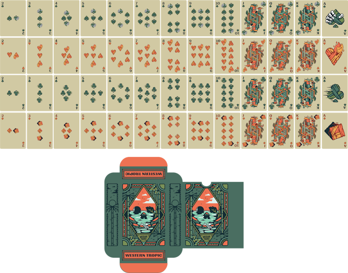
Every once in awhile a card game comes out that makes you go... "why didn't I think of that??". This is one of those games. Conceptualized by Len Kendall and currently funding on Kickstarter, Western Tropic takes a standard game and evolves it into something greater. Brilliant!

Western Tropic is played with a deck of standard playing cards but it utilizes a set of custom components and symbols that give the game far more depth. The game includes a custom 52-card deck that can be used for any standard card game. In addition to the typical suits you see on a deck of cards, the Western Tropic deck includes suits that remind you of each suit's abilities.


The gameplay utilizes a 5x5 grid that acts as a communal, but ever-changing set of cards that players use to create the best possible poker hand. Much like Texas Hold'em, each player has hole cards that are unique to them. What makes it fun and challenging is the use of an extra (third) hole card each round that can be traded in, to grant various actions such as moving your character around the grid, or changing the grid, altogether.

Here are 5 things you should know about Western Tropic:

1. This deck of custom cards was originally designed for use with the upcoming tabletop game Western Tropic. The game takes the spirit of Texas Hold'em poker, but adds significantly more depth and strategy to the game by utilizing additional components and rules.


2. The playing cards that come with the deck, art by graphic designer Brooks Engel (Instagram: @nowherelandsupply), received so much attention. Len told Kardify," I decided to offer the deck on its own for those who were only interested in the playing cards. Since there is a strong community of playing card collectors, this has proven to be a very popular option for the Kickstarter campaign. The deck has also picked up quite a bit of attention on Reddit.


3. The theme of the game and the corresponding design is a juxtaposition of two genres that generally don't go together: The Wild West and Tropical/Jungle. The premise of the game is that an eccentric billionaire hosts an annual card game tournament on a remote island in the Pacific. Since he's a fan of Westerns, he has recreated an old west town in the middle of this island (think West World if you've seen that show). "The real-world island that actually inspired the game is called the Palmyra Atoll. I even had an artist sketch a fictionalized version of the island to add further detail to the world I'm building around this game (image below)".

4. While these two opposing themes are mixed in through-out the full game, you can also see the subtle combination of them solely in the card deck. "The tuck box focuses primarily on the island art (with hidden skull graphic created by the design) while the actual cards are a combination of the two themes. For example, the King card leans more into the cowboy feel, but the leaves surrounding him still tie back to the jungle elements. The overall color scheme also is meant to reference both desert and the jungle environments."


5. As of right now, Len is only going to produce/sell these cards via the Kickstarter campaign. It will be active until October 11th. The actual cards will then move into production and will be available by or before February.

Printed by AdMagic, the standalone Western Tropic Playing Cards is available on Kickstarter for $10 or get the full game for $25!

[post_ad]

Kardify Magazine Issue 96 NOW on Patreon

We just released Kardify Magazine Issue 96 on Patreon! Patrons who pledged $3 or more will be able to download the latest issue from our Patreon page. This issue compiles selected articles published from mid-April to mid-May. Deck images, articles, and news to keep you informed and up-to-date with the latest playing card news, releases, and previews. If you love playing cards, you will love Kardify Magazine!

Also, don’t forget to check out our other cool reward tiers on Patreon! The tiers include monthly desktop and smartphone wallpapers, a mystery deck shipped to you every 4 months of ongoing contributions, social media shout-outs, and multiple sponsorship tiers! Check it out!

Funds received from the magazine will help us keep the site running and growing, and bring new quality content to you. Our aim is to support designers by backing crowdfunded projects and supporting magic and playing cards retailers with their new releases. If you want to support us, please head over to our Patreon page. If you have an idea for an article you would like us to pursue, do get in contact with us. We hope you enjoy the read. In this issue:   

Swiss Franc Legal Tender: The latest addition to Kings Wild’s Legal Tender series. Continuing the tradition of blending cur- rency design with playing card craftsmanship. Find out more!

Room 52 x 52: From Lunzi & TCC, a hand- illustrated deck that trans- forms everyday doors into portals of imagination- a story behind each unique door!

Cyclopeans CyconiumA unique deck by Stockholm17 forged in the depths of myth and leg- end featuring intricately designed card backs and face cards. 

Golden Eagle No.7 Vintage: Have a look at this beautifully crafted deck is inspired by A Haines Playing Card’s love of British Birds of Prey, combined with their love of classic decks of playing cards.

Laval Lamp:  Flaminko Playing Cards is back with a vibrant deck inspired by the hypnotic movement and bold colors of classic lava lamps.

Tanuki Yukaku: This rich and imaginative deck invites you into a mesmerising world of charm, illusion, and tradition, brought to life through the lens of a mischievous tanuki courtesan. Check it out!

Grid Series 6: The eighth deck in the GRID collection by Luke Wadey features a bold full-bleed neon orange back with white accents, custom faces, pips, and typography inspired by an isometric grid. Find out more!

… and more! 48-pages of articles and deck images. Enjoy!

Matrix Edition 2 Playing Cards


Matrix Edition 2 Playing Cards, designed by Luke Wadey, are inspired by historic Swiss graphic design experiments, particularly the International Typographic Style’s pioneers like Armin Hofmann. This deck is a follow-up to Matrix Edition 1 and is currently live on Kickstarter.

The second Matrix deck features a two-way back design and a fully customized deck and tuck box. The product features neon Pantone ink, giving it a vibrant and eye-catching appearance. In addition to its striking design, the set includes four bonus cards, including a double backer card from the Matrix Edition 1. The Matrix decks are based on historic graphic design principles, particularly those exploring the fluid matrix of circles. This design experiment focuses on creating dynamic shapes from a grid of circles, resulting in abstract and recognizable forms.

The Matrix Edition 2 deck evolves this concept, featuring new pips and courts on the card faces and a symmetrical (two-way) back design with neon yellow ink contrasting against black and grey sections. The narrow border creates interesting shapes in fans and spreads, with colors designed to captivate spectators. The neon ink used on the cards and tuck box reacts under UV light, making the yellow sections stand out prominently.

The deck includes 13 different card face shapes using the circular grid, combined with custom pips to enhance functionality. The power ace (Ace of Spades) features an enlarged pip graphic made of circles, and picture cards are recreated in a minimalist circle design overlaid with large ‘K, Q, or J’ letters.

The tuck box wraps around with a representation of the card back displayed across three sides, and the neon yellow ink creates a striking visual effect.

Standard editions are printed by WJPC using the linen-finished 300gsm German Black Core Paper, while the Limited Edition 2 features a new full-bleed design and colorway will be printed by MPC, including three additional cards, a hand-numbered sticker seal, and a personalized additional Ace of Spades.

Pledge starts at $18 on Kickstarter.

Case Study: LEGACY Playing Cards Relaunch?


After 3 successful projects- The Grid, The Grid 2.0 and Necronomicon, the guys from 4PM Designs (4PM) launched LEGACY at the end of Nov13. The project currently stands at $13.7k of their $15k goal with over 20 days remaining. According to our data provider Kickspy, the project is trending towards $21k (144% funded).


Everything seem to be on track. Project update on the Dec 27 gave the impression that everything is on track with a new add-on being offered. Then came the bombshell- On Jan 1, an update was sent out to all backers.
... As the Legacy struggles forward we have been considering different options for this project and our next. We have gotten plenty of good reactions to the decks and had big plans to continue the Legacy series as long as there was a demand for it. However, it doesn't seem that time is now. Before we go further, no we are not abandoning the Legacy decks. We love our Legacy decks and do plan to release it. We hoped to raise enough to have all the bells and whistles put on the decks but at the rate funding is going, and the costs of producing a minimum of 5,000 decks (2,500/2,500 each color), it makes things difficult. Instead of blatantly canceling then relaunching the project, we are presenting supporters of the 4PM brand some options, as new ones have been brought to our attention. Our planned KS deck to follow Legacy is planned for a February/March release. The reason why it would be launched so quickly is because of a business opportunity (which will make producing decks easier for us)...
The word struggle and cost caught my eye. From a backer's point of view, being 92% with more than 21 days remaining doesn't look like the project is struggling. Surely this project will be funded given the time. Also, why wasn't this decision made ealier?

In my opinion, this came down to inadequate planning, which indirectly affecting cost. Firstly, 4PM probably didn't expect the growth rate to slow drastically over the holiday period. Can't blame them seeing that their past 3 projects were all above the $40k mark. Also, LEGACY's day 1 stats were pretty impressive with over $6k raised within the first 24 hours. That's 44% of the funding goal.


Secondly, launching a project over the holiday period is always risky! For me, it's not about the money but more about the buzz and interest it generates. People do spend less time in front of screens during the holiday period and with all the traveling, family time and holiday sales that is going around in Dec, it is really hard to capture interest. I for one did not see the creator in the forums promoting the project or any social media marketing campaign. I tried contacting 4PM earlier in the campaign requesting for some non-watermarked photos of LEGACY for a write-up on Kardify to help spread the word. No reply.

Thirdly, 4PM were very ambitious to start with. Setting a lower funding goal to attract backers is great but what happens when it is just 5%-10% above goal? Potentially, 4PM would have to pay for and fulfill all of these products which costs above the funding goal leaving the bottom line in the red. The ideal scenario would be to have a lower goal and reaching upwards and above. Obviously, that is not happening fast enough. With all the extra feature 4PM planned to introduce over the course of the campaign- specialty inks, custom seals and tuck texturing, one would wonder why 4PM would take the risk and set the funding goal to the minimum.

Here's how 4PM describe the situation in terms of costing:

Fourth, on Christmas Eve, the Postal Regulatory Commission voted to hike the cost of sending letters, magazines, and packages by about six percent, starting Jan 26. Business groups are already howling over the above-inflation increases.This is unfortunate for projects launched before Dec 24 but one that is beyond almost anyone's control and hence, a higher funding goal is a good contingency.

Having said that, 4PM did the right thing by communicating and getting feedback from backers about the proposed options. Although not a popular choice, backers were able to vote for the deck colour they prefer for the relaunch.

Also, I applaud 4PM's choice to maintain the quality and their vision for the LEGACY deck. Not easy but at the same time, backers do share in the same vision and want to get their hands on this beautifully designed playing cards.

A decision to relaunch the LEGACY project will only hurt 4PM's reputation and trying to win backers trust (especially early backers) will be challenging. With more than 20 days to go, 4PM should give it a go and start focusing on social media marketing and maybe start introducing stretched goals to fund the extras and at the same time generate interest.

This classy deck will be printed by USPCC. Currently (if no relaunch) available in two colours- red and blue, the LEGACY deck will be Bicycle branded. Pledges starts from $23 for a pair of LEGACY deck. The first deck is due out to the backers by August 2014.

I am a backer and I want to see this project succeed! Fingers crossed.

Data provider:


Deck View: Bicycle Draft Playing Cards


Blue. Artistic. Grid.

The Bicycle Draft Playing Cards are designed by Randy Butterfield of Midnight Cards, and produced by Will Roya of PCD. This fully custom deck features USPCC’s Maiden Back and traditional white line art on a blueprint grid paper look.

The Hearts and Diamonds large pips contain Red borders to maintain familiarity. To complete the blueprint feel, accent shapes and markings are added symmetrically to each Face Card. The Tuck Box for the Draft Bicycle Deck emulates a blueprint drawing pad. The black bounding at the top wraps over to the front and back, and the sides graphically feature the individual edges of each sheet.

Printed by the UPSCC and available NOW on playingcarddecks.com for $10.99

News: Latest Addition to the LUXX Collection- Greille Playing Cards


Beautifully illustrated by Rick Davidson, Greille is the latest addition to the LUXX collection from JP Playing Cards. Inspired by Aztec and modern grid-like patterns, this deck blossomed into life with its' stunning foil printed backs.


The detail and intricacies of the foil backs make Greille stand-out from most decks in the market.


According to owner Paul Middleton,
The goal with LUXX was and always will be to create decks to be used and enjoyed. By printing with Legends on classic finish the deck is just as practical and handles as well as any other in the collection.

We were told that there are less than half of the matching sets (paired numbered seals and matching dealer coin) remaining.


Also, the stunning gilt-edge editions are now available for Elliptica and Palme. These are produced in collaboration with a highly-skilled English craftsman. Definitely a stunning gift collectors during the holiday season. Check it out, here!

Greille Playing Cards are available now on JP Playing Cards.


© all rights reserved
Kardify 2013