


 Randy Butterfield is one of the playing card industry's most dynamic designers. By day he works in product/display design and by night he works on some of the industry's most sought after designs. So sought after that two of his decks are currently sold out. With news of another deck on the way, we got in touch with Randy to see if he would be interested in doing an interview about his career and with his involvement in the playing card industry. Randy agreed and gave us insight into a lot more than just his playing card designs. If you are a young designer looking to make your mark in this world, Randy's insight and knowledge can serve as great advice to your budding career. Read further for the interview, Randy's designs and even some family photos....
Tuck Case: How long have you been a designer?
Randy Butterfield: Well, I graduated from Central Michigan University in 1995 with a Bachelor of Fine Arts in Graphic Design. During the first few years after college I was working in the pre-press department of a print shop in Toledo, OH. I learned a lot about how to build clean files for print and how to fix any file problems that could bring any postscript printer to it's knees (you would not believe how bad some of these "print" files were built)! That job really molded how I work to this day.
While in Toledo I would also freelance design for some local clubs and did a lot of design for a local Music Magazine called The Glass Eye. In 2000 I moved to San Francisco and found my dream job with Motive Marketing (www.motivemktg.com). I met my wife in California and around six years ago we moved to Indianapolis to start a family in the midwest. I continue to work at home for Motive during the day, and then work on any personal projects and card designs at night after my wife and kids are sleeping - the main reason for the name "Midnight Cards".
Tuck Case: How did you get into playing cards?
Randy Butterfield: Seeing the Kickstarter project of a fellow Indy designer is what inspired me to create my own Deck. It was Adam Clarkston's Revision 1 Deck back in August 2011 (it's sad to see what's happened with Adam's Army Men Deck). After seeing the KS project, I searched around and found the playing card forums and the various playing card & magic companies. Shortly after, I got to work on the Ornates with the goal to design a very unique deck that could still be playable.
Editor's note: Long story short, The Army Men Deck was successfully funded on Kickstarter last fall. However, Due to various reasons in and out of the creator's control, it was unable to be completed.
Tuck Case: Do you have any favorite playing card decks?
Randy Butterfield: I enjoy collecting all varieties of playing cards. Some of the more recent decks I like include Artisans, Bohemia, Curator, Origins, Aurum and Federal 52. I feel that even a deck with re-colored standard courts can be a real piece of art. The Back Design and AOS (Ace of Spades) on the Artisans are unbelievably beautiful!
The only type of decks I don't get into much are the comic-style illustrations found on a lot of the mediocre Kickstarter decks. I'm hit or miss when it comes to minimal designs. They have to be done extremely well to be worth the price of admission.
Tuck Case: How has your work with Motive Marketing prepared you for designing playing cards? Any challenges?
Randy Butterfield: Even though we're a very small team at Motive, we churn out a ton of work for some demanding and high-profile clients. After spending the day working on anywhere from 8-14 projects, all with tight deadlines and unique challenges, it's refreshing and peaceful to switch gears to work on cards at night. The best luxury of working at night is the absence of distractions - no phone calls, e-mails or kids beating each other up (the downside of working from home during the day). I may only work a couple hours a night, but it's definitely some of my most productive work throughout the entire day!
Tuck Case: How is designing for alcohol clients different from playing card design?
Randy Butterfield: Almost all of the work for my day job eventually has to get approved by our client who needs the work, lawyers within the spirits company and sometimes even a brand team. The brand teams get involved if we're working on a large program or if it's something that will be used nationally for a big brand like Absolut or Jameson.
Some of Randy's Alcohol packing designs (Click on link to view full size):
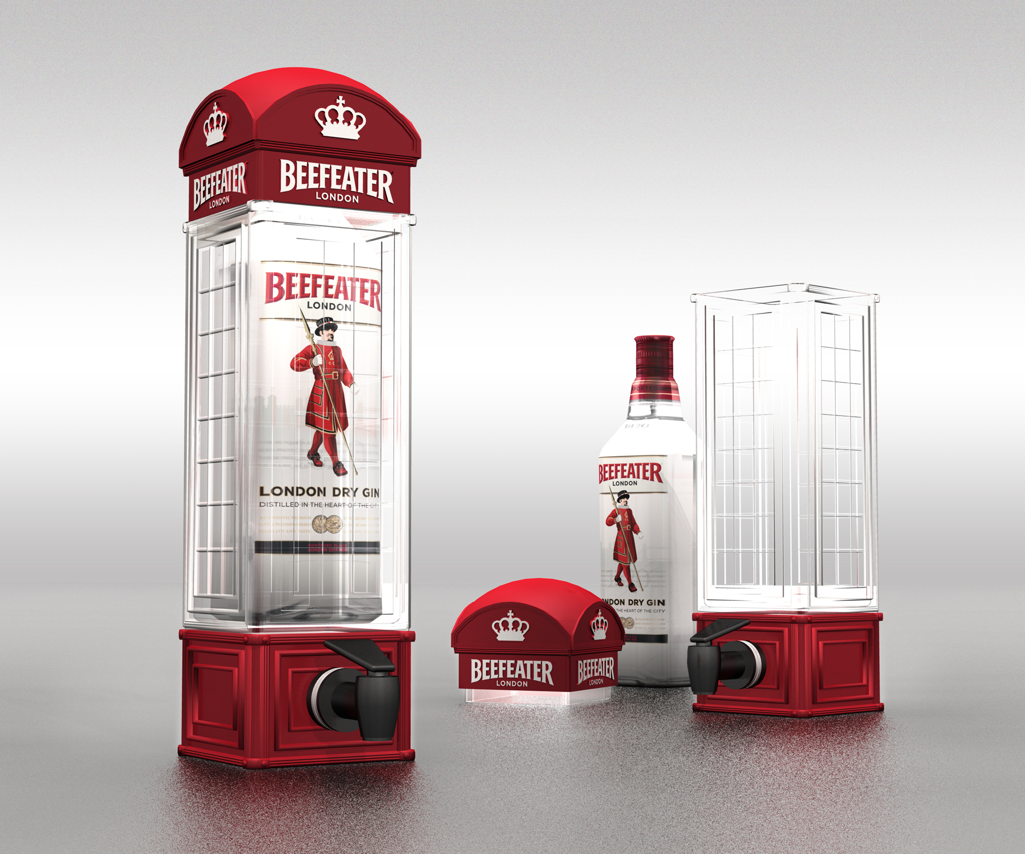

Designing playing cards is a relief from the hectic day. The challenge is finding the happy medium of working enough each night to feel creatively satisfied and also not too much to make me exhausted the next day. My wife always lets me know when it reaches that point! I'll definitely be taking a nice break after the Imperial designs are finished up.
 |
| Randy's Wife, Susan, and Kids |
Tuck Case: How many playing card decks have you designed? Which ones are they?
Randy Butterfield: Soon it will be four overall deck designs. A couple of them have color variations to add to the number, but it's really just the Ornate Series, the Blue Crown Luxury Decks, the United Cardists Deck and the upcoming Imperial Deck.
Tuck Case: Your first deck, Ornate, was distributed by HOPC (House of Playing Cards), how did you get hooked up with HOPC?
Randy Butterfield: In January of 2012, I posted some images of the Ornates onto The Discourse forum and got some very positive responses. A week or two later I received a PM from Kevin Reylek of The Blue Crown. He informed me about a new company (House of Playing Cards) they were starting that would concentrate on custom playing cards from designers and artists all over the world. It sounded very promising, so I signed on!
Tuck Case: Ornate is currently out of stock on HOPC, will it be printed and sold again?
Randy Butterfield: All I can say is the original series of four will never be reprinted.
Tuck Case: A lot of decks are put out today with Kickstarter, is there a reason you chose to not use Kickstarter for Ornate?
Randy Butterfield: At first the plan was to go with Kickstarter. After learning about HOPC, I decided it was worth the wait to see how it played out (it was still months away from the site launch and the Ornates were in line after the launch Decks).
Being part of the HOPC "family" has been a real thrill ride. I have absolutely no regrets on the decision of going with HOPC over Kickstarter.

Tuck Case: How did you get involved with the Blue Crown Luxury deck project?
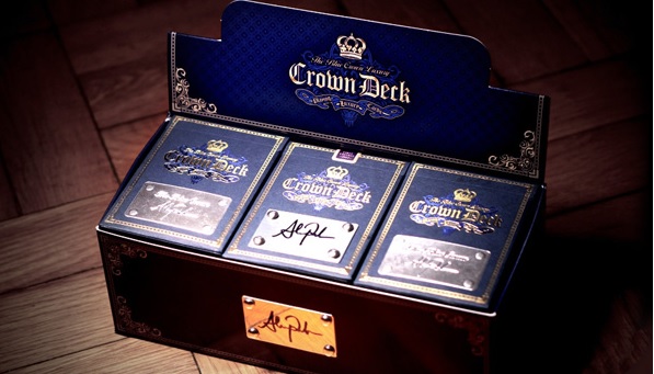
Randy Butterfield: Shortly after the Ornates' release Kevin mentioned that they were planning to do a Luxury version of their Crown Deck. He asked if I was interested in designing it, and I jumped at the opportunity!
It was exhilarating working for The Blue Crown. Alex Pandrea served as the Creative Director for the project and had a great vision of how he wanted the deck to look. After the rigorous work on the Ornates it was a relief to concentrate solely on a few elements - Tuck Box, Back Design, AOS, Jokers and re-colored Arrco Faces.
Tuck Case: A question I like to ask all interviews - What advice can you give someone looking to create and produce a deck?
Randy Butterfield: I've noticed a lot of young designers trying to create decks for Kickstarter. My advice to the younger designers would be to go to college and try to become successful in the design industry before trying to tackle something as daunting as a deck of playing cards. If I would've attempted this when I was young it would've been horrible! Of course, nowadays some kids think they're fluent in Photoshop before they're even out of high school. I'm old. I still remember working with Photoshop 2.0 while at CMU. No layers!
I guess another piece of advice I would suggest is to checkout the designs from the card and magic companies. Designers should look at the company decks to gauge the level of quality to strive for, not Kickstarter. For every one beautiful Kickstarter deck, like Federal 52, there's about four or five eyesores, like the Brite Neon Deck.
In the coming weeks we will be releasing news about Randy's upcoming playing card deck called Imperial.
In the meantime, check out Midnight Card Company on Facebook.
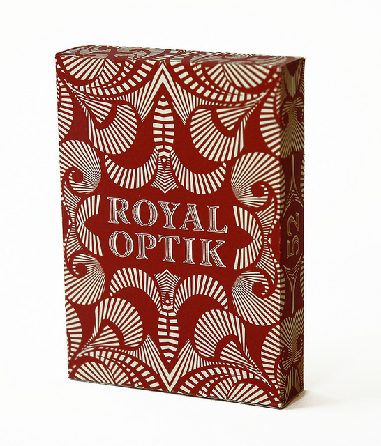
Here are some more of Randy's designs:




 Kardify is the leading online destination for playing cards news, reviews, and cardistry culture. Enjoy the best editorial content daily.





