Responsive Ad Slot

Showing posts sorted by relevance for query MPC. Sort by date Show all posts

Kickstarter: 5 Things You Didn't Know About MPC and the Impressions Foil Playing Cards Series


The Impressions Foil Playing Cards Series are designed and manufactured by MakePlayingCards (MPC). This unique deck series were created using high gloss embossing technique with a metallic layer infused to give it a very glossy look that is both eye-catching and at the same time a unique touch and feel aspect to the cards.

Currently funding on Kickstarter, the Gold and Silver embossed foil backs is the third Impressions Foil in the series. Here are 5 things you didn't know about MPC and the Impressions series:


1. MPC is a large custom playing cards manufacturer. MPC not only produces their own brand of playing cards but are in fact a large tabletop games printer and manufacturer of over 35 years. According to Alex Tse of MPC, "We produce games for many of the large retail tabletop game brands out there. Our experience in this industry allows us to make playing cards exactly the way we want it in terms of material, handling, quality, print and production, thanks to our very talented R&D and production teams. We have made huge investments in different state of the art machinery which allows us to manufacture with no minimum order quantity on most items, something that is very hard to achieve in this industry. This coupled with our very flexible and powerful user-friendly online playing cards maker, makes MPC one of the best choices out there if you need playing cards or card game production."


2. This is the third Impressions Foil playing card series and the fifth in the Impressions series. "We continue to release more playing cards under this series due to their ever growing popularity in the market. The gold and silver decks have in fact been developed for a while now but we have so much in the works that we have only been able to release it now. Arriving at the chosen shades of gold and silver took us a very long time. We wanted a gold which is not too gold but rather that it should show elegance and luxury. The silver then followed and we had to make sure that its color matched the gold as well. The handling of the cards is simply great and we love it. Developing the recipe for it so that it has the right balance of beauty, practicality and handling were painstakingly difficult and time-consuming."


3. There may be another surprise release "We do have something else in planned which we will release in due time. All we can say is that it completes the set for this Kickstarter and that we’re very excited about it."

4. Alex is the guy who is in the frontline communicating with the Kickstarter backers and came up with the Impressions series. Alex came up with the idea to apply the very special high gloss embossing onto playing cards. It was a huge risk to take doing this for a number of reasons including that it has never been done before therefore, involved huge amounts of development trial and error. Also that this new concept may not be accepted by the playing cards industry. Nevertheless, MPC decided to go with it based on Alex’s hunch that it would be successful.


5. We know it as Impressions technology but MPC calls it high gloss embossing. It is such a unique printing and production method that can only be found on MPC playing cards. "The machine that we have in our possession is not a common one but having the machine itself means nothing. The investments in R&D to develop these cards with high gloss embossing and foil layer as found on this Kickstarter is a feat of engineering in the printing and manufacturing industry. We have the high gloss embossing available to customers who wish to use this technology with their own designs which can be found on MPC's website but not with the foil layer as this is exclusive to the MPC branded cards only."

Available Gold and Silver. Pledge starts from $16 and half and full metallic brick box and uncut sheets are available as add-ons. Check out the Kickstarter campaign here!

Cardistry: MPC Beta ONE Playing Cards


As seen during Cardistry-Con 2018, Hong Kong, the MPC Beta ONE Playing Cards represents a huge milestone in the history of MPC. Every one of the 200 attendees received a deck. This was the first time anyone outside of MPC got to test out the new card stock and finish which has been in development for close to 3 years.

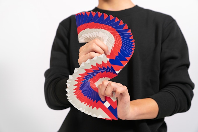
It is completely re-engineered and designed specifically for the mesmerizing art of Cardistry.


The concept which determined the aesthetics of this deck was created by Alex Tse who aptly named the deck called The ONE for several reasons. The design is based on the number 1. This is the 1st deck ever that uses this completely new development by MPC on playing cards. The aim was to create the best possible deck in terms of feeling and handling for performing Cardistry and card magic.


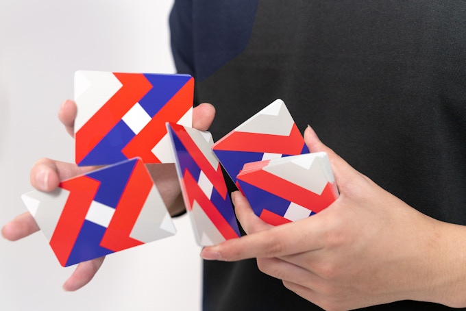
The back design is made out of two number 1’s diagonally facing each other on opposite corners. It was designed in a way that fully complements and enhances card flourishes such as card fans, springs, cuts, and spins to name just a few. A borderless design is adopted in order to accentuate each and every move performed.


The card stock used on The ONE is nothing like you’ve ever handled before. The Linen Air Light is thinner, lighter, softer and possesses the perfect level of stiffness needed for amplifying your Cardistry and card magic skills.


Meanwhile, the finish fully complements the Linen Air Light and produces a handling experience that’s nothing short of amazing. Silky smooth for fans, spreads and with an element of stickiness for cards to stick together, to your fingers as and when you need them to. MPC call it the Beta finish. Limited to 5500 copies and available now on Kickstarter. Pledge starts at $14.

[post_ad]

MPC Peach & Pumpkin Fluorescent Ink Playing Cards


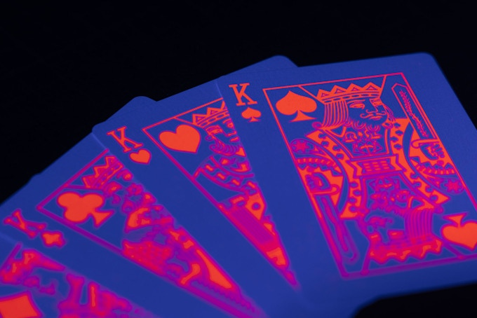
MPC's eye-catching fluorescent deck series continues with Peach & Pumpkin edition. The decks feature fluorescent neon ink printed on both sides which intensifies in UV light. Like the neon green edition, the design of the deck features the tree back design and face cards. A special highly fluorescent ink is used on the artwork on both sides of the card. 


The eye-catching fluorescent neon colorways are used on both face cards, card backs, and the tuck box (exterior and interior). According to the campaign page,
The Peach Edition Fluorescent Playing Cards uses a fluorescent peach pink for both the card front and back as well as on the tuck box. The Pumpkin Edition is a light orange color.


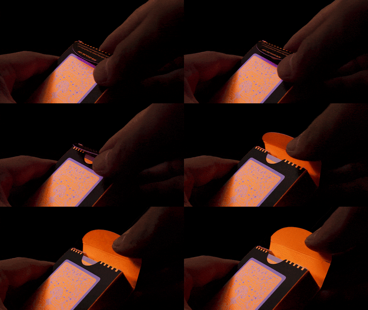
The tuck box used for MPC's Fluorescent decks are 100% made from recycled paper and finished off with a matte water-based varnish to protect the print. To add that extra special touch, MPC will print the respective fluorescent ink on the inside of the tuck box too producing an amazing glow the moment you open the box. 


The cards are produced on MPC’s M30 linen air-light card stock with their renowned BETA finish creating a deck that is very smooth, snappy, springy as well as flexible, which is needed for all those complex card movements as used in sleight of hand card magic tricks. 


The Peach and Pumpkin editions will be a limited run of 2500 decks each. Less than 48 hours remaining on Kickstarter! 

[post_ad]


Fried Chicken Scented Playing Cards by MPC

Seeking funds on Kickstarter, Fried Chicken playing cards is a new concept in playing cards produced by MPC. Combining the mouth-watering aroma of hot fresh fried chicken and superbly engineered playing cards, the 2 favorite things for many of us!

Over a year in the making, the Fried Chicken playing cards is the world’s first-ever scented deck of cards. According to MPC on the campaign page,

It is not an easy task but as always, backed up by our rich history in making unique custom playing cards, we decided to challenge the norm and do just that.

Adding smell to a deck of cards does in fact affect the smoothness of the entire deck and changes its dynamics of it. MPC continued,

We applied the scent to the deck in a way that absolutely keeps the deck in pristine performance condition whilst smelling like fried chicken while you’re handling the cards.

Using microtechnology, fried chicken fragrant essence oil is trapped inside tiny microcapsules which is then cleverly applied onto the cards as well as the tuck box. When you handle or rub the cards or box, the microcapsules break and release the delicious fried chicken aroma. The whole concept is genius!

The design on the cards has been redrawn and contains 4 different popular chicken pieces namely the chicken wing, drumsticks, thigh, and chicken nuggets.

The Aces are designed in a way to make up the 4 different pips in a traditional deck of cards. The court cards are redesigned so that each of the king, queen, and jack contains their respective fried chicken piece. The red card back contains a white border and 2 whole fried chickens on either end.

2 joker reveal playing card designs revealing a seven of diamonds and a 3 of hearts in a fried chicken bucket. The tuck box used for the Fried Chicken deck is 100% made from recycled paper and finished off with a matte water-based varnish to protect the beautiful print. Yup! The tuck boxes are smothered in a fried chicken scent.

The cards use MPC’s renowned M30 linen air light card stock coupled with BETA finish for superb handling. Now on Kickstarter for $16. Limited to only 1000 decks.

Check Out MPC's Transparent Plastic Playing Cards on Kickstarter


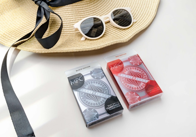
Transparent Playing Cards, a deck of cards fit for playing at the beach, the pool, and in the bar. If you are looking for an outdoor deck, this deck is completely waterproof and handles perfectly! 


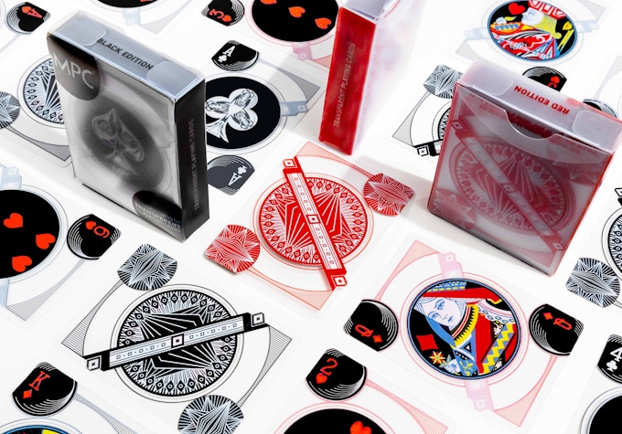
The transparent playing cards are designed and manufactured by MakePlayingCards (MPC). The artwork used on the card fronts uses the standard MPC branded card front and the card backs uses a beautiful, more complex vector artwork pattern to cleverly hide the same area as the indices and pips on the front. This prevents players from seeing through the cards that you are holding. 


Most transparent decks currently in the market do not handle well and they stick together. MPC ensures that this deck handles beautifully, made possible through the use of MPC’s specially developed card finishing. 


Two versions are on offer during the Kickstarter campaign, the Red version, and the Black version. The colors are used on the card back pattern. There are 55 cards in the deck, ace to king including 2 jokers and 1 extra card that is completely transparent. 


These cards are made from premium quality plastic transparent card stock ensuring years of use. The surface of the cards are slightly blurred which helps them to hide the artwork on the other side whilst keeping the transparency aspect. 


This impressive transparent deck is kept in a tuck box made out of the same transparent plastic! So no worries if you drop the whole deck into the pool, or into your drink. Give them a wipe and they’re good to go once again.

Pledge starts at $17 on Kickstarter.

[post_ad]

Final Hours on Kickstarter, MPC';s Gods Playing Cards


Currently seeking funds on Kickstarter, MPC’s Gods Playing Cards are based on a Greek mythological heroes theme where 12 renowned Greek heroes are used to represent all 12 characters in the court cards. 

Generally, the king cards are gods, the queens are goddesses and the jacks are young gods. According to the campaign page,

Each character was studied to ensure we had a good understanding of the character before we went into the sketching stage. And as on standard playing cards, we wanted the characters to be holding an artifact which is related to themselves such as the king of diamonds holding a cornucopia which symbolizes abundance and wealth and on the jack on clubs is Dionysus who is the god of wine so he is holding some grapes and a cup of wine. 

The card back comes in a mirrored design of Zeus, the father of all gods and ruler of Mount Olympus.

The aces took a bit of design time and they feature mythological children outlining the shapes of the 4 pips. Zeus and Hades are featured on the jokers.

The deck is kept secure on a special tuck box to compliment the Gods deck where there is an extended tongue on the back side of the box as opposed to the standard tuck-in box found standard on playing cards. 

Also, this will be the first deck of cards under the MPC brand which uses double foiling on a color carded box where gold and silver are foiled onto the artwork areas.

The deck will be printed on MPC‘s M30 linen light card stock coupled with the super smooth BETA finish. Pledge starts at $13 on Kickstarter.

The Aqua Deck- Invisible Playing Cards by MPC


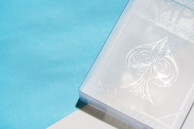
This incredible deck by Make Playing Cards (MPC) was funded in less than a day on Kickstarter. The Aqua Deck - The Invisible Playing Cards is a ground-breaking completely TRANSPARENT deck of playing cards with clear ink print.

MPC has been doing some great work with the popular Impressions playing cards series and the invisible deck continue the trend of being the first of its kind. I've never seen anything like it before.


The AQUA playing cards really is the closest thing to an invisible deck of cards that you can still physically hold. The deck is made using state of the art printing and production machinery. According to the campaign page,
We use premium transparent plastic card stock which we then apply high-gloss transparent print with pinpoint accuracy, to certain areas of the playing cards to produce a sleek raised gloss embossed effect. The cards are then completed with a finishing that enables the cards to glide seamlessly for fans and springs and perform as you’d expect a high quality deck of playing cards to perform. Cutting the cards is no problem either as we use our MPC state of the art cutter to ensure the edges are angled for cutting into. The thickness of the deck is pretty much like a standard deck of cards.

What I dislike about plastic cards is handling. They do not fan nicely and they stick together after a while. From the animated gif on the campaign page, the AQUA fans and spreads BEAUTIFULLY.


The deck is kept in a frosted transparent plastic tuck box, printed with different densities of high gloss to complement the unique playing cards. Stunning!


The Aqua deck is a very versatile deck of cards for any occasion: A unique deck for your collection, aesthetically pleasing for performances, and to amaze and definitely for game night with a twist. oh.. since it is plastic.. it is waterproof as well. So good for outdoor adventures.

The Aqua Deck - The Invisible Playing Cards is available NOW on Kickstarter and pledge starts at $20.

[post_ad]

Deck View: MPC Beta ONE Playing Cards

Smooth. Engineered. Cardistry.

The MPC Beta ONE Playing Cards marked a significant milestone for MakePlayingCards, serving as the debut platform for its newly developed Linen Air Light stock and Beta finish. First distributed to attendees at Cardistry-Con 2018 in Hong Kong, the deck was created specifically to showcase MPC’s next-generation handling technology after nearly three years of development.

Designed by Alex Tse, the deck revolves around the number one, symbolizing both its name and its status as the first release to feature the new stock and finish. The minimalist back design consists of mirrored numeral “1” graphics arranged diagonally across a borderless layout, creating striking visuals during fans, spreads, cuts, and other cardistry moves.

The real focus, however, is performance. The Linen Air Light stock is thinner, lighter, and softer than traditional playing card stock while maintaining enough stiffness for flourishing and magic. Paired with MPC’s Beta finish, the deck offers a smooth handling experience with a balance of glide and grip, making it well suited for cardists seeking maximum control and visual impact.

Available for $13 on Make Playing Cards.

Kickstarter: 7 Questions with Bryan Sloan of the Wizard of Oz Deck


Designed by extraordinary digital artist Suzanne van Pelt and produced by LUX Playing Cards, the Wizard of Oz decks are a fully custom deck of playing cards, inspired by L. Frank Baum’s fantasy novels. The decks feature new art, embossing and foil on the tuck, and the new "Impressions" technology by MPC which allows the card back to be raised/lifted/glossy so that you can actually feel the embossing on the card back.

A lot of thought has gone into the design and layout of the deck. For example, the Spades feature the evil characters, while the Diamonds portrays Dorothy with two very important Oz characters, the Wizard and the Scarecrow. The Hearts are represented with the Cowardly Lion and the Tin Woodman, along with the Good Witch of the North, all of whom helped Dorothy and the Clubs are made entirely of characters originally from Kansas, including Aunt Em, Uncle Henry, and Toto.


We had a quick chat with Bryan Sloan of LUX Playing Cards on the design background & idea behind the Wizard of Oz deck and his experience from his first Kickstarter project.

When did you start work on the Wizard of Oz deck?
I decided to do this deck in March, almost 1 year ago. So we planned and outlined the characters and commissioned the art from Suzanne van Pelt of Norway. She did a great job by making the characters unique.

Tell us about this new technology you are using for the deck?
We also wanted to experiment with the technology with the glossy raised backs on some of the cards. It's a feature that goes well with the "fantasy" theme, and then of course we wanted some decks printed by USPCC.


Can you tell us more about the artwork and the design of the deck?
The art itself is very intricate, and the final product will be amazing. I'm glad to see that the Aves deck has been received so well, and I am hoping that these will be printed so everyone can enjoy the new art by Suzanne. The card back itself is a balance between good and evil. The tornado from Kansas that picks up Dorothy can be seen, and it looks 3 dimensional. The negative space between the axes and brooms create the letters "O" and "Z" to help create the OZ deck. It's a really creative back design that I can't wait to see in-person.

That being said, the Wizard of Oz deck is very different from the Aves deck. How did you come out with the idea for the Wizard of Oz theme?
We wanted to do something different that might appeal to a different group of card players in this new project. Our Aves deck was critically acclaimed, and even featured on the very popular Colossal sites. This Wizard of Oz deck definitely has a smaller niche target audience, although people who are fans of fantasy art will enjoy it. I'm trying to publish decks that are different from what's currently on the market, so we wanted to explore something completely outside the norm.


Walk us through the process you and artist took to design the deck. How did you get to this finished product?
Suzanne van Pelt is a fantastic artist who specializes in fantasy work, including crossing over from humans to non-humans, which was perfect for a deck in this realm. She was able to put together some amazing creatures with really intricate details. My favorite card in the deck is the Tin Woodman. The details on this card are superb, as she showed everything from the detail on the axe blade to the rust and imperfections on his attire. Suzanne started with sketches of different characters, and took her time to finish each portrait to try to bring forth the essential character and features of each individual.

What was your most brilliant breakthrough when designing the deck?
I knew we wanted USPCC to print a deck, and so we went that route, as they know how to put out a fantastic product which handles well. I then decided to do something completely different, and offer the new "impressions" technology from MPC which allows each card to have a raised glossy feature. Instead of on the card faces as MPC did with their successful campaign, I put the raised glossy feature on the card backs. I think it's a great feature to have on a card back that sets the deck apart from other typical decks. It's a fun avenue to explore and it's definitely a new feature to have fun with.


You have successful completed the Aves deck. What are a few key elements and principles you incorporated into your project that you think future Kickstarter creators could benefit from knowing?
I love seeing creators try something new. The Aves deck was actually a risk because there is not a lot out there as far as fine art playing cards. Uusi is one studio that has published some great fine art decks, although we still are in the minority. There are definitely decks with great detail (anything by Lorenzo Gaggiotti) but on the face of it, Aves, a deck featuring art inspired by birds, doesn't hit home with a lot of people. That is when the art speaks for itself, and the talent of the artist can reach out to people.

Thank you for your time Bryan and all the best! If you like what you’ve read here and want to support the Wizard of Oz deck, you can find it on Kickstarter here


The Wizard of Oz Playing Cards will be available in two editions: Bicycle branded edition by USPCC and Emerald City edition by MPC with new embossing technology to accentuate the art on the card back. Pledge starts from $12 and the uncut sheet is available as an add-on.


On Kickstarter, Aqua Black Invisible Playing Cards by MPC

MPC's Aqua Black Invisible Playing Cards are a fusion of sleek design, cutting-edge technology, and durability. This limited-edition deck funding now on Kickstarter takes playing cards up a notch with its transparent black aesthetic, featuring clear raised ink for a mesmerizing embossed effect.

Crafted from premium transparent plastic, Aqua Black is 100% waterproof, including the box... making it perfect for any environment, from a card table to the poolside.

The deck is engineered for smooth handling, allowing for seamless shuffling, fanning, and cardistry without the usual clumping seen in plastic cards.

The matching black transparent tuck box adds to its futuristic appeal, complementing the deck’s striking, see-through design.

Whether you're a collector, a magician looking for innovative tricks, or simply someone who appreciates a stunning deck, Aqua Black is built to impress. Printed by MPC and limited to just 5,000 decks, Aqua Black is available on Kickstarter for $20.

Less Than 24 Hours! Fluorescent (Neon Edition) Deck on Kickstarter


Another eye-catching deck by MPC funding on Kickstarter. Fluorescent (Neon Edition) Playing Cards is a fully fluorescent deck with neon ink printed on both sides which intensifies in UV light. 


The design of the deck is similar to MPC’s Impressions series featuring the tree back design and face cards. However, a special highly fluorescent ink is used on the artwork on both sides of the card. 


The eye-catching fluorescent neon yellow-lime green colorway is used on both face cards, card backs and the tuck box (exterior and interior). According to the campaign page,
We chose this color as this is the most common and popular color associated with the term “fluorescent”.

The cards are produced on MPC’s M30 linen air-light card stock with their renowned BETA finish creating a deck that is very smooth, snappy, springy as well as flexible, which is needed for all those complex card movements as used in sleight of hand card magic tricks. 

The Neon edition will be a limited run of 5000 decks and available NOW on Kickstarter for $14.

[post_ad]
© all rights reserved
Kardify 2013