Responsive Ad Slot

Showing posts sorted by relevance for query sam hayles. Sort by date Show all posts

Designers: Big Blind Media Interview Part II- Dose Production's Sam Hayles Discusses Karnival Elite


This is part II of a two part interview series with Big Blind Media. Part I interview with Big Blind Media's Owen Packard can be read here

As Owen Packard mentioned in Part I of the Big Blind Media Interview, he calls on the creative mind of Sam Hayles. Sam is the designer for all of Big Blind Media/Karnival playing cards and is not new to the style Owen seeks to obtain. Sam runs Dose Productions out of Edinburgh where his design background reaches back to the late 90's. With Dose Productions, Sam has created some of the darkest, most bomb-dropping and edgiest designs to ever grace the music scene and now the playing card and magic industry.


Sam's work defies what we thought we knew with designs that range from futuristic color bombs to abstract premonitions of the apocalypse... or of an alien abduction...or of a trip to Hell. And just when you thought Sam was only about heavy metal, he throws in a touch of elegance and sophistication. It is all there.  His most colorful designs are his darkest designs with a depth that just can't be reached. Sam Hayles' artwork is all out madness that sucks you in every time you pick up a deck of his cards or flip through the cover art of an album he designed.

In Part II of our interview with Big Blind Media/Dose Productions, TuckCase.com spoke with Sam about his venture into the playing card world and his thoughts on the upcoming Karnival Elite.

Tuck Case: In terms of concept and design, what kind of images/imagery can we expect with this deck? and why did you go with those images?
Sam Hayles: The concept for this deck : Elegance, dark and baroque. I used lots of ornaments and also images of imaginary animals like unicorns and a phoenix.

The deck is all black with lots of white and a hint of red. No skulls in this one. Oh surprise! Just to prove that we can do it!


Tuck Case: How long was this deck in the making?
Sam Hayles: I would say a couple of months as we first talk about the concept of the deck and then find and decide on the the name. We then try out different typography. I then work on experimenting the first designs to find the style we will use on the full deck. I usually start with the Ace Of Spades or the back design.

I did a nice owl design for this one but at the end we didn't use it as we only wanted to use imaginary animals.

Tuck Case: Since your decks have a lot of "heavy metal" imagery, what bands have you been listening to lately while designing? Any specific band on your playlist during the creation of Elite?
Sam Hayles: This was done between end of 2012 and beginning of 2013. I always listen to music when I work so I do have a LOT in stock.


I can't remember what was on my playlist during the Elite period of creativity. I am currently enjoying listening to the latest albums from Alice In Chains, Queens of the Stone Age, Boards of Canada, Clutch, and Earthtone9. My regular favs in my playlist are bands like Faith No More, Soundgarden, Interpol, NIN, Killing Joke, Fugazi, Massive Attack, Napalm Death… I also listen to a lot of film soundtracks.

Tuck Case: It is known that USPCC/Bicycle censored some of your work from being printed. How has that impacted you and your work going forward?
Sam Hayles: It hasn't changed a thing really. I oppose all kind of censorship and I truly believe that the worst thing about censorship is........

Tuck Case: What do you use to design? What is your tech setup/workstation?
Sam Hayles: I am a pure 100% Mac user. My dad bought the first Apple Macintosh in 1984 and as a kid I was like amazed by this machine.

Today - I have a Macbook pro, the latest iMac 27" with a second 24" screen and a good old Power Mac G5, which has been serving me well for more than 7 years now.

I mainly use Photoshop and Illustrator. I don't use a tablet much. I rather draw on paper and scan in my drawings.

Tuck Case: What advice can you give other designers looking to produce a custom deck of cards?
Sam Hayles: Be original and creative and do your own thing.

Here are some of Sam's designs courtesy of Dose-productions.com as well as a video of Karnival Elite Playing Cards in action by Ric Edgell:


7 Questions with Yassine Boudraa of 5 of Spades (Dark Edition) Playing Cards


Conceptualized by Yassine Boudraa, the 5 of Spades Playing Cards is an intriguing deck featuring the artwork of UK designer Sam Hayles. The centerpiece of the artwork focuses on Yassine's brand, 5 of Spades. The iconic logo has been prominently featured on the tuck, card backs and the custom 5 of Spades card (instead of the Ace of Spades).

The meticulously crafted deck features 56 cards with Cartamundi standard faces updated with faded pips, indices and scratched out court cards giving it an intriguing visual that captures the imagination. Also for the curious, secrets, reveals, and codes are woven throughout the deck to be discovered.

Before the launch of the Kickstarter campaign, we had a quick chat with Yassine about the collaboration with Sam Hayles, inspiration and design process behind the 5 of Spades deck.
 
Can you tell us about yourself and how did you end up collaborating with Sam Hayles?
My name is Yassine Boudraa. I was born and raised in France and currently living in Brussels, Belgium. I am a big fan of card magic and also love cardistry even though I don't really practice it. I love collecting cards and I discovered the Karnival series by Big Blind Media, designed by Sam Hayles (aka DOSEprod). I bought my first DOSEprod deck and quickly discovered all his decks. I became a fan of his artworks and got in contact with Sam as I wanted to get a signed copy of his deck. I felt happy and pretty honored when he replied me as he is an extremely busy man. He sent me few signed decks and the collectible DOSE goodies. The logo DOSE has always been part of my life.


Months later, I became very active on Social Media and started posting on Facebook and Instagram. I posted several times, DOSEprod's decks and artworks and I was tagging him. He liked most of my posts, he began to follow me. One day, I sent him a message to thank him for reacting to my posts, he thanked me too, he felt glad and proud! He confessed he didn't have much time for advertising, broadcasting and posting on social networks. I told him that I could do it for him. He took the time to think and finally he accepted. We discussed goals, objectives, and how it was going to work. We understood each other quickly as we have the same way of thinking and working. The DOSEprod dealer was born. I currently do advertising for Sam, I promote his artworks, find new collaborations, and I sell his private goodies (teeshirts, stickers, decks, etc).

This is your first crowdfunded deck. When did you first start thinking about using Kickstarter? What made you decide to take the plunge?
I noticed that crowdfunding is an incredible way to fulfill dreams and bring a product to live! As I am currently unemployed and without funds or savings, it is the obvious way to launch my project. The Cards community is a very industry with magicians, cardists, collectors, artists, and businessmen. So Hopefully we can raise funds enough funds. I have worked on my project for 3-4 years. The design evolved due to fashion trends and even XCM became Cardistry! Many cardists designed and launched their own decks. Few succeeded, while many are still trying. I feel that I am ready to launch my deck.


Can you describe the 5 of Spades Playing Cards? and why are you passionate about it?
I imagined many different concepts and imagined a deck which will attract magicians, cardists and collectors. So after a while, I realized that I couldn't create only one design. After several deck designs, I collaborated with Sam Hayles aka DOSEprod, to create a third design for me. That was unexpected. Sam had at this moment a lot of projects but he accepted. I wanted a dark and creepy deck but not excessively. So I ended with one concept but 3 different designs. I wanted to launch them all in the same Kickstarter campaign, but I realize that it will be complicated and difficult.

I also can tell you that the 5 of Spades Deck Dark Edition are full of secrets, reveals, and codes. I will launch a contest. Backers will be able to participate and discover and decrypt the secrets. There will be several selected winners and they will win incredible gifts (decks, t-shirts, and stickers). I am very proud of my concept. With it, I managed to meet very nice people and some of them became bro's, I have many great opportunities and developed my network. Thanks to God, I am living a wonderful adventure which gives me strength, hope and positive vibes every day.


What role did you play in the art direction and how much time did you spend working on the deck?
I thought about the concept for many years. When I have an idea, I developed them and built on my concept. For months, I explained my concept and project to DOSEprod. DOSEprod is very talented and professional. He designed more than 40 different decks (36 colors, 28 different designs). After several brainstorming session, DOSEprod started work on the deck. He's a machine! He started with the back design, then the tuck-case and the 5 of Spades card, the court-cards and the faces. Finally the Jokers and THE secret Card. We tweaked some of the details, but he spent around 3 months because he was working on several projects and holidays.


Could you walk us through your “Creative” process, do you DOSEprod have a routine when designing the deck or individual card?
As I answered you for the previous questions, I wanted to imagine a different concept. I wanted to create an original deck. I gave DOSEprod details, my ideas with examples and clues I didn't want to manage him with a draw and just ask him to work it on photoshop. He's an artist. I obviously let him work freely on my concept. DOSEprod's universe is very wide and he has many ideas and reactions. To be honest, even if I am the DOSEprod dealer, I don't really know how he works, he has his own secrets. I just know that he loves to walk in parks to contemplate nature, to visit museums and historical monuments. He also finds ideas and has inspiration listening to music, watching movies etc etc..

We initially noticed the 5 of Spades deck on Instagram (@5.of.spades). What do you think of the playing card community on Social Media particularly Instagram?
At first, I was more active on Facebook. I didn't know that the Playing Card community was, in fact, more active on Instagram and Snapchat. I don't really use Snapchat and I had to create an Instagram account. Finally, it was there that my network expanded. The playing card community is a huge community! Very passionate, talented and helpful.


Finally, what are your favorite playing card decks?
Ohoho!!!! That's a difficult question! My favorite decks are mainly DOSEprod decks, obviously, but I also love most of Daniel Madison's decks (I am also fan), Dan and Dave Bucks's decks, David Blaine's decks with the awesome Mark Stutzman's artwork, The Blue Crown/House of Playing card Decks, Jimmy K's Decks (Mechanic Industries), the Bicycle Dreamcatcher by Handy Altan who also is a bro and the old vintage decks (Arrco, Steamboat, Tahoe, Stud, Aviator, etc).

Thank you for your time, Yassine! At the time of writing, the project is only 27% funded with 38 days to go. If want to support 5 of Spades Playing Cards, you can find it on Kickstarter here!


The deck will be printed by our friends at Cartamundi on the super smooth B09 true linen finish. Pledge starts at €10 and there are multiple add-ons available such as Uncut Sheet, stickers, and t-shirts.

Designers: Big Blind Media Interview Part I- Owen Packard Talks About Upcoming Karnival Elite Playing Cards


Based in the UK, Big Blind Media is a magic media and playing card company known for their "heavy metal" and edgy design work in both their magic videos and on their line of Karnival playing cards.  Makers of the darkest playing cards on the market such as Karnival Inferno, Karnival Assassins and Karnival Death Heads (images below); Big Blind Media is not afraid to push their capabilities and push the limits of what USPCC feels comfortable with printing. Fans know them for it. Fans love them for it.  Fans keep coming back for it!

Big Blind Media  is run by Owen Packard, who is also a guitarist in heavy metal band Earthtone9. One listen to the band's aggressive style and you will understand where Big Blind Media gets their vision. Owen does the same for the magic and playing card industry that he does with his band - always driving new ideas louder than ever each time he goes to work.

With that, TuckCase.com spoke with Owen as well as designer Sam Hayles as they gear up to release the next deck in the Karnival line of playing cards - Karnival Elite playing cards. In this two part post, you will learn the story behind Karnival Elite directly from Owen and Sam in two exclusive interviews only on TuckCase.com....


Tuck Case: Your next deck, Karnival Elite, is coming out rather soon, do you have a release date in mind?
Owen Packard: Yep - we are looking at mid-July for the Karnival Elite to land. It is always a loooooooooong process from first thought to release date, and we get very impatient waiting ha! But each step of the process is quite involved, so it can take a long time to get a new deck into somebody's hands!!!

Tuck Case: Why the Karnival Elite playing cards? What inspired the idea behind Elite?
Owen Packard: Well, we wanted a deck that was slightly more elegant. Something that embraced everything that defines the Karnival range (edginess, rock 'n roll, etc....) but presented a more baroque and refined vibe. Sam (Hayles - designer) and I talked at length and fiddled with a lot of ideas before we settled on this look. We are really pleased with it. It's clearly a Karnival Deck... but it's something a bit different too.

Tuck Case: What stock will the Karnival Elite playing cards have?
Owen Packard: It'll be on the standard USPCC stock. We don't tend to fiddle with the stock too much - we just use the tried and tested USPCC stock (and finish) for that unparalleled feel and quality.

Tuck Case: In a post on BMPokerworld.com it was said that there will be 5000 printed for the release? Is this a one time only limited release?
Owen Packard: Yep - just 5000!!!!

Tuck Case: In the same press release from BMPokerworld.com, it also mentioned there will be a Standard Red Bicycle 7 of clubs face up in the center of the pack. Why is this being done?
Owen Packard: Aha. Well, let's just say that magicians might be able to find a use for an errant card from another deck being face up and SEALED INSIDE a deck of Karnival Elite's!!!

Tuck Case: As a UK based company, what challenges do you face working with a US based production company USPCC?
Owen Packard: We work with USPCC via their European sister company Fournier, so there are a lot of people involved in each step of the process ha! But to be honest it is not too much of a headache. We have a US office in Florida too, so we have all global positions covered. We have been doing decks with USPCC for over 5 years now, so we have the system pretty much down, and we have a great relationship with them. And let's face it - if you want the best playing cards - you want BICYCLE!

Tuck Case: Karnival Elite Designer, Sam Hayles, has designed all of your decks, correct? How did you team up with him?
Owen Packard: Sam and I go way back. He has worked with a lot of the heavy metal and rock bands I know over the years. In fact, Sam has done the artwork for the last two albums my own band released. So we are close anyway. I would use Sam on ANY project that needed a design element. I love his work. I love his style. Plus he has an amazing ability to take ideas and generate something cooler than you can even imagine.

Come back tomorrow to read the Part II of the interview with Big Blind Media as you will hear from designer Sam Hayles.


Kickstarter: Voodoo Playing Cards by SpielKartenShop and DOSEprod


Voodoo Playing Cards is a collaboration between Sven Philipp of SpielKartenShop.com and Sam Hayles aka DOSEprod (Instagram: @DOSEprod). For those of you who are familiar with the work of visual artist Sam Hayles, you will notice that he has a thing for skulls and you will see in his design a lot of inspiration from esotericism to punk, bizarre to gothic, apocalyptic to elegant and all the bizarre things and elements from our strange world.


For this deck, he was commissioned by Spielkartenshop who asked him to design a custom deck using the Voodoo theme. On the inspiration, Sam told Kardify,
I was very excited about this theme and it was very inspiring. I remember seeing and loving the movie ‘Angel Heart’ with Robert De Niro and Mickey Rourke back in 1987 which is set in New Orleans and is related to black magic and voodoo. Of course I had to dig out my old DVD and watch it again before getting started working on this project!

Sam did a lot of research online about voodoo and the symbols and designs related to that world and also the rituals and black magic and he then used the inspiration he had found in the designs.
You will find a lot of symbols hidden in the artwork and references to the world of voodoo. For example, you will find the voodoo symbol of Baron Samedi, Patron of dead and black magic on one of the cards. He is perhaps the best-known Loa of the Vodou pantheon. Baron Samedi is often portrayed as wearing a black top hat which inspired me to do the skulls wearing one in the designs of the Voodoo deck.

Sam continued,
I also used chicken feet in the designs because for those of you who are not familiar with how chicken feet are used in magic: Chicken feet are used in arts of Voodoo as a Charm for a powerful form of protection. 

Nice touch! For the cards, Sam chose to use the sepia and old paper and grungy textures because that’s the style he loves and use the most and again fitted very well with the overall theme and style of graphics...

and also very DOSEprod style!


The deck will be printed by Cartamundi on their amazing True Linen B9 Finish. Available now on Kickstarter for €11.


Kickstarter: Bicycle Knights Playing Cards by Sam Hayles


The team at Playingcarddecks has just launched their next project on Kickstarter- Knights Playing Cards. A collaboration with award-winning artist Sam Hayles from Edinburgh, Scotland, the deck is inspired by medieval knights and their most recognized style of armor and weapons.


The Bicycle Knights deck is fully custom and hand-illustrated with great attention to detail. The cards have a vintage look and feel to them, from the two-way courts, jokers to the coat of arms aces and bold indices of each suit. You can certainly see Sam's gritty style of illustration on these cards.


This Bicycle branded deck will be printed by the US Playing Card Co on their classic stock with embossed finish. Available NOW on Kickstarter from $9.

Kickstarter: 3 Questions with Elijah Hayles of Ghoul Guys Playing Cards


Ghoul Guys Playing Cards is a monster-themed deck uniquely illustrated by 11-Year Old Elijah Hayles from Edinburgh, Scotland. Elijah Hayles is the son of playing card designer, Sam Hayles. It took Elijah over 3 months to create the Ghoul Guys deck, which started off when Sam’s client saw Elijah's drawings on his Instagram page and suggested that he make a monster playing cards deck. Elijah told Kardify,
I thought it was a great idea so we got to work on the project.
Elijah worked on the illustrations after he got back from school and during the weekends and holidays. Elijah spent a lot of time imagining and drawing all these ghoul guys. He never lost the motivation and the passion during all the process of creating his first deck of cards. Elijah also likes reading, drawing, swimming, playing tennis and playing lego.


Late last week, we had a quick chat with Elijah about the inspiration behind the Ghoul Guys deck, his plans for the future and his favorite flourish and playing cards.

1. What is your inspiration behind the Ghoul Guys Playing Cards? How did you end up collaborating with PlayingCardDecks?
I got quite a lot of ideas from what I would see or read. Sometimes I would see a monster in a film or in a book and I would turn it into one of my ghoul guys. But sometimes I just felt like drawing a crazy monster of my own. I ended up collaborating with PCD because my dad had already worked with them and had designed the Bicycle Knights Playing cards. Then they wanted to do another project but this time they chose me :)


2. What’s next? Can we expect more deck designs in the future?
I would definitely want to draw another monster deck because it is fun and successful (so far) and I like seeing my drawings on a card and I like working with my dad.


3. Finally, what are your favorite playing card decks?
My favorite playing cards deck is the Voodoo playing cards decks.

If you want to support Elijah and the Ghoul Guys deck, head to Kickstarter here! Pledge starts at $11 and the deck will be printed by the USPCC on Classic Stock with Air-Cushion Finish.

Review: The Discoverie Deck (Pre-Release)


The Discoverie Deck is a collaboration between Big Blind Media and Vanishing Inc and pays homage to Reginald Scot's "Discoverie of Witchcraft". The design is unlike any either company has ever released and will only be released in limited quantities. The deck has been somewhat of a mystery up until now when only a select few have been given any information regarding the deck. Currently on pre-order for a July 19th release by select retailers including JP Playing Cards in the UK, The Discoverie Deck is much more than a regular deck of cards. The Discoverie Deck is history wrapped in 56 custom designed playing cards. Here is the story of the deck as told by Big Blind Media and Vanishing Inc:
In 1584, magic was changed forever by one man and one book Reginald Scot published the Discoverie of Witchcraft, one of the first ever magic books written in the English language. Discoveries showed a superstitious public that magicians were not witches, but entertainers with clever effects and methods. We commemorate this historic moment in history with a deck befitting the Discoverie legacy.

The Discoverie Deck is designed in a style of a rare first edition Discoverie of Witchcraft. Intricate woodcuts from the book are featured on the faces of the cards, and the Aces are adorned with a passage from the book. Written in elegant calligraphic style of the day. The tuck case act as "covers" to protect the "pages" cards within. The Discoverie Deck is printed on premium grade USPCC Stock

Without Discoverie the world of magic would have been a very different place. It is the first and only pack of cards ever produced by vanishing inc magic, and has been printed in a very limited edition.
The specs:

Name: The Discoverie Deck
Company: Big Blind Media and Vanishing Inc.
Release Date: To be released on July 19, 2013
Stock: Bicycle 
Finish: Air-cushion
Colors: Deep reds, browns, beige, burnt orange, antique colors
Face: Standard
Size: Poker

The Discoverie Deck features 56 cards including 2 Jokers and 1 gaff and a "history lesson" card.  The tuck case is quite the change from what Big Blind Media usually releases as it is designed to look like the first edition of "Discoverie of Witchcraft" book released in the 1500's. The entire tuck case looks like an almost ancient book with a leather binding and weathered pages. Although printed by USPCC, the Bicycle logo does not don this deck. In fact, the only wording on the Tuck Case is "Discoverie Deck" across the the top front and left side.

Once inside this deck, you are met with a design that takes actual images from the original "Discoverie of Witchcraft" book. The back design continues the concept of the leather bound book. It almost seems as if it is the inside of the book cover. A small downside with the back design is that it is one-way but given it's simplicity, the one-way design is not extremely noticeable and does not take away from the overall deck. More than likely a spectator will never notice the subtle differences that make this a one-way design. It is true to a book cover in that book covers are not normally two-way.

The Ace of Spades is not the keystone of the deck as it is combined with all of the other Aces to create a message taken right from the book. By downplaying the Ace of Spades, which is normally the arch of the deck, designer Sam Hayles puts emphasis on the message of all the cards combined instead of the individual cards separate. This brings the concept of a "book" into light as each card becomes a page in the book creating a much larger story.


Every card in the deck dons a background that looks like an old page in a book with burnt orange, beige and other colors to give the effect of  discolored or antiqued paper. The Jokers take images right out of the book as seen here in a later edition of Scot's classic:


The number cards feature the antiqued book paper look as well. Interestingly, the two's and four's have a Joker image as well as another book image on them. This can be used creatively for different card magic routines. This is something you do not see often or ever in standard playing cards. In fact, most custom decks do not even add this type of design to the number cards.


Up close look at the number cards' detail:


The court cards were designed with custom coloration on an antiqued paper background that overlays the royals. They still feature the Anglo-American royals that are normally on traditional playing cards. Given the the theme of this deck it would have been interesting to see more customization on the court cards with artwork depicting early magicians and other historical figures from the 1500's when the book was written. It can only be imagined that magicians in the 1500's were under a lot of scrutiny and pressure, which is extremely stressing. Although the current court cards are not far from that period's style, a more emotional looking court card dressed with items that early magicians and witch hunters used would have been a unique touch. Despite that, the colorization of the court cards provides a cohesive look and feel throughout. Because of that, the cards do not feel out of place at all and actually become more of the pages in the book that this deck is based on.

The cards handle like a standard USPCC/Bicycle deck. They are smooth but not slippery. There are no complaints on fanning, shuffling and overall handling.

Notes on the The Discoverie Deck: 


  • Reginald Scot died in 1599, 15 years after "Discoverie of Witchcarft" was published. 

  • James I ordered all copies be burnt in 1603.

  • There have been later editions released including downloadable copies. 

  • The Discoverie Deck is limited with less than 10K printed.

  • Designer Sam Hayles designs all of Big Blind Media's cards including the upcoming Karnival Elite being released on the same day.

Final Assessment: The Discoverie Deck is an extremely unique deck of playing cards that should appeal to collectors and magicians. The story behind the deck goes back hundreds of years, which can be very beneficial for those magicians that love to tell stories in their routines. Because the story is so rich in history, it can even help those that struggle to tell stories. The design of the deck isn't the most detailed or most eye popping but the sum of this decks parts makes this deck stand out among some of the super detailed and illustrated decks. This deck was meant to tell a story and to pay homage to one of the first books on magic ever written. It accomplishes both tasks and then some. The Discoverie Deck becomes the book. And that is what makes this deck such a must have.

Final Score:  9.5/10


Revealed: Karnival Delirium First Look

Early this Monday morning Big Blind Media's playing card division, Karnival, has released images of their upcoming deck called Karnival Delirium.

The artwork, which was posted early Monday morning US time, features trippy design work by Sam Hayles. Hayles is primarily Big Blind Media/Karnival's artist. The centerpiece on the tuck case includes a plague doctor wrapped in spiraling checkerboard, skulls and a faint color palette that screams a certain psychedelic darkness.


While there is no release date officially released for Delirium, we do know that Big Blind Media usually and in the past has teased their releases at least a month in advance. However, this is not a definite account of the release date. Strictly, prediction.

Card Flash: Bicycle Knights Playing Cards by PlayingCardDecks


From Playingcarddecks, Knights Playing Cards is a collaboration with award-winning Scotish artist Sam Hayles. The deck was successfully funded on Kickstarter late January and now at the final stages of fulfillment.


As the name suggests, the deck is inspired by medieval knights and their most recognized style of armor and weapons. Both the tuck and the cards have a vintage look and feel to them - at first glance, almost as though they've been kept in storage for ages!


Bicycle Knights deck is fully custom and hand-illustrated with great attention to detail. Sam's gritty style of illustration has been applied to the two-way courts, coat of arms aces, jokers and the bold indices of each suit.


Another well-produced deck by Playingcarddecks! Backers will be pleased how well the deck turned out. Printed by the US Playing Card Co. on their classic stock with embossed finish.

The 12 Best Playing Cards for Halloween 2018


It's that time of the year! Once again, we have painstakingly compiled the best playing cards for All Hallows' Eve just for you. Behold! The Kardify Top 12: Halloween 2018 Edition! This year with enough owls, ghosts, skulls, Vikings, quirky characters and pirates to keep your spine tingling through the night. If you have one that we haven't discovered. Do feel free to share.

Note that the selection expressed in this top 12 are solely those of the author and the list is in no particular order.


Dead Soul


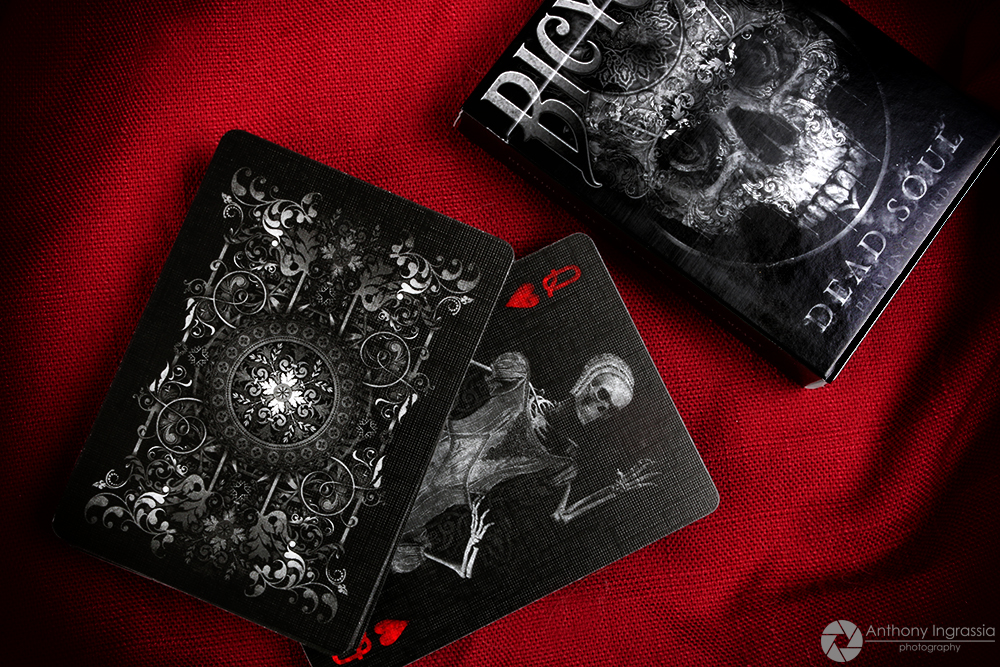
Brought to you by TCC Playing Card Co., Dead Soul Playing Card is a dark macabre deck featuring 52 uniquely designed cards. Beautiful back design and custom courts! Fantastic detail, intricate design, and style to bring out your dark side.


Maidens Playing Cards


From Joker and the Thief, Maidens Playing Cards is a fully custom deck inspired by Dia de Los Muertos. On the outside, the lavish tuck box features an incredible dyed creme colored paper stock, letterpressed and adorned with beautiful foil accents inside and out! Inside, the face cards tell a story through the use of symbolism and meticulously illustrated throughout. The back design is eerie yet eye-catching! The consistent design of the face and backs beautifully tie the enchanting theme of the deck together.


Bicycle Bone Riders


Still one of our favorite. A collaboration between Art of Play and Bicycle, these fun new limited edition Halloween-themed playing cards are inspired by Bicycle's classic Rider Back design, the Bone Riders feature fun illustrations of bike-riding skeletons, fanciful jack o'lantern's, flying bats, and ornate pumpkin vines entangling it all together. Each deck includes two specialty Jokers, a unique Ace of Spades and one blank-face and one double-back card. Packaged inside a festive tuck box featuring premium matte card stock with embossed typography.


Strigiformes


Strigiformes Playing Cards is a fully custom deck of playing cards featuring original illustrations of owls designed by Renee LeCompte and produced by PlayingCardDecks. The deck is fully custom with meticulously hand-illustrated courts, pips, jokers, aces, and a custom back with tarot symbology used throughout. The darker tone gives the deck an enchanting feel!


RAVN Purple Haze


A collaboration between Caroline Ravn and Stockholm17, The Ravn Purple Haze is beautiful, elegant and at the same time attractive. The deck was designed to keep the classic look. The faces are quite standard, with improvised hands and the faces of the Jacks, Queens and Kings. The jokers are intriguing and Ace of Spades is very attractive.


Fury & Rage Knights


From Midnight Cards, Knights Playing Cards is a fully custom deck inspired by medieval knights and their most recognized style of armor and weapons. The Knights card backs feature an etched armor background and a head-to-head layout of the shield, Bull Head crest, and Battle Mace. The face cards have a metal texture with grey full-bleed coloring and the pips have a silver metallic look inlaid with Rivets.


House of the Rising Spades


From the mind of Lorenzo Gaggiotti of Stockholm17, the House of the Rising Spades is an exquisite deck inspired an esoteric realm full of mysteries built for cartomancers, cardists, magicians, collectors, dreamers, and card enthusiasts. The beautifully illustrated face cards have no standard index, particularly the spot number cards (2 to 10).


Voodoo


Voodoo Playing Cards are produced by SpielKartenShop with artwork by Sam Hayles. You will notice that he has a thing for skulls and you will see in his design a lot of inspiration from esotericism to punk, bizarre to gothic, apocalyptic to elegant and all the bizarre things and elements from our strange world. You will find a lot of symbols hidden in the artwork and references to the world of voodoo. For the cards, Sam chose to use the sepia and old paper and grungy textures because that’s the style he loves and use the most and again fitted very well with the overall theme and style of graphics!


Haunted 8's


If you’re not already in the spirit of Halloween, then this spooky deck is certain to get you in the mood. Ghouls, Goblins, Headless horsemen, Zombies, Scarecrows, Pumpkins and more...! All packed into the October Kings Wild Shorts deck recently delivered to subscribers. A fun-filled deck brimming with artistry and ingenuity for All Hallows' Eve. The theme, colors, spooky characters and design elements that make up Haunted 8s came together perfectly!


Ragnorak


Ragnorak is a fully custom Norse-themed deck series designed by the team at Design Imperator. The Jormungand (Dark Blue) and the Fenris (Dark Brown) Editions features fully custom pips, indices, aces, and courts. The card backs showcase Norse artwork inspired from original knotwork and wood carving designs, both set in a mirrored composition printed with metallic silver and copper inks. The meticulously hand-illustrated courts along with the darker tone of the deck highlight drama, intensity, and an epic battle!


Salt & Bones


Inspired by the life and crimes of Captain H. Every, the man behind the biggest heist in history, Salt & Bone Playing Cards from Ellusionist celebrates bad intentions by becoming the lost bounty. The narrative of the deck starts with the striking bone white tuck, an imperfect paper grain reserved for rich men and cunning thieves. The compliment black and red foil adds a touch of danger and intrigue. Inside, the fully custom pips twist and snake you towards the elusive treasure, and court cards contain the sigils of the most infamous pirates to ever live.


Odd Bods


The Odd Bods Playing Cards is a brilliant deck illustrated by Jonathan Burton. Produced by Art of Play, the Odd Bods Playing Cards feature amusing characters, quirky illustrations, and playful imagery. The deck has been hand illustrated in a beautifully nostalgic style and designed to have the look of ‘aged’ Victorian lithographs. Every image proves its own quirk and oddity, but is never ostentatious-- Odd Bods are the epitome of refined indulgence. Packaged in a gorgeous gold-foil embossed tuck box.


The selection expressed in this top12 are solely those of the author. 


[post_ad]

Kickstarter: Bicycle Dragonlord White Edition Playing Cards


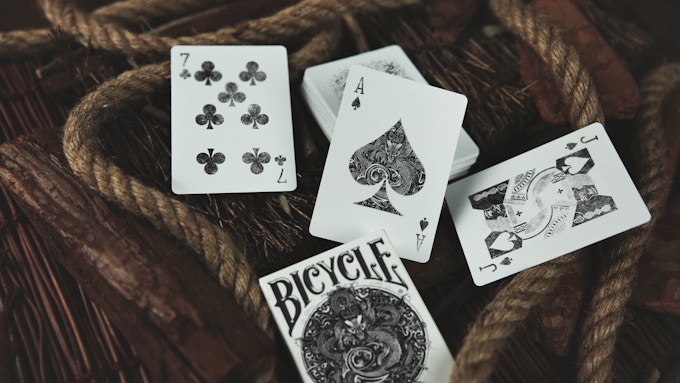
Produced by TCC Playing Cards, the Dragonlord Playing Cards was designed by UK designer Sam Hayles based on the Chinese tradition culture: Dragons! The deck consists of Chinese style design elements with the Dragon being the core of Chinese Culture. In the eyes of the Chinese, it symbolizes freedom and perfection.


Using the Dragon as the theme, the deck has been meticulously designed with a modern flair. The Dragonlord deck is presented in  a black and white colorway, representing the long history and the precipitation of wind and frost, as well as the meaning of blessing.


The deck features custom intricate hand-illustrated Ace of Spades and Jokers. The card backs are the familiar bicycle rider back and face cards are standard with updated colour palette with some what of a dated look to fit the overall theme.


Pledge starts from a reasonable $10 and will be printed by the United States Playing Cards Co. Join TCC Playing Cards on Kickstarter as they bring this incredible and mysterious treasure in the form of playing card to life.

First Look icycle Apocalypse Playing Cards

Two years in the making, the Bicycle Apocalypse series by TCC features the dark art style of Sam Hayles, known for his popular Karnival series. Three unique decks are available during the Kickstarter campaign: Dead Souls, Lost Spirit, and Dragon Lord. As you would expect, all 3 decks are fully custom with bold and exquisite illustration lines, giving the decks a touch of mystery and macabre.


Dead Souls

This fully custom deck follows the art style of the Karnival decks, with skull and gothic design elements. Compared to the mysterious first edition, the new edition comes in a white colorway.

Inside, all card faces were redesigned, and the extra smoke rendering adds detail to card faces. Skull, spine, ribs, and carpal bones… each card faces are skeleton images. You can use the cards to put together a complete skeleton!

The courts are noblemen who are illustrious in their lifetime but still unwilling to return to the dust after their death, you can try to imagine their evil story. Joker’s bones belong to the ruler who still wears a crown on his head after his body has decayed and is unwilling to leave his throne.

Printed by the United States Playing Card Co. and limited to 2988 decks. Only 1,000 will be made available for the collection box.


Dragonlord

A 100% custom dragon theme deck designed with a combination of east and west design elements of the dragon. The mysterious deck is presented in a black and white colorway.

The deck features custom intricate hand-illustrated Ace and Jokers, prominently featuring the dragon. The design of face cards is updated with a black and gold color palette instead of the regular red and black suits, and a dated look to fit the overall theme of the deck.

The card backs showcase two awing dragons and black background without white edges. This Bicycle-branded deck is printed by USPCC and limited to 1343 decks. Only 1,000 are available in the collection box.


Lost Spirit

A macabre deck featuring fully custom artwork in a gray/silver colorway. Within, the face cards showcase fantastic detail and intricate design. Spade, clubs, hearts, and diamonds all use standard traditional suits, and the face cards are updated with a gray and white texture, adding a dark, and strange vibe.

For the card backs, the overlay of several layers of texture further enhances its already strong sense of solemnity, creating a mysterious and noble sense. Two jokers are Death who wears a black cloak and stares out of the frame.

Printed by USPCC and Limited to 1260 decks. 1,000 will be made available for the wooden collector box.


Wooden Box Set

Wooden boxes have long been the top and most expensive collector’s option. The elegant set includes all three decks and coins in the release, stored in a wooden collection box. The design of each deck is to the coin collection, and each unique artwork and design element is clearly visible on the coin.

Pledge starts at $59.90 for the box set (Early Bird Price is 45% OFF) on Kickstarter.

© all rights reserved
Kardify 2013