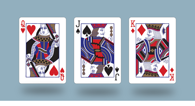
From very early in my magic career I learn very thing I could about playing card design, so I merged my two passion of graphic design and magic together. My goal in creating the Compass Playing Cards was to create a elegant but simplistic design that will be enjoyed by all.
Currently funding on Kickstarter, Compass Playing Cards is inspired by classic playing card designs. Cedric started by researching old compass rose and finding a minimalistic style that will accent the back of a card. The back is encompassed by a world map to represent travel and how we are all connected. The light blue color is inspired by the faded sea colors found in old maps and the Gold Metalic color represents the gold/knowledge that can be found through exploration.
Last week, we had a quick chat with Cedric about the inspiration behind Compass Playing Cards, support from the community, and his favorite flourish and deck.
What is your inspiration behind the Compass Playing Cards? How did you come up with the idea?
I’ve always wanted to make a deck of cards that could fit right in with the traditional playing cards but still have that extra Luxury feel. I took inspiration from my favorite deck designs like the tally-ho circle backs, Madison dealers, and Monarchs. I want to incorporate the things that I loved into a deck of cards. One of the things that I love is traveling to be able to visit many places and find credible new things. The deck design began back in 2016. I started incorporating the idea of time represented by the Center circle then I focus on destinations. Old compass roses found in maps and chose a minimalistic style. I decided to incorporate a world map with grids found in maps today. The light blue robin’s egg color was chosen based on faded sea colors found in maps. The gold color is used to outline the Compass and the map found the cards back as a way to represent the treasure that can found as we find our way throughout the world.
We first noticed the deck on Instagram. What do you think of the playing card community in terms of the feedback and support that you’ve been getting so far?
I have been amazed at the support that I have received from everybody and The members of the playing card community. I am grateful to see all the positive feedback and their willingness to support the Kickstarter campaign. The playing card community on Instagram has been greatly beneficial in turning this project into reality.
I have been amazed at the support that I have received from everybody and The members of the playing card community. I am grateful to see all the positive feedback and their willingness to support the Kickstarter campaign. The playing card community on Instagram has been greatly beneficial in turning this project into reality.
My favorite for Flourishes all times is Francqleen from Anddison Reynoso, Lepaul Spread, Judoflip.


 Kardify is the leading online destination for playing cards news, reviews, and cardistry culture. Enjoy the best editorial content daily.
No comments
Post a Comment