Responsive Ad Slot

Showing posts sorted by relevance for query NPCC. Sort by date Show all posts

Deck View: Clear Skies Playing Cards


Hope. Peace. Beautiful.

From Old Gravity in collaboration with Noir Arts (NPCC), and Max Playing Cards, Clear Skies Playing Cards showcases beautiful artwork by Ritu Bhattacharya with a message of hope for peace in Ukraine.

Inside, this fully custom deck features eye-catching watercolor paintings in two colorway, blue and yellow: the colors of the Ukrainian flag. The back design features two-way illustrations of a golden tree on a full-bleed background of a starry night. The suits represent positive values in the hope of peace in Ukraine.

The tuck box comes with embossing and metallic foiling prominently featuring elements that represent Ukraine: sunflower, the national flower of Ukraine, the interweaving colors of blue and yellow, and a dove, a symbol of peace. 

The deck is printed by NPCC in Ukraine, designed in the hopes of peace in Ukraine, and made in Ukraine to help Ukraine.

CLEAR SKIES Playing Cards on Kickstarter

Clear Skies Playing Cards is a deck by Old Gravity, Noir Arts (NPCC), and our friend Max Playing Cards that showcase beautiful artwork with a message of hope for peace in Ukraine. Artist Ritu Bhattacharya designed the entire deck- all of the faces feature her eye-catching watercolor paintings. In the background, there are two colors of blue and yellow: the colors of the Ukrainian flag.


The suits are to represent positive values in the hope of peace in Ukraine. The back design features two-way illustrations of a golden tree on a full-bleed background of a starry night. The tuck box comes with embossing and metallic foiling prominently featuring elements that represent Ukraine: sunflower, the national flower of Ukraine, the interweaving colors of blue and yellow, and a dove, a symbol of peace.

The deck will be produced by NPCC in Ukraine, designed in the hopes of peace in Ukraine, and made in Ukraine to help Ukraine. Pledge starts at 25$ for a single deck, with free shipping worldwide on Kickstarter.

Kickstarter: 7 Questions with Maciej Frolow of Victorian Playing Cards


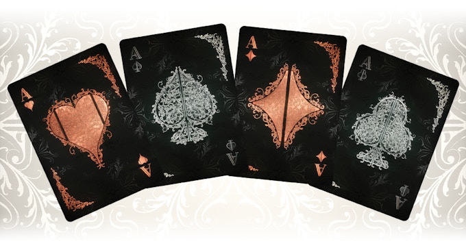
Victorian Playing Cards is an intriguing deck combining the old and the new in historic Victorian-inspired design. The deck is currently over 160% funded on Kickstarter with .. to go. Designed by Maciej Frolow, the deck features fretwork patterns, with gold and silver arabesques, floral lines, and curves.

The main idea of the deck is to replace the traditional court cards with symbols: scepter for the king, rose for the queen, and pistol for the jack. The color of the suits has been updated: copper for the red and silver for the blacks. This makes the various design elements and patterns do stand-out against the black cards. The mirrored card backs are filled with a dense copper and silver pattern which also integrates two card symbols. The deck is packaged in an elegant tuck box with embossed and embellished in silver foil!


Last week, we had a chat with Maciej about his design background, inspiration, and design process behind the Victorian Playing Cards.

For those of us who don’t know, can you tell us about yourself and what is your design background?
I was born in Poland, moved to France at the age of nine, and still going back and forth between those two countries. I get cultural influences from both of them. About work, I’m a self-taught freelance illustrator using 3D tools instead of traditional pencil and pen 😉 I’m working with advertising agencies, magazines, and scientific & medical clients for 25 years now creating photorealistic images and animations. My influences are from Japanese manga, French comics, American movies, and of course a lot of illustrators like Syd Mead, John Howe, Rodney Matthews, Paul Bonner, concept art designers Like Doug Chiang or Daniel Simon and many many more.

Can you describe Victorian Playing Cards and why you’re passionate about it?
Working for advertising or magazines is based on short projects with limited diffusion so all ends to be some kind of virtual. I wanted to spend more time on a project which people can enjoy and cards came naturally.

For the description, I’ll refer to what I wrote “The project main idea is to replace the traditional court cards by symbols: scepter for the king, rose for the queen and pistol for the jack. Other cards stay as usual. The colors are copper for the red and silver for the blacks. The background is black with a victorian pattern.“


As my passion is 3d modeling, in fact sculpting in virtual clay, for those who don’t know the term. Spending long hours creating the patterns, sculpting the shapes, working with textures, lights, and how they react to each other, with no deadlines and no constraints is what I love to do. With hope, the final result will be eye-catching and pleasant

Walk us through the process you took to design the deck. How did you come out with the idea and how did you get to this finished product?
In fact, I came to the idea by planning another deck which involved crazy amounts of time, people and money and about which I’ll talk more one day. In short, it was real people in costumes a with 3D generated backgrounds. An idea we had with my associate Vincent Corlaix who is a great storyteller and with him, we are creating a bunch of fantasy worlds and ideas for next projects.

For the process first I established the color palette, I wanted something very limited in colors. So I chose copper for hearts & diamonds and silver for spades & clubs. Black background with a Victorian pattern given to all an elegant look. As second I worked on the shapes of the scepters which each fit the symbol on the top of it.


What was your most brilliant breakthrough when designing the deck?
I think as in the description above, by replacing the traditional court cards with symbols. Something interesting which is not so far from the original concept and communicates immediately what “function” the court card does. It can be turned into many different ways.

With so many playing card projects competing for funding, why should potential backers choose your deck?
I think because most of the decks use traditional two-dimensional techniques instead of 3D rendering which I used. You should know there is no photoshop used there for anything else than color correction. Also because they will be printed by NPCC. By seeing what they created and spending a lot of time speaking with Roman I have no doubt the result will be awesome. Also, I feel really lucky as I meet Max (from Max playing cards) who decided to help me in this campaign preparation process which I did know absolutely nothing. He told me that he believes in this project and treats it like it was his own which is great. So with such support, I’m confident this is a good project.


What’s next? Can we expect more deck designs in the future?
Yes, I have many ideas that will come from my twisted mind and from the Galaeth universe we are creating with Vincent, especially one which will continue the concept of replacing the court cards figures by symbols but in a much more extended way. It will be a steampunk style deck. I’m showing you just two card sketches. The Jack of Diamonds and the back of the cards. The background story of those cards is huge and you’ll discover it soon.

Finally, what are your favorite playing cards?
Those with elaborated graphics, surprised? 😉 Wicked Kingdom by Wilie Becket – Dark and twisted beautifully executed illustrations, LUMINOSITY Playing Cards – Just awesome and Vonnart Illustrated Playing Cards – I’m actually backing this one as it’s still running on Kickstarter.

Thank you for your time Maciej and congratulations on the quick funding. If you like what you've read here and want to support Victorian Playing Cards, you can find it on Kickstarter Here! 


The deck will be printed by NPCC on 310 gsm premium German linen card stock. Pledge starts at $17 on Kickstarter.

[post_ad]

Kickstarter: Helheim Playing Cards by Design Imperator


Danish team Design Imperator is currently funding Helheim Playing Cards on Kickstarter. With less than 6 days to go, the project has already hit its funding goal within 6 hours of the campaign launch. Helheim Playing Cards is a fully custom Norse war-themed deck and is the successor to Design Imperator's previous release, Ragnorak Playing Cards.


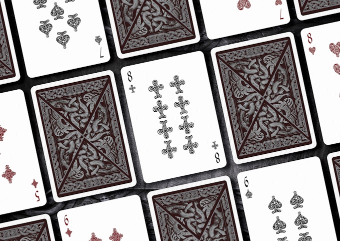
Two decks are on offer during the campaign, Herja (To Wage War) and Nidhug (Corpse Eater). The Herka tuck sports a dark grey colorway with a blood-red seal. The card backs are dark red with metallic silver ink. The tuck case is manufactured with a solid, ash-grey stock with intricate, embossed artwork, hot stamped with silver foil and spot UV.


Meanwhile, Nidhug is the black edition with an oak brown tuck seal. The card backs are black with metallic silver ink. The tuck case is manufactured with a solid, black stock and has embossing, silver foil and spot UV on the case.


The face cards on both decks feature Vikings of Norse mythology. All illustrations are meticulously hand-drawn by professional artist Nicolai Aarøe. His artwork continues to inspire and capture the essence of Norse mythology.


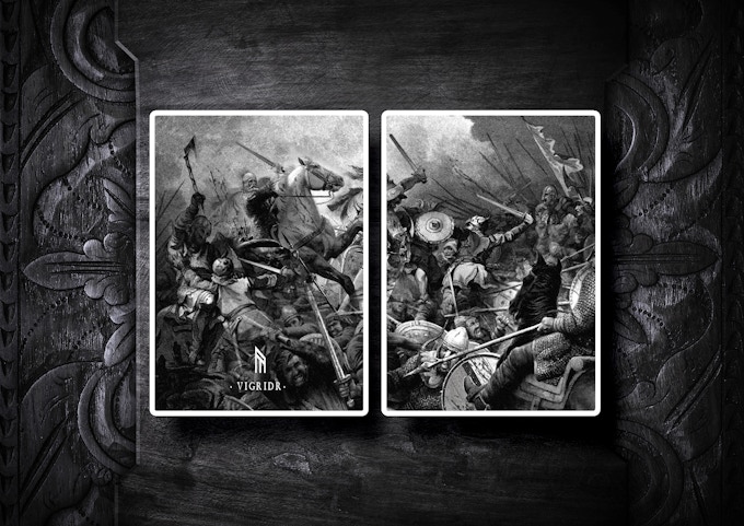
The dark tone of the deck highlight drama, the intensity of an epic battle. The diptych jokers featuring the massive battle at the fields of Vigridr.


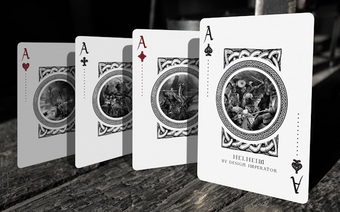
The card backs of Helheim Playing Cards showcase Norse artwork inspired from original knotwork and wood carving designs, both set in a 2-way composition. Both decks have a classic layout of pips and indexes, reimagined in Norse style. Also, the aces of Helheim Playing Cards feature illustrations depicting the massive assaults by Hel's army.


The decks will be printed by NPCC with premium linen finish and pledge starts at DKK$89 (~USD$14) on Kickstarter.

[post_ad]

Regium Playing Cards, 5 More Days on Kickstarter


From Noir Arts, Regium playing cards is the successor to the beautiful Branle series. Less than a week on Kickstarter, the decks are intricately crafted with character and flair. 
 

Two decks are on offer during the campaign, Classic, and Antique. Each deck has its own, unique hand-drawn card faces, backs, and tuck box. Decks are completely custom - from the pips to the tuck box and deck seal. 


The concept behind the design of both decks is to create a clean and modern look for Classic deck and aged/antique look for Antique deck. Ukrainian artists Denis Makanin & Lev Kushnirenko have meticulously crafted each design element of the deck - from court card faces to decorative elements of card backs. 


Some of the classic elements of playing cards are made almost classic to make it playable, while the art itself has been re-imagined, hand-drawn, reflecting the history and culture of the XVI-XVII centuries. 


The artwork of each court card represents a real historical person from the artist's point of view. Each of the suits can be associated with some particular royal families from different European countries. For example, Britain, France, Spain, and Eastern Europe (Rzeczpospolita, Transylvania, Hungary). 


Regium Classic has a more clean look, court cards are more like a painting, whereas elements on the Antique deck are worn out and artwork created more sketched and flat, drawn with a pencil. 


Card back design features elements and details seen in Renaissance architecture and various royal palaces. Inspired by old-world luxury, the minimal line, detailed art pays homage to a vintage sophisticated aesthetic. Numbered cards have standard-looking pips. 


Tuck boxes for both decks are decorated with foil ornaments and embossing which enhance detailed artwork, while cards feature golden metallic ink on fronts and backs.


Tuck box for Classic deck feature yellow gold foil over royal blue pearlescent cardstock and Antique tuck box feature 2 foils - gold and copper, over pearlescent copper cardstock. 

Printed by NPCC in Ukraine and pledge starts at $13 on Kicksarter.

[post_ad]

Deck View: Hunter of York (Mistress Edition) Playing Cards


Elegant. Floral. Vibrant.

The Hunter of York Playing Cards are inspired by the witch-hunting era and the Tulip Mania set in York, 1636. This is the first volume in the Florus Drama series by artist Nicolai Aaroe. The Mistress Edition is one of two decks in the Hunter of York series. Fully custom, the face cards have a fresh and vivid appearance with illustrations in vibrant colors to make the deck look elegant and new. Aces have very full floral decoration.

The artwork of the courts are truly incredible! They are illustrated in collaboration with another Danish master of the pen, Martin Helgren. The ornate and floral decoration on each of the face cards gives it a touch of class and elegance. The deck is kept secure in a dark blue tuck shielded with stunning gold foil.

Printed by NPCC and available from isolatedthunderstorm.com.

[post_ad]

Kickstarter: 7 Questions with Slava Shestopalov of Hipsteria Playing Cards


Hipsteria Playing Cards are created by designer Slava Shestopalov from Ukraine. This playful deck represents the most remarkable elements of the hipster subculture, designed in a minimalistic manner. The artwork has been hand-drawn and finalized on the computer.

The deck is fully custom, with unique artwork on all 54 cards in a line-art style. Every character and elements are a combination of lines, arches, curves and dots. A lot of thought has gone into the design of the deck. For example, each suit represents a different item: Spades - Food, Clubs - Interior, Diamonds - Accessories and Hearts - Clothes. The Aces are inspired by hipster logos and emblems. Exemplify the uniqueness of this deck.

We reached out to Slava and had a chance to talk about the design background and the idea behind the Hipsteria.

Can you tell us about yourself and what is your design background?
I have been working in the graphic design direction for over 5 years. Currently. I'm the visual designer at Epam Systems and my daily activity is connected with creating interfaces for web and mobile. I live in Lviv, Ukraine, a magnificent old-fashioned city that is often called the "cultural capital" of the country. I am keen on mountain hikes, bicycles and metal music.


Can you describe the Hipsteria Playing Cards and why you’re passionate about it?
Hipsteria is an attempt to make a snapshot of hipster culture, trends and stereotypes and show them in a funny way. These cards represent things that are associated with hipsters and are designed in a trendy line-art style.

How much time did you spend working on the deck?
It's a hard question because I don't track time when working on my personal projects. I guess the first card was created in May. Then I tried to spend at least a couple hours every week to create more Hipsteria stuff or review the existing designs. A sufficient part of work time was spent for googling “true hipster” accessories and for sketching.


Talk to us a bit about going from the first draft to the final version. How did you get to this finished product?
The most interesting and challengeable thing was to convert the real objects to minimalistic illustrations. The manner, in which all the cards are designed, is based on geometry and I had only lines to show volumes, shadows, and textures. Sometimes I faced the issues when things that look nice on paper are dull and not recognizable in the line style, so I had to change details or try another layout. The last 15 cards were drawn directly on a computer without sketching, because by that moment I had known the target style and proportions inside out.

What was your most brilliant breakthrough when designing the deck?
The first intermediate success was when I tried an idea to make numeric cards individual and created the first set of numeric cards for one suit. I drew two cabinets for two of clubs, three chairs for three of clubs, four pallets for four of clubs and so on. It looked perfect and fresh; I haven’t seen such an approach before. The second important stage of the project was to choose colors for boxes and card backs, since color impacts the overall impression greatly. I tried over 50 different combinations and the current ones seem to be bright and stylish.


What are your favorite playing cards in the deck?
If we talk about Hipsteria, I like the jokers most of all because they are a bit sarcastic and very straightforward. But generally, I like an ace of spades card. It's powerful and often decorated with an emblem of the deck manufacturer.

What’s next? Are you planning to design more playing card decks in the future?
I'm not sure but it might happen. I am considering creating a board game on the adventures topic.

Thank you Slava and all the best! At the time of writing, the project is only 25% funded with 26 days to go. If want to support Hipsteria Playing Cards, you can find it on Kickstarter here


Hipsteria will be printed by NPCC and pledge starts from $11. There are also multiple rewards that are waiting to be unlocked once the project hits its stretched goals. Notably, the Hipsteria Milky (White) Edition at $7.5k.


3 Days Remaining! Entwined - Vol. 1: Summer Playing Cards on Kickstarter


Entwined - Vol. 1: Summer is the first of four decks in a series based on the ballet of nature and the freedom of spirit. Currently funding on Kickstarter, this beautiful deck is a collaboration between Old Gravity and artist, Ritu Bhattacharya (Twitter: @artwork_by_ritu).


On the exterior, the tuck box is intricately designed, beautifully embossing and comes in two variations- Summer Gold and Summer Rose. Both are dual-foiled with a rich metallic-gold or rose-gold base, coupled with a beautiful blue foiling, a homage to the enriching power of the warmer days. The tuck comes with a wrap-around design and putting them together forms a continuous design.


Inside, each card has been meticulously hand-drawn, taking inspiration from ballet, and then entwining it with nature. The gorgeous face cards sports a warm color palette, expressing the warmth of summer, and its rejuvenating heat. 


Each dancer is coupled with the grace of an animal or bird symbolizing the symbiosis between the soul and nature’s spirit. 


The artist brilliantly envisioned each number card suit as leaves on a branch. Each denomination increasing the number of leaves against four beautiful summer landscapes. Each suit is based on a leaf, the ginkgo leaf for the heart, the papal leaf for the spades, the oak leaf for the diamonds, and the maple leaf for the clubs.


The aces are fully custom and the two playful ballet dancers are showcased on the two joker cards.


The card backs prominently features the graceful swan and decorated with rich ornate design in stunning metallic gold or rose gold foil, giving it a touch of class. The borders are printed in metallic ink as well. 


Also available during the campaign is the Limited edition collector's box with a run of 100. Each set comes with a custom numbered seal. The box contains 2 limited edition decks of Entwined Vol.1 - The Gun Metal Edition and The Noir Edition. These decks are exclusive limited runs for the Collector's Box - Summer Night Edition.


A truly beautiful deck with delicate ornate design and warm color palette. The decks are printed by NPCC on 310 gsm Premium German Linen Card Stock. Pledge starts at $17 on Kickstarter. Also, add-ons such as Collector's Box and Swan coin are available during the campaign.

[post_ad]


Kickstarter: 5 Things You Didn't Know About Ragnarok Playing Cards by Design Imperator


Danish team Design Imperator launched Ragnarok Playing Cards on Kickstarter a few days ago and has already hit its funding goal within 6 hours of the campaign. Ragnorak is a fully custom Norse-themed deck and is a sequel to Design Imperator's previous release, Midgard Playing Cards. With the next Thor movie by Marvel releasing just around the corner, I'm pretty excited about these. Here are 5 things you didn't know about Ragnorak playing cards:


1. Courts in motion.
Unlike the illustrations of most playing cards on the market, the courts of Ragnarok Playing Cards are all illustrated in motion to highlight drama, intensity and a great battle. They are all in non-static pose and design with weapons raised for combat or magic.


2. Borderless backs. 
While the design of the project involved extensive research into mythology and Norse literature, the biggest challenge of the designers turned out to be whether or not to add white borders to the card backs. Collectors and followers of lead artist Nicolai Aarøe helped to make a decision on the matter, with an overwhelming preference for borderless designs. With the first stretch goal, both designs are now printed with metallic silver and copper inks.


3. Runes are real.
The runic inscriptions utilized for the tucks, cards and coins of Ragnarok Playing Cards are actual runes, originating from the Futhark alphabet of Norse culture. Backers will be able to translate the texts directly with an alphabet at their disposal.


4. Biggest stretch goal ever?
While Ragnarok Playing Cards is the biggest standalone project by Design Imperator to date, the whole project was actually constituted as the last stretch goal by popular demand of the backers of its predecessor, Midgard Playing Cards. The artwork of Ragnarok is heavily inspired by backer influence suggestions and ideas.


5. Mother of monsters
Many people know that the Midgard Serpent and the mighty Fenris are two of the most prominent and destructive monster of Ragnarok cosmology. But few people know these beasts actually share the same mother, the powerful giant queen Angerboda. The illustrators involved in the project aimed to portray the most feminine and fertile, yet monstrous and terrifying mother ever to have taken place as a queen in playing cards.


There are two decks on offer in the campaign: the Jormungand (Dark Blue) and the Fenris (Dark Brown) Editions. Both decks include custom pips, indices, courts, and aces. The card backs feature Norse artwork inspired from original knotwork and wood carving designs, both set in a mirrored composition. The Jormungand backs feature a blue/grey colorway while Fenris in a velvet/golden colorway. Printed by NPCC with premium linen finish and pledge starts from DKK$89 (~USD$14) on Kickstarter.
© all rights reserved
Kardify 2013