Responsive Ad Slot

Showing posts sorted by date for query monarchs. Sort by relevance Show all posts

BHOOMI Playing Cards

BHOOMI Playing Cards by Orion Playing Cards are the third chapter in an elemental series that explores humanity’s connection to nature, following the themes of water in JAL and fire in AGNI. The name “Bhoomi,” derived from Sanskrit, means “Earth” or “Land,” and the deck pays tribute to the planet as the enduring foundation of life.

Designed by Bivas Bhattacharjee from Old Gravity, this collection centers on the philosophy “The World is One Family.” This idea reflects the belief that all living beings share the same ground and are interconnected through the Earth.

Two main editions represent different aspects of the planet. The Bloom Edition celebrates the vibrant surface of the Earth with a rich palette of emerald green, forest brown, and gold. Its design features a symmetrical Tree of Life motif, intricate vine patterns, and solid gold gilded edges that reflect the energy of flourishing ecosystems.

In contrast, the Roots Edition honors the quiet strength beneath the surface. Using muted silver, deep umber, and copper tones, it evokes the ancient stability of soil, stone, and mineral foundations. Copper-colored gilding and subtle metallic details reinforce the grounded, subterranean theme.

The court cards tell a narrative of humanity’s relationship with the Earth through a diverse cast of figures drawn from history, mythology, and global culture. The characters include farmers, scholars, monarchs, and mystics—each representing a different connection to the land.

Even the aces reinforce this philosophy, with each symbol transformed into a stylised tree. The Ace of Spades features a powerful oak set against hypnotic woodgrain rings, the Ace of Hearts forms a canopy shaped like a heart, the Ace of Diamonds echoes the geometry of crystalline minerals, and the Ace of Clubs evokes the sturdy strength of a sacred grove rooted in fertile soil.

Across both editions, the number cards share a unified design language built around winding vines, organic geometry, and botanical motifs. The pips themselves are redesigned as miniature “Tree of Life” forms, reinforcing the idea that every suit and number represents a branch of the same ancient system. 

Both editions feature 56 custom poker-sized cards printed on premium 310gsm black-core stock by King Star. Pledge starts at $16 on Kickstarter.

Monarchs Summer Edition Playing Cards

Theory11 has released their latest addition to the Monarchs line: the Summer Edition…the first in 4 years. This new deck features a vibrant pink colorway, perfect for the season.

The teaser image hints at the exquisite purple foil embossing on the tuck box, a signature detail of the Monarchs series. Expect the court cards to have the classic faces with meticulously detailed line work, while the card backs will carry the sweet pink theme, matching the tuck box.

Printed by the United States Playing Card Company, the Summer Edition Monarchs. Given the limited availability, these decks are expected to sell out quickly! Available from Theory11 for $14.95

Less Than A Week on Kickstarter, Sacred Fire Playing Cards


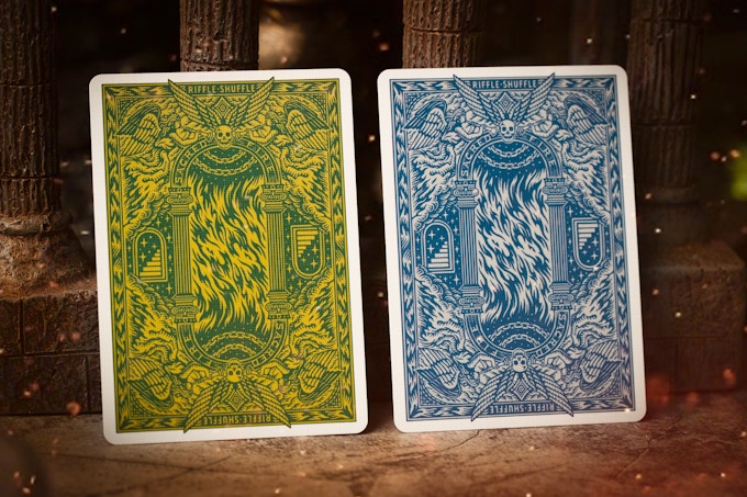
Sacred Fire Playing Cards is Pedro Oyarbide's second deck produced by Riffle Shuffle currently funding on Kickstarter. The deck is inspired by the power of fire, reminding us that the path to our annihilation will be born from our greatest innovations. 


The fully custom deck features Perdo's incredible artwork througout. From the striking tuck case, intricate card backs, to the menacing royals, suits and jokers. 


The back design is infused with some clever details. Two symmetrical "phoenix" figures are prominently featured in the center of the flames. Also, between the Greek pillars, the enormous flame with intricate detail, fiery eagle heads, angels and skulls. 


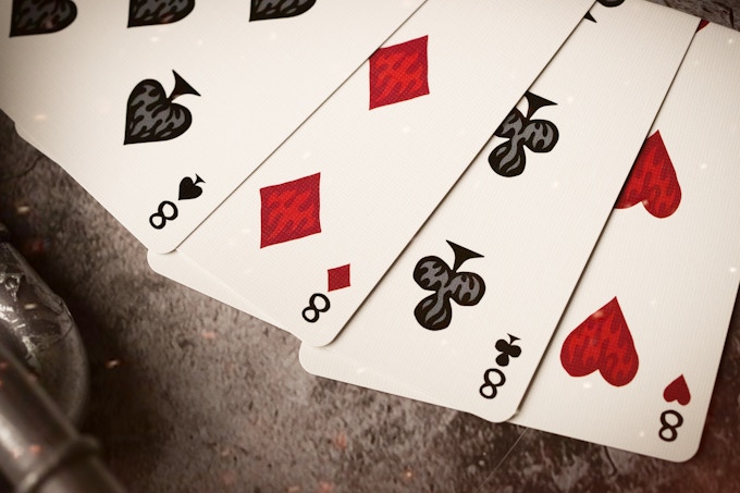
The suit symbols has the motive of flames within, and the numbers in the corners appear in a classic, yet slightly stylized version.


The courts are increibly illustrated and hold weapons. However, some royals possess other items, such as a small hut and a feather, possibly a pen. These are human's greatest creations: weapons to hunt, houses for shelter, feather pens to write. All used by monarchs to control the masses. 


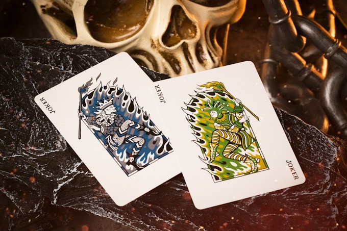
The eye-catching Ace of Spades feature the recurring skull with wings lies dead centre of the flaming spade with surrounding symbols and motifs, creating beautiful symmetry within the spade. The jokers donned their typical outfits playfully hold wooden sticks with their ends ignited with fire. They stand dramatically upon the entrance to their stage like true entertainers.


Two colorway's are on offer during the campaign- Emerald Flare and Sapphire Blaze. Each tuck case comes with a unique die-cut window and a special fire foil stamp cards.


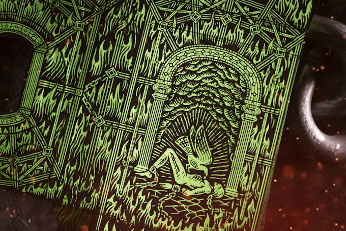
The Foiled Stamp Card is made with 3 different colours of hot foil on both sides to mimic the bright flames from the Sacred Fire. The tuck case is adorned with Green and Blue foil on both exterior and interior! 


Printed by Taiwan Playing Card Company with their Luxury Paper Stock. Pledge starts at $14 on Kickstarter.

[post_ad]

Kickstarter: 3 Questions with Kevin Kim of Hak Playing Cards


Hak playing cards is an elegant deck that explores the designs, traditions, and architecture of the golden age of Korean history. Designed by New York-based graphic designer and photographer, Kevin Kim, the deck is currently seeking funds on Kickstarter. On his design background, Kevin told Kardify,
I’ve always had an interest in magic, cardistry, and playing cards, so when I realized I could design cards myself I jumped at the opportunity. This is my third Kickstarter campaign with two successful campaigns under my belt (Shard Playing Cards, Naabi Playing Cards). The ‘K' in Studio K stands for the K in my initials, and also my Korean heritage. Just as K-Pop spreads Korean culture in pop music, I hope Studio K Cards can spread Korean culture to those in the magic, playing cards, and cardistry scene!


Hak playing cards feature fully custom artwork, from the mirrored back design incorporating two cranes and eight japsang with Irworobongdo, to the striking Aces and the court cards designed with attention to detail for historical accuracy and recognizability.

Earlier this week, we had a quick chat with Kevin about the inspiration behind Hak Playing Cards, support from the community, and his favorite flourish and deck. 

 
What is your inspiration behind the Hak Playing Cards? How did you guys come up with the idea?
We came up with the idea for Hak playing cards from the royal palaces in Seoul, South Korea. Our main inspiration was the crane (pronounced 'Hak' in Korean) and the architecture of Gyeongbokgung, a palace during the Joseon Dynasty. We took details from royal architecture including rooftops, wall panels, and a folding screen placed behind the king’s throne. We used traditional outfits from the royal and ruling class of the time for the courts. We tried to show as many aspects of this unique period in Korean history as possible, so check on the Kickstarter campaign for more details! 


We first noticed the deck on Instagram. What do you think of the playing card community in terms of the feedback and support that you’ve been getting so far?
The support from the Instagram community has been amazing, it’s been great to see all the feedback we’ve been getting as well. We hope to take all the advice from our backers and supporters to create designs everyone has had a say in. Creating Kickstarter campaigns is definitely a collaborative effort, and it wouldn’t be possible without the help of the playing card community!


Finally, what are your favorite card flourish and playing card decks?
My favorite deck has to be the King Arthur deck by Riffle Shuffle, and Monarchs by Theory 11. Both are such beautiful and iconic decks! We hope to be able to collaborate with them on a deck one day. It’d be an amazing day for me and the team! My favorite flourish has to be the sybil cut. It’s one of the first flourishes/shuffles I’ve learned, and I’m still trying to get it down! 


If you liked what you read here and would like to support Hak Playing Cards, head to Kickstarter here! At the time of writing, the project is 98%! Pledge starts at $15 and the deck will be printed by the United States Playing Card Company.

[post_ad]


3 Questions with Ethan Ricketts of ECLIPSE Playing Cards


Pulse playing cards is a space-themed deck launching on Kickstarter 25th March by ECLIPSE Playing Cards. Based in Australia, ECLIPSE Playing Cards is headed by Ethan Ricketts, who realised the creative potential a deck could have after watching a video on YouTube about a particular deck of cards. He wanted to create his own deck and ECLIPSE was born. According to Ethan,
The name comes from my deep interest in space, ever since I was young. I wanted to create a space-themed deck for my first deck, which is exactly what I did with the ECLIPSE - 'originals.'

Pulse features a cool modern artwork with 3D layering and shading based on a pulse of energy, similar to a heartbeat or sine wave. The layers represent the propagation of energy as it moves through space and time. We had a quick chat with Ethan about the inspiration behind Pulse Playing Cards, support from the community, and his favourite flourish and deck.

What is your inspiration behind the Pulse Playing Cards? How did you come up with the idea? 
The inspiration for the pulse Playing Cards comes from my fascination with energy and the way it moves. I wished to capture the propagation of energy through space and time in this deck. In order to do this, I wanted to create a 3D effect through the use of layering, shadows, and colouring to really make the pulse effect stand out. I took inspiration from Riffle Shuffle's Sirius B decks for this effect. 


We first noticed the deck on Instagram. What do you think of the playing card community in terms of the feedback and support that you’ve been getting so far? 
I feel like the playing card community is generally a really safe and welcoming space for upcoming designers like myself. I receive comments on my design, as well as plenty of private messages giving feedback, praise, or suggestions. I've forged some really solid friendships through the playing card community on Instagram, and overall, I really like the positivity and support that circulates throughout this community. 


Finally, what are your favourite card flourish and playing card decks? 
Truth be told, I'm not very good at playing with the cards I create. I've never excelled at cardistry nor magic because I've always focused on the design of playing cards over playing with them. I want to create something for other people to use and enjoy. That being said, my favourite card flourish is the basic spring. I believe it shows how mobile and full of energy playing cards can be. 


They get the best reactions in public because people can't seem to piece together how little pieces of paper and card can go flying through the air in unison! Spring is my go-to simple flourish. Its short, sharp, and sweet. My favourite decks are the Mono - heXa's by Luke Wadey, Monarchs by Theory11, and Chocolate Pi by Kings Wild Project.


If you liked what you read here and would like to support Pulse Playing Cards on 25th March on Kickstarter! Pledge starts at $12 and the deck will be printed by the United States Playing Card Company.
   
[post_ad]

3 Questions with Cedric Lancy of Compass Playing Cards


Compass Playing Cards are designed by graphic designer Cedric Lancy, who has been doing magic for doing more than 10 years. Cedric has always been mesmerized by the art displayed on the playing cards. Cedric told Kardify,
From very early in my magic career I learn very thing I could about playing card design, so I merged my two passion of graphic design and magic together. My goal in creating the Compass Playing Cards was to create a elegant but simplistic design that will be enjoyed by all.


Currently funding on Kickstarter, Compass Playing Cards is inspired by classic playing card designs. Cedric started by researching old compass rose and finding a minimalistic style that will accent the back of a card. The back is encompassed by a world map to represent travel and how we are all connected. The light blue color is inspired by the faded sea colors found in old maps and the Gold Metalic color represents the gold/knowledge that can be found through exploration. 


Last week, we had a quick chat with Cedric about the inspiration behind Compass Playing Cards, support from the community, and his favorite flourish and deck. 

What is your inspiration behind the Compass Playing Cards? How did you come up with the idea?
I’ve always wanted to make a deck of cards that could fit right in with the traditional playing cards but still have that extra Luxury feel. I took inspiration from my favorite deck designs like the tally-ho circle backs, Madison dealers, and Monarchs. I want to incorporate the things that I loved into a deck of cards. One of the things that I love is traveling to be able to visit many places and find credible new things. The deck design began back in 2016. I started incorporating the idea of time represented by the Center circle then I focus on destinations. Old compass roses found in maps and chose a minimalistic style. I decided to incorporate a world map with grids found in maps today. The light blue robin’s egg color was chosen based on faded sea colors found in maps. The gold color is used to outline the Compass and the map found the cards back as a way to represent the treasure that can found as we find our way throughout the world. 


We first noticed the deck on Instagram. What do you think of the playing card community in terms of the feedback and support that you’ve been getting so far?
I have been amazed at the support that I have received from everybody and The members of the playing card community. I am grateful to see all the positive feedback and their willingness to support the Kickstarter campaign. The playing card community on Instagram has been greatly beneficial in turning this project into reality. 


Finally, what are your favorite flourish and playing card decks?

My favorite for Flourishes all times is Francqleen from Anddison Reynoso, Lepaul Spread, Judoflip.

If you liked what you read here and would like to support Compass Playing Cards, head to Kickstarter here! At the time of writing, the project is only 58% with only 17 days to go. Pledge starts at $12 and the deck will be printed by the United States Playing Card Company on Linen Crushed Stock Paper.

Deck View: Monarchs (Mandarin Edition) Playing Cards


Tradition. Vibrant. Festivals. 

A special edition of the popular luxurious Monarch Playing Cards series by Theory11. The Mandarin Monarchs was released earlier this year to celebrate the Lunar New Year. Illustrated by Curtis Jinkins, the deck features vibrant, bright red and yellow colorway, a tribute to the stunning festivals, and beautiful traditions of the Lunar New Year.

 The semi-custom deck features custom Ace of Spades, Jokers, and Card Backs. The courts are standard with the updated colorway, with a vintage, timeless aesthetic when combined with the custom artwork. This Limited Edition deck was only available for one week and currently marked 'Sold Out' on Theory11's store.

[post_ad]

Kickstarter: 7 Questions with Bao Magic of Instant Noodles Playing Cards


Instant Noodles Playing Cards is a fun and classy take on the popular instant noodles conceptualized by Bao Magic (Instagram: @baomagic) as part of his BaoBao Restaurant series. Currently funding on Kickstarter, the deck features a unique packaging and sleek card design. Instant Noodles comes in a predominantly red, yellow, and black color palette Inspired by the traditional colors found in many Asian cultures.

Inside, the back design features a sleek noodle pattern with a pair of red chopsticks. The borderless design mimics the look of a dry bloc of noodles and allows for great looking spread and fans. Each suit features a noodle pattern with a non-traditional placement of the pips on the number cards. The enlarged Aces highlight the details of each suit. The traditional courts have been updated with the Royals now interacting with elements related to instant noodles, giving the deck both an amusing and cohesive appearance.


Two extra cards are included in the deck featuring a soup base and a dry vegetable packet. A set of seasoning packets stickers will also be included with each pack of Instant Noodles Playing Cards. The deck is packaged in a typical-looking instant noodles-inspired tuck. The tuck is added into a resealable plastic bag to make the unboxing experience resemble as close to a pack of instant noodles as possible.

We had a quick chat with Bao last week about the design, inspiration, and design process behind Instant Noodles Playing Cards.

For those of us who don’t know, can you tell us about yourself and what is your design background?
I’m a magician and cardist from Montreal, Canada. My strong interest in card magic eventually led me to start practicing cardistry after watching the Virts’ “Reintroduction” video back in 2007. These two passions naturally led me to get into collecting playing cards.

My creative background came from 5 years of experience in the digital marketing industry. As a creative director for a digital marketing agency, ad campaigns, photography, videography, and graphic design are a part of my day-to-day. I had the opportunity to work with Meko Deng and Angga Tantama who helped me with the illustration of the Instant Noodles playing cards.


Can you describe Instant Noodles Playing Cards and why you’re passionate about it?
Everything about the Instant Noodles Playing Cards has been designed to resemble closely to a pack of instant noodles as possible while preserving key aesthetics that magicians and card collectors would still appreciate such as the court cards, the suits, and the pips placement.

Instant noodles have been a long staple for many people and myself. With this deck's nostalgic design, it's sure to remind you of the delicious simplicity of instant noodles. This project was my way of incorporating a piece of Asian culture by combining my love for instant noodles, and playing cards.

Walk us through the process you took to design the deck. How did you come out with the idea and how did you get to this finished product?
The whole idea of this deck initially started as a joke. A friend eventually convinced me that it was actually a good idea to pursue. Coming back from Cardistry-Con in 2019, the whole experience motivated me to start working on my concept. I then reached out to my friend Meko who illustrated the court cards, jokers, and I had the help of Angga who illustrated my concept for the back of the cards and the box.


What was your most brilliant breakthrough when designing the deck?
The back of the card was the most challenging element to design. Several drafts have been made along the way and after vectorizing one of the suggested drafts, we had to scrap the design because it felt too messy (imagine the squiggly pattern of a dry bloc of instant noodles). We finally chose to go with a better and sleeker pattern which is what you now see on the box and on the back of the cards.

While I love designs with borders, we felt that it made more sense to opt for a borderless design since it emphasizes the experience of unwrapping a pack of instant noodles. They also look great in fans and spread! We can also agree that the Instant Noodles stand out due to its unique packaging. While I wanted to use the same bag as a regular pack of instant noodles, I concluded that using a snug fitting resealable plastic bag (which is also recyclable!) was the best reusable option.


We first noticed Instant Noodle Playing Cards on Instagram. What do you think of the community in terms of support that you’ve been getting and the feedback about the deck being similar to Noodlers Playing Cards funded a few months earlier?
I am so grateful for the amazing community of magicians, cardists, and card collectors who helped spread the word on social media. The community’s incredible support helped me reach my funding goal in under 6 hours, which is something I couldn’t have imagined for my first Kickstarter campaign.

As for this deck’s similarities to the Noodlers Playing Cards, Deryn had addressed this on an Instagram story and a post. As soon as I found out that Deryn was also working on a deck with the same concept, I reached out to him immediately and shared the progress of my almost complete design. We both agreed that while our ideas were similar, the designs were completely different. Since our initial interaction, we’ve both been very supportive of each other.


What’s next? Can we expect more addition to the BaoBao Restaurant?
Yes, this is only the beginning! The next project will be a surprise.

Finally, what are your favorite playing cards? 
My all-time favorite deck has always been the Monarchs by Theory11. As a magician, it is the deck that I regularly use when I’m performing. Everything about the design from the back design to the foiled box is so elegant. If there is a deck that can become as iconic and timeless as the Bicycle Rider Backs, I believe that the next modern classic would have to be the Monarchs.


Thank you for your time Bao and congratulations on hitting the funding goal quickly on Kickstarter

Instant Noodle Playing Cards will be printed by the USPCC with Air-Cushion Finish. Pledge starts at $12 for a single deck on Kickstarter. Don't miss out!
[post_ad]

Theory11 Will Be Releasing The Monarch Mandarin Edition Today!


[Update] The Mandarin Monarchs are now on Theory11.com

Happy Lunar New Year! To celebrate the auspicious occasion, Theory11 has teased the release of a brand new Monarch! The Mandarin Edition Monarchs sports an orange colorway after the popular small citrus fruit.


A close-up view of the teaser image reveals the stunning gold embossing of the tuck box. Like all previous Monarchs, the court cards will have standard faces and meticulously detailed line work the card backs most likely in the orange colorway, consistent to the tuck box.


Printed at the United States Playing Card Company. The deck will be released on Friday, 24th January at 3PM ET. Available this week only. Due to the limited nature of this deck, we are pretty sure these will go fast!

[Update] The Mandarin Monarchs are now on Theory11.com

[post_ad]

JPGames Unleashes COBRA Black Edition Playing Cards


Our friends at JPGames have just released the limited edition black COBRA Playing Cards. Cobra is illustrated by the talented Rick Davidson and inspired by some of JPGames owner, Paul Middleton's favorite decks - DMC's Elites and the industry-changing Monarchs deck from theory11.


COBRA features easily recognizable face cards standard traditional faces, and indices. Stunning gold metallic inks were used on the courts and backs, making COBRA a premium deck made for everyday use.


For the working magician, 2 gaffs have been included in the deck- a blank face card and a double backer.


The deck is neatly packaged in a gorgeous soft-touch black 330gsm tuck box complete with gold foil COBRA logo and detailing.


The deck has been printed using Cartamundi's durable B9 Cardistry stock which has a lovely soft feel and finish. Available now from JP Games for £11.99.

A NEW Member Of The Royal Family, The Purple Monarchs!


We are really excited about the release of Theory11's new Monarchs! A new member of the royal family is born, in a vibrant, regal, purple color palette.


Illustrated by Curtis Jinkins, the latest edition of the popular luxury deck, the Purple Monarchs feature brilliant gold foil on an embossed, deep purple tuck case. Stunning!


Monarch playing cards are made in the USA on FSC-certified paper derived from sustainable forests. The cards themselves are printed with vegetable-based inks. Now available for $9.95 on theory11.com


Images from theory11.com

© all rights reserved
Kardify 2013