Responsive Ad Slot

Showing posts sorted by relevance for query Nick Nisco. Sort by date Show all posts

The Spectacle Deck by Jay Sankey


From the hands of Jay Sankey, the Spectacle Deck is a signature deck of cards meant to incapsulate the unique comedic style of Magician Jay Sankey. The deck is made up of a series of hand-drawn sketches by Jay himself. 


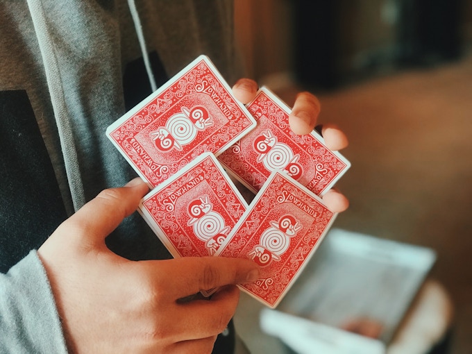
Only 3 more days on Kickstarter, this playful deck was designed in collaboration with graphic designers Nick Nisco and Kier Gomes. The trio spent months working together on creating a design that works for performing magicians, gameplay and collecting. 


The two-way back design in blue colorway features a series of hand-drawn glasses that make up a nice whacky and corky pattern that suits Jay's style and personality. The design also features the Spectacle Logo and a brilliant marking system designed by Nick Nisco. 

The face cards are pretty much standard be used to the Magician's advantage to have recognizable faces. But they have been updated to give each court card some nifty glasses to go with their looks! 


The Ace of Spades is represented by another sketch directly from Jay. The charming minimal look blends right into the pages of Jay's sketchbook but will stand out in your hands! 


The Jokers are drawn by Jay and feature a hand-written typeface with a court jester springing some cards overhead! Minimal, cute, personal. 


Also, Jay has designed some original concepts to include in this deck with built-in effects! Tutorials on how to properly use these special gaff cards are included with your pledge of 1 deck or more!

Printed by the United States Playing Card Company on Classic paper stock. Pledge starts at $15 on Kickstarter.

[post_ad]

Kickstarter For SlowHands Playing Cards Nears Funding Goal


SlowHands Playing Cards was conceptualized in 2015 by Kier Gomes. The idea is to create a deck that represents the origin of many young magicians and the sense of wonder that far exceeds one's skill when first getting into card magic. Kier collaborated with Nick Nisco of Elemental Playing Cards after he shared the concept of SlowHands with Nick and the two decided to work together on making it a reality in hopes of reminding the community of the roots they've established and passions shared.


Kier and Nick used the Bicycle Rider Backs as their inspiration and wanted to pay homage to the iconic back design, while still incorporating a fresh take on the classic deck. As such the red card backs of Slow Hands features a familiar aesthetic, but with updated, modernized and whimsical elements.


The SlowHands logo is a snail shell with a hand forming the body and a peace-sign making the eyes of the snail. This is not only a literal translation to the name SlowHands but also a fun and more playful approach to the theme of the deck. The scrollwork on the deck was drawn by Nick using inspiration from rider backs. There is also a subtle tweak to make the deck one way to help beginner magicians establish some very simple, yet deceptive card routines!


The face cards feature custom Ace of Spades, Jokers and updated standard court cards. The jokers are designed to have a few nods to the theme of the deck. Rather than a King on a bicycle, a snail is enjoying a nice ride on a tricycle. This is meant to represent the idea of "training wheels" and slow movement required to develop the muscle memory and dexterity it takes to be an expert sleight-of-hand artist.


With the courts, there have been some slight modifications to the cards. The blue that is typically used on the court cards has been replaced by black, and both Kier and Nick's faces can be seen on two of the courts. Kier's face can be seen on the King of Clubs, and Nick's face can be seen on the King of Hearts.


The deck is packaged in a minimal tuck box, a juxtaposition to the detailed work of the card back design. The crimson color with white trim provides an eye-catching contrast — and looks great for working magicians so they may have a unique, but unsuspecting, deck of cards.


SlowHands will be printed by the United States Playing Card Company on Premium Stock and traditionally cut.


Available NOW on Kickstarter and pledge starts at $12 for a single deck. Also, every 6 SlowHands decks will come in a half-brick box at no extra charge.

[post_ad]

Kickstarter: 7 Questions with Nick Nisco of Elemental Playing Cards


The Hydrogen Deck is the first in a series of Elemental playing cards inspired by the Periodic Table of Elements. The deck is an homage to the simple beauty of the periodic table — and a nod towards the many ways it mirrors a deck of playing cards. According to the Kickstarter campaign page,
Elements from the periodic table can be rearranged to form any substance in the known universe, each with their own unique properties; playing cards can be rearranged and placed in different orders and sequences to create different hands. Both feature symbols and numbers. And both live within order and structure.
Elemental Playing Cards exists to explore these similarities, starting with the first element from the periodic table: Hydrogen (H). The semi-custom deck showcase molecular hydrogen (H:H) on the card backs with two hydrogen atomic models bonded together covalently in the center.


The face cards are pretty much standard with semi-custom recolored court cards subtly embedded with hydrogen design elements within the garments and ornaments. The deck is packaged in tuck box featuring the element symbol for hydrogen as well as the hydrogen logo centered in a thick outlined circle representing the atom. When placed next to another hydrogen tuck case, it forms molecular hydrogen (H2).

Last week, we had a quick chat with Nick Nisco of Elemental Playing Cards about the design, inspiration and design process behind the Hydrogen deck.


For those of us who don’t know, tell us a little about Elemental Playing Cards?
Put simply, Elemental Playing Cards is an amalgamation of my love of design, science, and playing cards. I studied graphic design in college and it was while working as a designer at a firm post-graduation that I first became interested in magic and began collecting cards. After a few years, I decided to go back to school to pursue a career in science education. Today, I work as a middle school science teacher in NYC, teaching kids everything from forces of motion to chemistry and the periodic table of elements. My card collection has grown exponentially in recent years as I've acquired decks from the many talented designers out there and it inspired me to go back to my roots a bit and design a deck of my own. Elemental Playing Cards is my attempt to contribute to the playing card community with a deck that combines three of my passions.

Can you describe the Hydrogen deck and why you’re passionate about it?
The Hydrogen deck is meant to be the first deck in a series of playing cards that pays homage to the simple beauty of the periodic table of elements. Since I always envisioned the deck as the first in a series, I'm most excited about all the possibilities it opens up. The concept allows so much room for creativity which is what I am really drawn to, and what I think (hope!) other people will be drawn to as well. I'm also always passionate about the ability of design to elevate something seemingly ordinary (like the periodic table) into something beautiful.


Walk us through the process you took to design the deck. How did you come out with the idea and how did you get to this finished product?
I had been working on a deck previously but didn't love it because it was just a design that had no substance or story behind it — I didn't feel any attachment to it. When I started fiddling around with the idea of designing something around the periodic table, something just clicked. It checked off all the boxes of things I wanted in a deck of playing cards — something recognizable, something collectable, and something I hadn't seen before. I've been working on the Hydrogen deck (as well as a few of the other elements) for close to a year. It went through numerous iterations before I got it to point where I was satisfied with it.


What was your most brilliant breakthrough when designing the deck?
The whole purpose of an atom is to interact with other atoms to form the matter that makes up the whole universe. The breakthrough came when I realized the tuck case could be used as the interactive vehicle to mimic that purpose. Future element releases could visually "link" with one another to represent chemical bonds to form molecules. I thought this idea was extremely nerdy, which is what made me fall in love with it. It would add a collectable aspect to the deck. People could collect all the elements, or just their favorite. If people even have favorite elements. I might be the only card nerd who does —and it's carbon in case you were wondering.


With so many playing card projects competing for funding, why should potential backers choose your deck?
I am well aware that there are so many big players when it comes to the niche market of playing cards. And I'm also aware that adding a layer of science to my deck makes it even more niche-y. But, ultimately, I hope that my idea is different enough to stand out yet familiar enough to strike a chord with people. I feel like science has become more "mainstream" in the past few years with the help of people like Neil DeGrasse Tyson, Bill Nye, Elon Musk, Michio Kaku. I love seeing people go crazy over cosmic events such as the recent solar eclipse or when the first photo of the black hole was developed, thanks to the work of Dr. Katie Bouman. Also, it's hard to ignore the parallels science and magic have with one another. The idea of using the periodic table of elements as an inspiration behind the series gives people a chance to follow along with something they're familiar with and, hopefully, something they look forward to collecting over the years. I've given so much thought to the series and I'm really excited for the chance to bring those ideas to life.

What’s next? Are you planning to release more playing card decks in the future? 
For sure. I recently announced that oxygen would be the second deck to be released in the series. I decided to follow up with oxygen to showcase the interactivity of the series. With hydrogen being the first release, and oxygen being the second, card collectors could combine the decks to make water (H2O), the most important molecule needed to sustain life. I envision each deck having its own aesthetic. Each element has its own unique property and characteristics and I'm striving to do the same for each element deck release.


Finally, what are your favorite playing cards?
This might be the most difficult question to answer — with so many amazing decks out there, it's hard to narrow it down to just a few. I'd have to say my all-time favorite deck is the V1 Smoke and Mirrors from Dan & Dave. When I first saw this deck, it made me realize the possibilities for playing card design. I consider them the pioneers for breaking the mold of what a deck of cards could be. From the ornate back design and ace of spades to the simplification of the court cards, it was the first time I considered playing cards to be a work of art.

I also love the whole Orbit series. The V4 most of all. The Orbit series, as well as the Planets series from Vanda (another brilliant series), are the only other series that I know of with a science theme behind it. Chris Brown did a great job making the whole Orbit series really fun. I mean, who doesn't love spaceships, space, and aliens? He's also been doing a great job of teasing the upcoming V7.

More recently I've been a huge fan of what Luke Wadey has been putting out as well. I'm a typography nut and as soon as you see his decks, you can tell that he must be too. His Grid series, while very untraditional, is a re-imagination of what a deck of cards can be, and is extremely attractive to anyone who loves type. He is doing things that are very different than what other people are putting out and it's all very clever. His Mono-X release and upcoming Xero release has me feeling just as excited as I was when I first stumbled upon the Smoke and Mirrors series.

Thank you for your time Nick and all the best! At the time of writing, the Hydrogen deck is only 80% funded with 19 days to go. If you like what you've read here and would like to support Nick, head on to the Kickstarter page here!

The Hydrogen will be printed by the USPCC. Pledge starts at $11.

[post_ad]

Oxygen Playing Cards on Kickstarter


Oxygen is the second deck in the Elemental Playing Cards lineup following the success of the Hydrogen Deck. The deck is an homage to the simple beauty of the periodic table — and a nod towards the many ways it mirrors a deck of playing cards. According to designer Nick Nisco,
I’m really excited to release the second deck in the Elemental Playing Card lineup because it starts to show the vision I had for the series and what is possible with the collection.

The deck will be printed by the United States Playing Card Company on premium Bee stock and include the use of a metallic blue ink which is meant to represent the element in its liquid form.


The custom back design has been designed in a traditional poker style with a border showcasing the molecular bonding of oxygen. A portion of Bohr’s atomic model is also present with the words “Just Breathe” written in the electron cloud. Nick continued,
This has two purposes. One, to introduce a human element into the deck, and two, as a reminder to relax, take a few seconds and enjoy the moment. Mindful breathing has been known to help us refocus, release stress & tension, reduce anxiety, and increase creativity. Every single one of these is a benefit when it comes to using cards to perform magic or cardistry, as well as during different types of gameplay.

Meanwhile, the Ace of Spades has been customized to show off various important information for the element and the royals have been customized to include details that reflect the element oxygen and how it is used in different ways. The red color on the royal's garment has been enhanced with metallic blue ink.


The deck is enclosed in a custom tuck case designed so that when it is placed next to future element releases they can be “bonded” to create various molecules. The back of the tuck case showcases the element’s information as it would be found on the periodic table of elements.


Available NOW on Kickstarter. Pledge starts at $13 for a single deck.

[post_ad]

First Look at The Carbon Deck(s)


[Update] The Carbon Decks are now LIVE on Kickstarter!

Elemental Playing Cards are back with the 3rd installment of the popular series and this time around in collaboration with Luke Wadey for the Carbon Deck(s). The deck is scheduled to launch on in a few hours on Kickstarter (23rd June). The Carbon Deck campaign will be the first element in the line to feature 2 editions- Carbon Diamond Edition and Carbon Graphite Edition.


Diamond and Graphite are both are well-known minerals. Both are made of carbon atoms arranged in a crystalline structure. However, that is where their similarities end and in fact could not be any more different from one another. It is because of these differences that Nick Nisco decided to make both these decks as different from one another as possible


Carbon Diamond Edition has a 2-way back design with an included marking system geared more towards magicians, whilst Carbon Graphite Edition has a 1-way full bleed back design geared more towards cardists.


Carbon Diamond Edition was designed with magicians in mind. The two way back design features a familiar central circle design element that is inspired by the Tally-Ho Circle Backs. The design is meant to represent a round-cut diamond using a mosaic of various shapes and shades of black and white. The darker background coupled with this mosaic gives off an optical illusion of a diamond shimmering in the light. Around the perimeter of the diamond, you will also see the words "Diamond Edition."


Carbon Graphite Edition features a one-way design and semi-border/full bleed aiming to create unique and interchangeable fans. The focal feature is a large hexagon, it's textured and asymmetric gradients establishing a point of reference in your flourishes. Large pencil strokes run off the upper left side corner - the effect of scribbling in one place as if you were roughening up a freshly sharpened pencil helping to create dark areas during fans and spreads.


The face cards are completely standard except for the court cards and the ace of spades. Each of the court cards is done in black and white and has the diamond mosaic weaved throughout the garment each court card. The fading and smudging effect is prominently featured on the Graphite Edition. The designs also inhabit modified eyes, with the lower eyelid lines being removed for a cleaner finish, and overall result in a sense of familiarity whilst remaining distinctly individual.


The ace of spades follows a similar motif as the previous decks in the Elemental Playing Card line. It features an enlarged spade pip and in the center of the pip is Bohr's atomic model for carbon. The model includes carbon's atomic number, symbol, and the number of valence electrons.


Both editions of the deck will feature 3 jokers that were hand-drawn. The first shows an open hand holding piece of graphite. The second a closed fist around that piece of graphite with the words "pressure" underneath. And finally, the third joker shows the hand opened up once more, now with a piece of diamond.


The tuck design continues to follow the same motif as previous editions which a large circle on the front of the tuck that wraps around the sides. The element symbol "C" for carbon found in the center with the word "carbon" written underneath. "Diamond Edition" is written above the "C". The graphite tuck uses a deep grey to replicate that of pencil lead, contrasting with the white of the diamond edition.

[Update] The Carbon Decks are now LIVE on Kickstarter!

Printed by the USPCC and pledge starts at $12. Don't miss out!

[post_ad]

Hydrogen Deck V2 (Limited Edition) Playing Cards

Elemental. Molecular. Symbol.

Designed by Nick Nisco, the Hydrogen Deck v2 (Deuterium Isotope) is the second edition of the popular Hydrogen Deck. The deck is an homage to the simple beauty of the periodic table — and a nod towards the many ways it mirrors a deck of playing cards.

The back design comes in a striking magenta colorway and uses some of the same design elements as the v1, such as a pattern of H’s, but instead of a vertical/horizontal pattern, it uses a repeating 2H (the symbol for deuterium) in a diagonal pattern. The back also features a classic 2-way design with double border. 

The face cards are pretty much standard but updated to fit with the Deuterium theme. The custom ace of spades includes the words “Deuterium” as well as an updated atomic mass. The nucleus on the spade now houses the one neutron deuterium possesses. All standard red colors on the face cards have been swapped out for the metallic magenta ink. Standard blues and yellows have been replaced with black.

The decks are printed by the USPCC on classic stock, traditionally cut with air-cushion finish. 

Deck View: Oxygen Playing Cards

Calm. Precise. Elemental.

Oxygen is the second deck in Nick Nisco’s Elemental Playing Cards series, inspired by the periodic table. Inside, the custom back features molecular motifs and a nod to Bohr’s atomic model, with “Just Breathe” in the electron cloud as a reminder to focus. The Ace of Spades displays key elemental data, while the court cards reflect oxygen’s role in nature and human life.

The tuck case mimics a periodic table layout, showing the element’s symbol and atomic information, and aligns with future decks to form visual molecular structures. Oxygen is a refined, mindful deck designed for collectors, magicians, and cardists.

Printed by the USPCC on premium Bee stock with metallic blue ink, the deck blends scientific precision with elegant design.

Deck View: Hydrogen Playing Cards


Elemental. Molecular. Symbol.

Designed by Nick Nisco, the Hydrogen Deck is the first in a series of Elemental playing cards inspired by the Periodic Table of Elements. The deck is an homage to the simple beauty of the periodic table — and a nod towards the many ways it mirrors a deck of playing cards.

The semi-custom deck showcase molecular hydrogen (H:H) on the card backs with two hydrogen atomic models bonded together covalently in the center. The face cards are pretty much standard with semi-custom recolored court cards subtly embedded with hydrogen design elements within the garments and ornaments.

The deck is packaged in tuck box featuring the element symbol for hydrogen as well as the hydrogen logo centered in a thick outlined circle representing the atom. When placed next to another hydrogen tuck case, it forms molecular hydrogen (H2).

[post_ad]

Kickstarter: 7 Questions Deryn Le of Fresh Cuts Playing Cards


From the creative mind of Deryn Le, the man behind Noodlers playing cards comes, comes a barber shop/hair stylist-themed deck, Fresh Cuts Playing Cards. Vintage barbershop typeface logo, barber pole, hair stylists and barbers are all packed in this fully custom deck.

The deck was born from a thought of trying to give his personal barber a gift and now turned into an homage to those who keep us looking our best. According to Deryn on the campaign page,
I went to my barber to get a haircut some time ago. During this session, he asked me about the card collecting addiction I have. I explained to him that I'm a magician, which lead to collecting playing cards. He also asked about my I'mPossible Bottles. As I sat there getting my hair cut, I rummaged through my brain on which deck I could bottle for him to display on his station. Nothing came to mind.

Deryn has always loved the vintage look of classic barbershop logos and their storefront. The letter styling with all the embellishments and ornamentation was always beautiful to him. This is what he wanted to capture within Fresh Cuts playing cards.

To find out more about this delightful deck, we had a quick chat with Deryn about his design background, inspiration, and design process behind Fresh Cuts.

For those of us who don’t know, can you tell us about yourself and what is your design background?
I'm Vietnamese, born and raised in the US. I started practicing magic when I was 11.. which was 29 years ago 😳. My design background started in '97 when my friend gave me a copy of Photoshop. I've been messing with it ever since. In 2007, I became Tampa's Seminole Hard Rock Casino's first resident magician with help from my agent. In the same year, Daniel Madison contacted me to create an ambigram for his DVD, "Dangerous" and then again for his PDF "Madness."

Can you describe Fresh Cuts Playing Cards and why you’re passionate about it?
My wife and I started brainstorming about Fresh Cuts even before Noodlers. But we knew we wanted to take our time because it was more of a tribute deck for everyone that's in that field.


Walk us through the process you took to design the deck. How did you come out with the idea and how did you get to this finished product?
Fresh Cuts came out of necessity. I craft impossible bottles and when I custom a deck as a gift, I like to use a deck reflects the profession or passion of the person I'm giving it to. I wanted to give one to my barber but I couldn't find anything hair related other than a few mustache decks. Those just weren't what I was looking for. The main thing we wanted to capture was the old, vintage feel of classic hair salons and barbershops. Also, after some thought, I decided to commission a great artist to draw the courts in the likeness of some close friends. I can paint and draw, I just thought her style better fit this particular deck. Her name is Gaby (Instagram: @doodle_traffic). She's fantastic! We knew it had to have a barber pole.. it just HAD to. Kiana, my wife, who is the Queen of Hearts on the deck, had the idea of adding tools coming out the top and bottom of the barber pole. Adding embellishments really tied it all together.


What was your most brilliant breakthrough when designing the deck?
Deciding to have my friends as the courts! It was a hard decision on who to use because I didn't want anyone to feel left out. Unfortunately, we have a male-dominated demographic and I didn't want to put any men on the queens, which is why 2 of the queens are fictional characters. But simply having them on the courts wasn't enough. I wanted all of us to be hairstylists. Also the courts nod back to standard courts in the way they face and which hand is holding what.


We first noticed Fresh Cuts Playing Cards on Instagram. What do you think of the community in terms of the feedback and support that you’ve been getting?
I've gotten a lot of great feedback for the Fresh Cuts. I know not all cards are for everyone so I don't expect everyone to invest in them and that's fine. I just hope to those that do want to invest in them, I did a good enough job to earn their business.

Noodlers, Fresh Cuts… What’s next? Can we expect more deck designs in the future?
ABSOLUTELY! I'm currently helping a couple of friends with their decks. Both are retro are completely different. I've also been wanting to design a deck that uses standard courts. What better way than to do a casino-style deck? For me, those will be next and I plan on using foil on the backs to make them pop. I think I came up with the perfect name for the fictional casino I have in my head. Also, I'm going to do something I personally haven't seen done before in a deck. It's a small change, but something that needs to be done for my casino deck. You'll see!


Finally, what are your favorite playing cards? 
My favorite everyday decks, the ones I constantly shuffle, cut and dribble are Hydrogen and Oxygen by Nick Nisco.

My favorite working decks are Tally-Ho circle or fan backs. As a magician, spectators already assume we use trick decks so why even bother using a deck they've never seen before.

My favorite collectible decks are Thirdway Industries & Kings Wild Project.

Thank you for your time Deryn! If you like what you've read here and want to support Fresh Cuts Playing Cards, you can find it on Kickstarter Here! 


Three different editions of Fresh Cuts will be available during the campaign, Standard, Vintage, and Gilded. Standard Edition sports a full-color tuck with vibrant reds and blues, while the Vintage Edition will be an aged version of the Standard edition. The Gilded Edition comes with a black and blue tuck and the cards inside will be the Vintage edition but will have blue holographic gilding.


The decks will be printed by United States Playing Card Company on Premium Stock with Linen Finish and Traditional Cut.  Pledge starts at $12 on Kickstarter.

[post_ad]
© all rights reserved
Kardify 2013